
Yotti’s Packaging Design Ornaments Are Color-Coded To Denote Different Flavors
Yotti’s Turkish Delight is a South African brand of traditional Turkish sweets made from the gel of starch and sugar. The confections come in different varieties and flavors, from pistachios to bergamot orange.
The creative agency Stratitude has conceived, executed and produced the packaging design for this product that accurately and effectively reflects its origins and displays its contents.
Specifically, the most noticeable and unique elements of Yotti’s Turkish Delight packaging design are the ornate and complex arabesque patterns on each side of the box, as well as the top and bottom center.
These patterns derive from the Islamic sacred architecture, weaves, and other cultural artifacts. Innovative packaging designers skillfully utilize these cultural elements to create a connection between the product and its roots. Within the context of Yotti’s packaging design, each distinctive flavor comes with a unique ornament design and color.
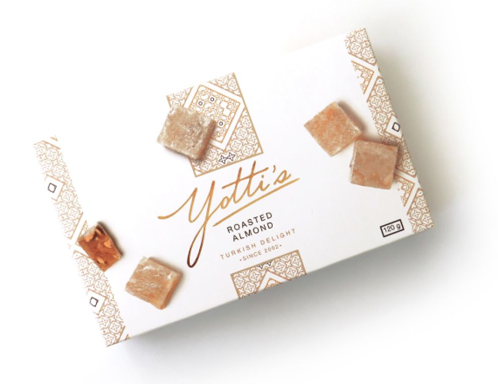
For example, the packaging for cherry-flavored Turkish delights has deep red ornaments with flashes of brown. Rose water-flavored sweets have the pink/cream pattern on the box, while roasted almond is all brown, cranberry is purple and so on.
This color-coded approach that matches each packaging’s content helps the consumers identify the flavor they are looking for right off the shelf, even without reading the key ingredient.

Yotti’s Complementary Hues Contribute To A Clean Packaging Design
Overall, Yotti’s Turkish Delight packaging design is very effective because it doesn’t create any distracting “noise.” Every design element is there to serve a purpose.
The arabesque patterns, product shots and label fonts sit atop a plain, white background that provides plenty of “breathing” space, so everything comes across as tidy and not overpowering.
This packaging also exudes class and tastefulness by using no more than two complementary colors. These colors are mainly used to correspond to the product’s many flavors. It is one of the clever ways brands use to trigger taste association.
The only constant element across all flavors is the brand name written in gold-brown gradient effect.
Everything else complements this consistency and contributes to a clean and eye-pleasing design throughout.

Yotti’s Script And Boxy Fonts Make For A Sweet Blend Of Content
Its brand name, “Yotti’s,” which also serves as the logo, stands in stark contrast to all other bits of messaging on this packaging – and not only because of its color.
The logo comes in big script lettering, slightly tilted to the right, whereas other pieces of content use a straightforward sans-serif typeface.
This was a smart choice on the design agency’s behalf. The overall design would have been too drab and monotonous if they did not opt for a radically different font, Stylistically, the strict, stern typeface used on the Turkish delight flavor and other information forms a delicate interplay with the more laidback and lighthearted brand name font.

Yotti’s Turkish Delight Shows How To Entice Consumers Using Mouthwatering and Hyper-Realistic Photos
A visual element that stands out the most – in a way, quite literally – are the representation of the actual treats inside the box.
The sheer quality of these images, their positioning and the wonderfully applied drop shadow effect make them appear hyper-realistic - almost three-dimensional.
The fact that these beautifully laid out images of Turkish delight pieces stand on top of the arabesque pattern only enhances this visual trick as it lends a layer of depth and perspective.
The craftsmanship and the quality of materials the brand has put into the packaging’s box contribute to this sweet appeal. The semi-glossy surface reflects light when observed under certain angles, resulting in a very life-like appearance of the confectionary images.
Yotti’s Turkish Delight Packaging Design Presents Cultural Authenticity & Well-Balanced Elements
Stratitude’s packaging design for Yotti’s Turkish Delight is a well-put-together synthesis of traditional, ethnic visual cues applied to a modern mass-produced product. It's a compelling display of how branding experts effectively bridge the gap between cultural heritage and contemporary design aesthetics in packaging.
Tapping into the rich heritage of Turkish/Islamic geometrical patterns acquired a differentiating quality for this brand of savory sweets. It evokes a direct association with the product’s country of origin in the minds of a consumer.
When Yotti’s Turkish Delight appointed Stratitude to perform their entire brand redesign, the agency’s Head of Client Service Stella Carter, remarked on the planned strategy for their client:
“Turkish Delight packaging is easily recognized because the same colors and patterns tend to be used, and while we want to keep some of these traditional elements, we’ll be adding a modern touch. Yotti’s has a gorgeous range of Turkish Delight and we can’t wait to make the new packaging as irresistible as the product inside.”
It is safe to conclude that this mission was a success – which is why Stratitude won DesignRush’s Best Packaging Design Award for this delightful design.

-preview.jpg)

