For most chocolate lovers, the packaging is probably something that gets dismissed quite quickly in search of the real milky goodness inside. However, for designers and those with an observational eye, the packaging on some decadent chocolates is fast becoming a piece of creative.
It's unsurprising to hear that there’s more to packaging some foods than merely putting the brand name on the front, yet there are some graphic design experts who are taking this to a whole new level.
We’ve rounded up 16 best chocolate packaging designs for current year. The variety of the packaging speaks for itself, with everything from minimalistic, plain designs to hand-drawn, bespoke packaging.
Browse through the following chocolate package designs, and you might just find some inspiration for your next design project. Failing that, they might help you solve that sweet tooth of yours!
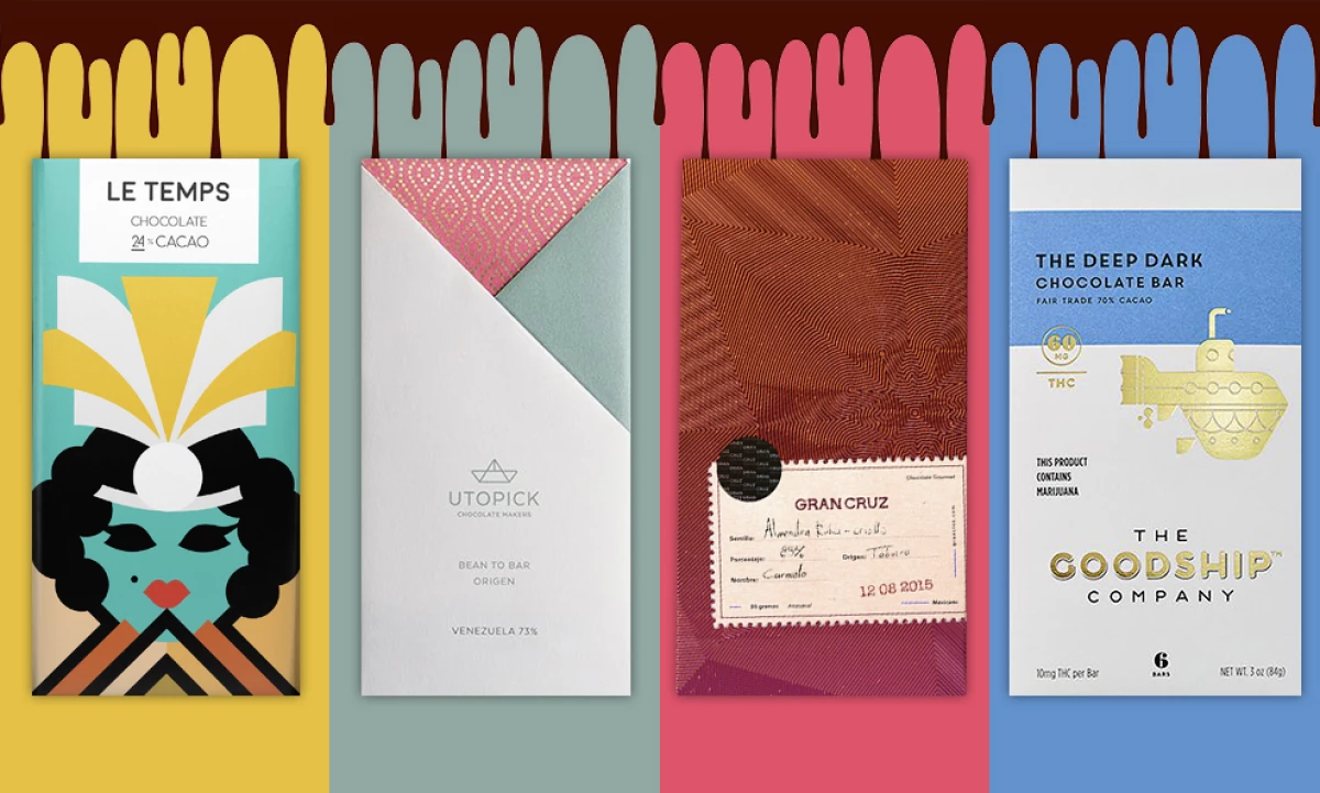
1. Minimalist Chocolate Package Design: Utopick Chocolates

A quick glance at Utopick Chocolates reveals that this is not some ordinary chocolate bar. The handcrafted treat is wrapped in a hand-folded paper wrapper. The colorful paper extends out from behind a minimalist, white wrapper, giving each variety a unique look, all while remaining consistent with the brand.
The colors used on the logo align with the accent colors on the packaging, but for the most part, the clean, white, and minimalistic design of the packaging portrays the chocolate brand in a rather luxurious manner.
2. Cannabis Packaging: The Goodship Company

The Goodship Company commissioned Mint-USA to design a product packaging that captured the high-end taste of their product and set them apart from other brands.
The white boxes with gold designs immediately create an aura of luxury, disrupting the already-existing "spiked chocolate" industry. The line of bright color along the top of the box differentiates the variety, and it serves as an excellent focal point to which a consumer’s eyes are drawn before they assess the rest of the box design.
The individual packages with the design of the bigger boxes with the gold and white coloring add a clean finish, while the colorful bar and black text stand out on their own.
3. Humorous Chocolate Packaging Design: Titses Milk Chocolate

The Titses chocolate's packaging takes creativity to the next level. It appeals to a more masculine demographic through a revealing name and provocative shape that resemble a woman's breasts.
The simple packaging carefully uses circular shapes placed next to each other to reinforce the name and represent what's inside. That, coupled with bold colors and sharp fonts reflect the richness of the taste. The playful design speaks to a particular audience and represents a more liberal approach to chocolate and packaging design.
4. Retro Chocolate Package: Le Temps Chocolate

Le Temps Chocolate implements elements from different decades of the 20th century. For example, white chocolate bars feature an English aristocrat in a top hat wearing a monocle, and the 24 percent cacao chocolate bar shows a girl wearing a 1920s headband and art deco elements.
Meanwhile, the '60s, '70s, and '80s are presented similarly -- bright, clear style with bold and timely elements.
5. Natural Chocolate Package Design: Crude Raw Chocolate

Crude Raw chocolates take a simple, clean, and organic product concept and incorporate it seamlessly into an honest packaging style. The structure and composition of the packaging and the use of pattern in the typesetting of label express this perfectly.
The box is an exciting contrast of corrugated card and geometric metallic foil that is similar to art deco-style ornamentation. Additionally, the modest color palette feels distinctive and contemporary.
The box is an interesting contrast of corrugated card and geometric metallic foil that is similar to art deco-style ornamentation. Additionally, the modest color palette feels distinctive and contemporary.
Each package consists of similar geometric shapes, capping off what is a well-designed package which showcases how texture, paper, and color can be successfully and beautifully implemented.
6. Monochromatic Chocolate Packaging Design: Jolly Good Nutcracker Chocolate

The Emedia Creative team created a limited edition, Jolly Good Nutcracker Chocolate pack. This monochromatic design was completed with gold and black foil stamping and it comprises of four distinct characters. The typeface on the packaging is playful, bold, and compliments the illustrations well.
According to the agency:
After another year of creating for clients, we decided to have a little bit of fun for ourselves and develop a series of limited edition chocolate packs.The combination game was something we all played as kids, where someone draws a head and folds the paper over, the next person draws a body with arms, and the last person finishes off the legs and feet. As we often spend a lot of time on computers, this was a perfect way for the team (even the non-designers) to get a little creative. We combined our personal, hand-drawn efforts in true team fashion. Celebrating another ‘cracker’ of a year, the Nutcracker sparked inspiration for the final four limited edition characters. The end result is a series of luxe gold and black foiled chocolate packs that perfectly represent Emedia Creative.
The rectangular packaging also features an insert for the gold-wrapped chocolate bar, and the company logo is also engraved on each piece of chocolate. This attention to even the smallest details makes this a memorable gift to give or sweet treat to eat.
7. Sophisticated Chocolate Packaging: Beau Cacao

Beau Cacao’s chocolate bar packaging showcases a sleek and elegant design. A combination of geometric maze designs with brilliant paper coloring to draw the chocolatier’s eye to the product.
The complementary coloring of corals with gold creates a graceful and clean appearance. The all-caps typeface inlaid in a diamond plate of gold that depicts the product name of “Beau Cacao” is accented with a cacao plant logo, bringing a natural feel to the packaging.
Separate color combinations for different flavors add a rich layer of design to the product. Gold and bright yellow packaging smartly represent silky smooth caramel flavorings, while coral with gold brilliantly combines sandalwood and paprika.
Continuing the exquisite design on the inside of their packaging, Beau Cacao delicately wraps each bar of chocolate in a sheet of solid gold. The choice of doing so allows consumers to feel luxurious and lavish as they unwrap their chocolate bar.
8. Festive Chocolate Package Design: Arcobaleno Chocolate

Arcobaleno is a fictional brand of fruit-flavored dark chocolate with a bright and colorful packaging that focuses on the fruity flavors. Created as a school project, the dark background and white accents create the perfect stage for the illustrations. The bright colors and simple shapes creatively let the customer know what the main fruits are inside the chocolate.
The unique fonts, sharp contrast, and colorful graphics draw consumers in to find out more about the bright design.
9. Luxurious Chocolate Packaging Design: Break The Mold

Break The Mold marries a wink-inducing name with elegant features to create a decadent treat through and through. The handmade chocolates are wrapped in a design by Jessica Glebe.
After carefully preparing countless batches of sea-salted caramels bathed in dark chocolate and pairing them with equally delightful dark chocolate coffee truffles, we set out to package these goodies in a gift box that would do them justice. Thus, we placed our decadent treats in a quaint little box, wrapped it in ultra-smooth Neenah® SLIDE black paper (for a super-rich, smooth-to-the-touch feel), and printed the design in rose gold foil. We then placed the uncoated square centerpiece design onto the front panel, showcasing raised glossy black ink and rose gold foil. To complete the package, we melted and stamped the Limited Edition wax seals onto the box, along with handwritten elements and our signatures. The inside of each box included a handwritten note to each recipient...and delicious homemade chocolates, of course!
This product's first step towards distinguishing itself is its unusual square shape, as opposed to the more universally recognized rectangular chocolate bar. The high-contrast color palette is accented by a copper wax seal on the side, which immediately brings an air of exclusivity from generations past. The bold sans serif typography sends a message of strength as if the chocolate were being announced at a soiree, making us want to break into this treat even more.
10. Holiday Chocolate Package: The Handmade Christmas Company

While this packaging isn't solely cocoa-based, the festive green and red packaging by Socio Design can be personalized to hold your loved one's desires -- chocolate goods included!
The deeper shades of emerald and ruby keep the Christmas hues elegant, while slight metallic and burlap accents add both texture and personality to the packaging. Each box is elevated with a delicate crest, which ever so slightly resembles antlers.
11. Dreamy Chocolate Packaging: Mirzam

These chocolate bars by Mirzam are a dreamy and inspiring food packaging that takes consumers on a journey across the cosmos. This bean-to-bar chocolate brand is inspired by the original spice route, accentuating these flavors in the chocolate and in the design.
There’s a whimsical vibe to these designs that come from the creative illustrations, smooth colors and dreamy designs.
Consumers are taken on a journey with the help of a boat image that seems to glide along a cosmic background. There is also the depiction of exotic lands — the lands where these beans come from — elevating the brand and its identity and infusing it into the designs in a seamless and stunning way.
These chocolate bars embody a destination and a spirit. They come with a personality and a soul. These chocolate bar designs tell a story through intricate and meticulous design elements, illustrations and imagery.
The background looks like it belongs in outer space --with smooth and colorful shading that looks like the night sky. A boat glides along like it’s sitting in a sea, and in some designs, there is a wave-live pattern etched in.
The beauty of this passionate brand is evident in its packaging, making it a stand out contender in the category of best chocolate packaging.
12. Illustrated Chocolate Package Design: Cacao 70

Cacao 70 is another bean-to-bar brand that specializes in authentic products with tasteful ingredients. It’s a brand with a personality and a persona that they infuse into each of their products — and definitely into their package designs. You can feel the heart and soul here.
Each of these bars, depending on flavor, includes a character that tells a story. These are humorous, short and sweet. But they add a friendly layer to the design that makes the brand stand out as a whole.
The illustrations are bright and engaging — the creativity and the fun evident in the soft lines, bright colors and smooth surfaces.
The pastel colors that coat the packaging is equally tranquil and serene. It’s a captivating design that pulls consumers in and gives them a fun and flirty story to interact with before they ever tear open the packaging.
These illustrations add a light an airy quality to the packaging, which is otherwise rather minimal and soft in comparison. These designs are winners with their storytelling capabilities, captivating illustrations and enigmatic empty, negative space.
Have some fun, and enjoy a happy, tasty snack with these Cacao 70 chocolate bars.
13. Modern Chocolate Package: Gran Cruz

Gran Crus is a modern and innovative luxury chocolate brand that puts the perfect amount of passion and dedication in its chocolate creations. It’s a Mexican-based brand that infuses the tradition and history of Mexico and the chocolate-creating culture into its tasty bars.
To capture this essence, the designers behind these modern chocolate bars played with captivating patterns and imagery to create a holographic, almost three-dimensional design that was impossible to ignore.
According to Shift, the agency behind the packaging:
We opted to create a visual language that alludes to Latin America’s colonial era’s craftsmanship and military recognitions in the form of a ‘cruz’ or medal, hence the name, ‘Gran Cruz’. The detailed patterns and holograms in both branding and packaging aim to communicate the product’s authenticity and level of attention to detail, effort and demanding selection process. The mixture of serif, sans serif and handwritten texts highlight the brands human aspect and artistry. A modern and vibrant colour palette is contrasted against sober and monochromatic tags as a reference to Mesoamerica’s colorful culture juxtaposed with colonial era’s industrial European influence.
And these designs really do shine. They’re artistic and enigmatic, with strong geometric lines, bold colors and a simple travel-inspired label that shows the reach and impact of chocolate across the globe.
This package captures a strong history that makes it one of the best packages for chocolate we’ve seen.
14. Vegan Chocolate Packaging Design: ACH Vegan Chocolate

ACH Vegan Chocolate is a Lithuanian-based brand that plays with flavors in surprising ways. In a complementary way, the packaging plays with handmade illustrations that embody the bold flavors and emphasize the power behind the delicious ingredients.
There are a number of intriguing aspects to this design. The first being the numbered quality. Each bar gets a name and a number — with the number matching the brand name in a bright and engaging silver foil.
This information sits on a clean white rectangular label that includes the name and ingredients in a simple, sophisticated way. And the coloring of this text matched the overall color palette of the bar packaging.
And the surrounding package design really does steal the show. Clever illustrations take on the shape of flowers, herbs and fruits that dance across the paper packaging. These are cute and fun, adding a playfulness and a spirit that really embodies the entire chocolate-eating experience.
There’s a softness and a playful subtlety here that adds an almost romantic and emotional edge. These are made with all-natural ingredients free of any animal intervention — so you can even feel good about eating them!
15. Colorful Chocolate Package Design: Green & Black’s

Green & Black’s is a sophisticated chocolate brand with an ethos that’s strong and impactful:
GREEN & BLACK’S is a chocolate brand founded on sustainable and ethical cocoa sourcing principles, based on our conviction that great taste comes from the finest ingredients. Green symbolizes our commitment to always sourcing ethical cocoa. Black stands for our high quality and the delicious intensity of our chocolate. The first GREEN & BLACK’S chocolate was created in London by original founders, Craig Sams and Jo Fairley. They launched the brand with an organic dark chocolate bar with 70% cocoa. And today you will still find a dark chocolate bar with 70% cocoa in our organic line! Now, the GREEN & BLACK’S collection includes a wide variety of offerings, all expertly crafted with hand-selected, ethically sourced cocoa beans and the finest ingredients from around the world. From developing our unique chocolate recipes to selecting ingredients like hand harvested Anglesey Sea Salt and Mediterranean Almonds, we take great pride in creating distinctively smooth and rich chocolate experiences.
And to match this airy and heartfelt mission, the packaging incorporates a colorful smoothness that lulls you into a chocolate-filled paradise.
These designs are made up of a white background with a cascading watercolor pattern that glides up the packaging. It’s breathtaking and subtle and smooth. It’s an elegant design that sets the perfect, breezy backdrop for the luxurious brand.
The copy is bold and bright, providing users with the authentic and authoritative information. It’s a comprehensive offering that’s contemporary, modern and edgy.
16. Elegant Chocolate Packaging: Lauren Coffee Dark Chocolate

This chocolate bar infuses two great loves — dark chocolate and coffee. It’s a tasteful creation that aims to promote happiness and excitement. One bite and you’re addicted, we’re sure of it.
But the packaging that encases these chocolate bars is equally enchanting and seductive. There’s a moodiness that comes from the coloring and the imagery, and it urges users to rip it open and take a bit.
There’s a luxuriousness and vibrancy to these dark and sophisticated designs. It starts with a matte black coating, with a subtle image of a coffee bean sitting at the bottom, only half in view to inspire mystery.
Numbers in shiny, glossy and curly font take up the majority of the design. These numbers denote the amount of cacao in the chocolate — the higher the number, the darker and more bitter the chocolate creations.
Under these bold and glossy numbers is the word cacao which is written in the same font — only now, it’s in a bright white font that stands out against the matte black background.
Different variations include different imager at the bottom — if the chocolate has nuts or herbs, that flavor is symbolized at the bottom.
These modern designs grab attention and exude luxury and sophistication in a subtle yet captivating way. They’re mysterious and moody but have a playful edge that gets your mouth watering instantly.
These are a knockout chocolate packaging design thanks to their simple sleekness and sophistication.
Top Chocolate Packaging And It's Impact On Branding
Each of the above designs takes what could have been a relatively typical package and makes it into, not only a piece of art but a design that is reflective of both the product and the company who created the chocolate.
Achieving both of these in the packaging makes for a compelling story and a visual experience that you’ll never forget while enjoying your chocolate. This focus on a unique visual experience is a hallmark of designs that win packaging design awards, which often celebrate the innovative use of form and function.
But it also adds to an overall brand identity that's compelling and engaging. These designs have a way of encouraging buyer behavior and changing perspectives. Whether you're a new brand or one with a history, it's always important to keep branding alive through your designs.