Standout Features:
- Refined serif logotype
- Integrated wood grain pattern
- Clean layouts maximizing white space
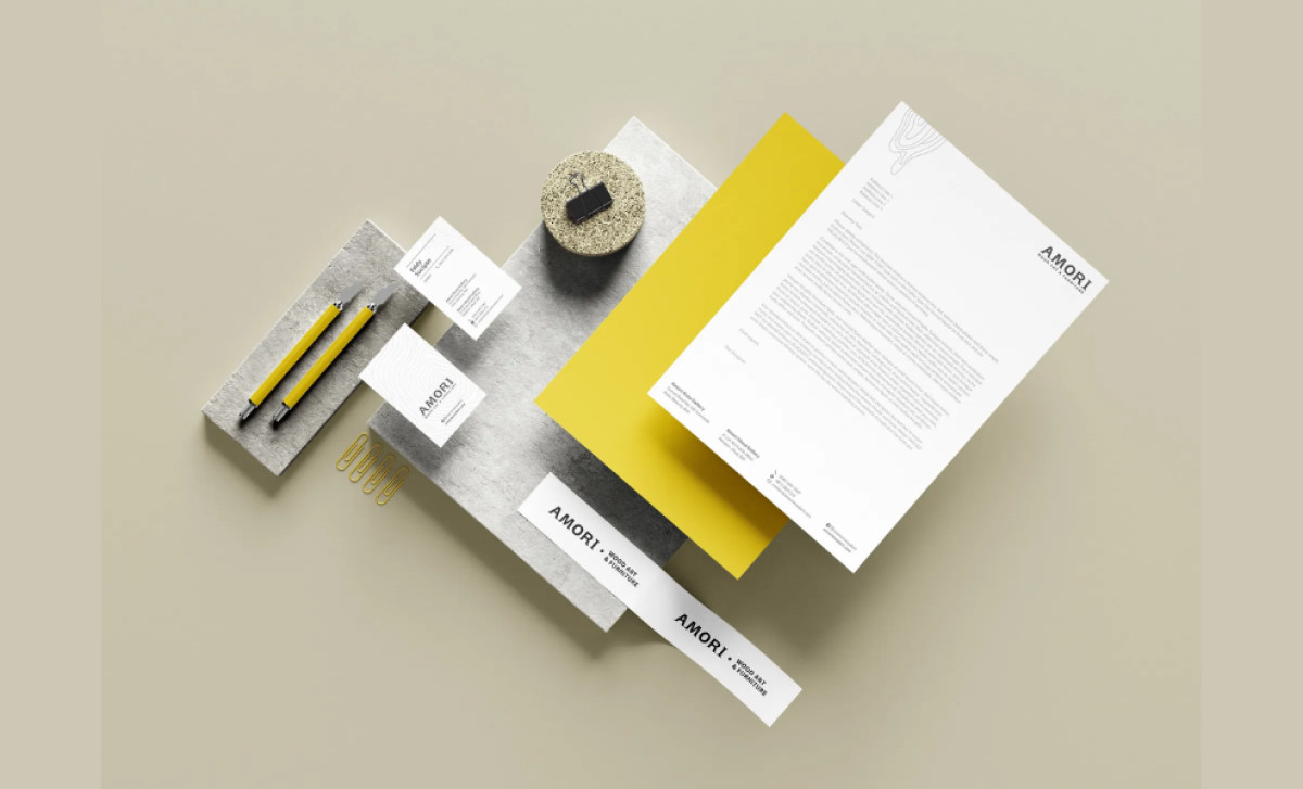
Bali's distinguished Amori Wood Art & Furniture gallery tasked IS Creative specifically with developing print stationery that would align with its medium of organic wood materials. But how can print stationery alone communicate the craftsmanship of such a high-end art gallery? Simple: through elegant typography, subtle texture, and minimalist principles.
Firstly, its serif logotype provides a sense of quality and artistry, aligning with the gallery's positioning of crafting "masterpieces." This is balanced by a clean, light sans-serif font used for contact details and secondary information, ensuring modern clarity while allowing the main logotype's artistic character to shine.
Next, it integrates a subtle wood grain pattern, prominently featured on the whitepapers. Rendered in thin outlines, this pattern creates a direct visual and conceptual link to the gallery's core medium: wood. It adds an organic, almost tactile dimension that prevents the minimalist design from feeling too stark.
Furthermore, each piece in the entire stationery suite utilizes generous white space. This approach is complemented by a restrained color palette consisting mainly of white or off-white paper stock and natural sandpaper tones. The resulting aesthetic feels clean, confident, and high-end — as expected from a fine art gallery.
The remarkable success here lies in the authentic way it represented the brand’s essence of artistry plus wood. Through strategic stationary print design, this approach constantly reinforces its unique selling proposition through both touch and sight.