Team Behind the Agency
Unifying multiple brands under a single corporate identity is one of design’s most complex challenges. Tasked with bringing cohesion to BIMAL Group, the leading edible oil producer in the Balkans, MicroMedia approached the project as both a creative and strategic opportunity.
Print Design Analysis
Strong print design should feel consistent yet alive across every format. BIMAL’s new promotional identity does just that.
It transforms everyday corporate materials into cohesive visual statements, reinforcing both professionalism and warmth.
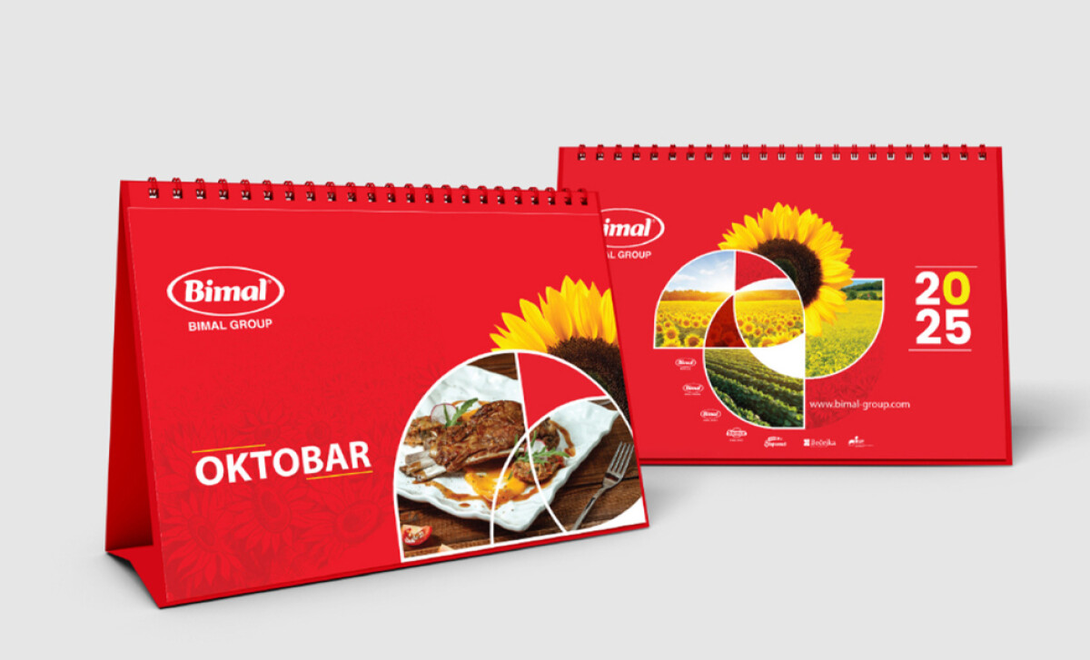
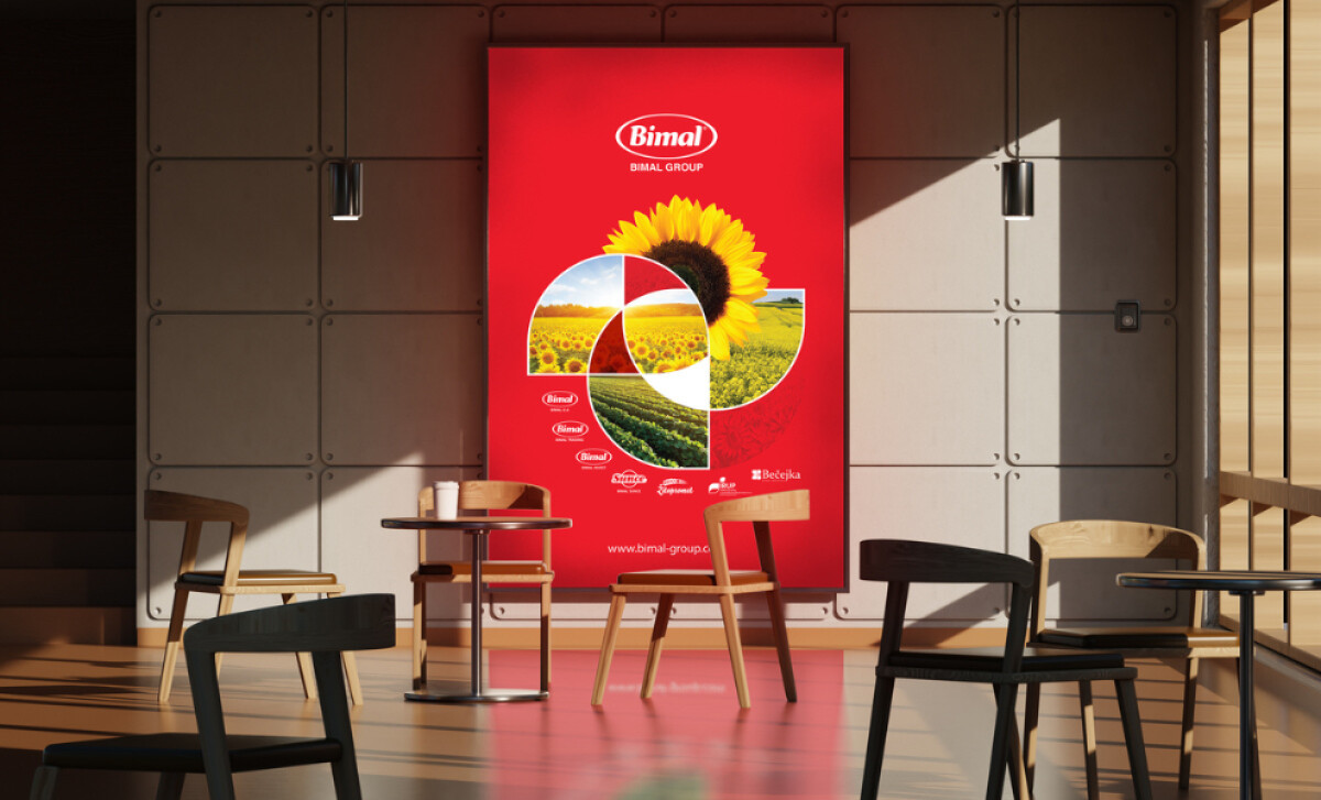
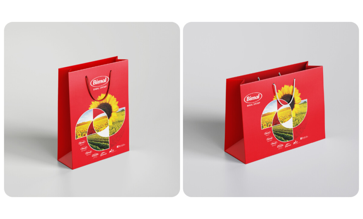
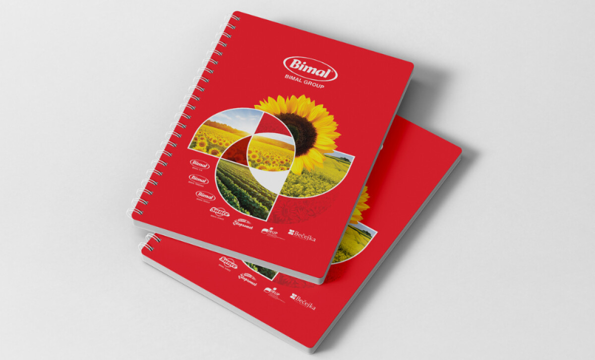
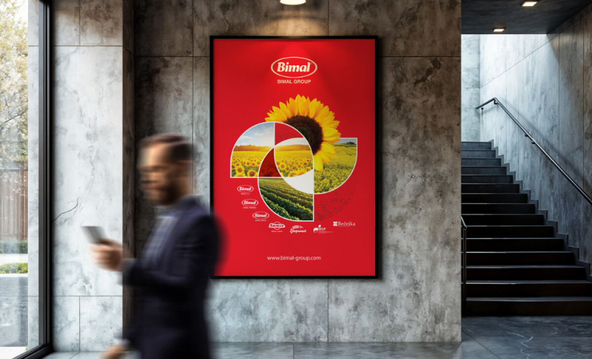
- Sunflower-Inspired Graphic System: The circular motif drawn from sunflower photography immediately caught my attention. I like how MicroMedia uses this geometry to represent unity and continuity across the BIMAL Group.
- Modern Geometry Meets Tradition: I appreciate the balance between minimalist structure and regional warmth. The clean grids and open space create a modern tone, while the sunflower imagery keeps it grounded in local character. It feels approachable and professional at once — a mix that’s rare and effective.
- Signature Red as Brand Connector: The brand’s red stands out as the visual thread linking every format. I like how it carries energy without being loud. The color feels confident, guiding the viewer through each layout while holding the identity together.
- Consistency Across Formats: What impressed me most was the continuity across materials. Whether it’s a wall poster or a desk calendar, everything shares the same rhythm in typography, color, and imagery. That consistency builds trust and gives the brand a steady, recognizable voice across every touchpoint.
Impact & Recognition
The BIMAL Group rebrand brought measurable cohesion across all marketing channels.
- Brand recognition strengthened significantly during trade fairs and industry events.
- Unified visual language improved recall across both consumer and corporate audiences.
- The new print materials now serve as the foundation for all future promotional campaigns within the group.
Collaborator Input
For an inside look at the project, here are takeaways from the brand.
Words from the Agency
''Special attention was given to the balance between corporate elegance and everyday accessibility, ensuring the materials resonate both with partners and consumers.''
- MicroMedia Design Team
What Brands & Agencies Can Learn from BIMAL
This project demonstrates how consistent visual systems can transform a diverse corporate structure into one unified story.
1. Build Identity Through Metaphor
Using the sunflower as a central motif gave the design both meaning and memorability. It connects the brand to its natural origins while symbolizing energy and growth. Agencies can learn how a single, well-chosen metaphor can unify multiple sub-brands under one recognizable visual theme.
2. Design for Adaptability
The modular layout adapts easily across formats, from small merchandise to large outdoor prints, without losing rhythm or clarity. That flexibility keeps the brand consistent as it grows. The system feels practical, durable, and suited for long-term use.
3. Balance Corporate and Human Appeal
MicroMedia achieved the right tone between professionalism and warmth, making a corporate system feel approachable. Clean geometry and authentic imagery coexist naturally, showing that business-oriented design can still feel personal.
About DesignRush Featured Designs
At DesignRush, we review hundreds of creative projects each month across print, branding, and digital media. The featured works stand out for their clarity, craftsmanship, and strategic insight.
Only the most impactful projects advance to become Monthly Design Awards winners, recognized for excellence in creative communication.
Explore standout print design projects and related categories:
- Best Print Designs
- Best Website Designs
- Best App Designs
- Best Logo Designs
- Best Packaging Designs
- Best Video Designs
For a full list of design agencies and related services, see our Agency Directory.