Team Behind the Design
Print Design Analysis
I study annual report print design by examining how grids, typography, and color work together to clarify information.
When these elements align, even the most content-heavy report becomes easy to navigate and more engaging to read.
This is the approach I used in reviewing Annual Report 2020 FZ.
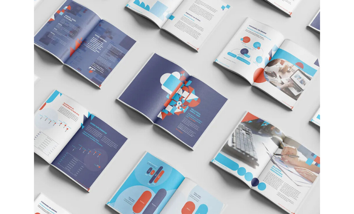
- Typography: Typography uses modern, readable type that balances hierarchy and accessibility. Larger section titles anchor each spread, and supporting text stays clean to avoid overwhelming readers.
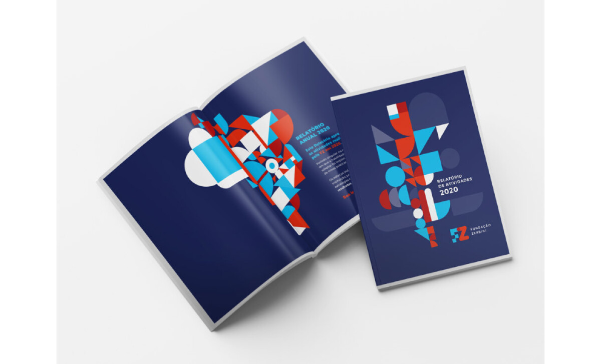
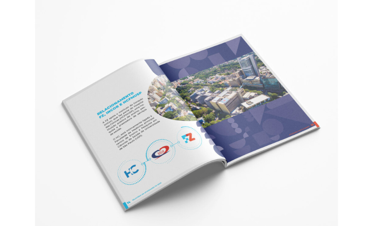
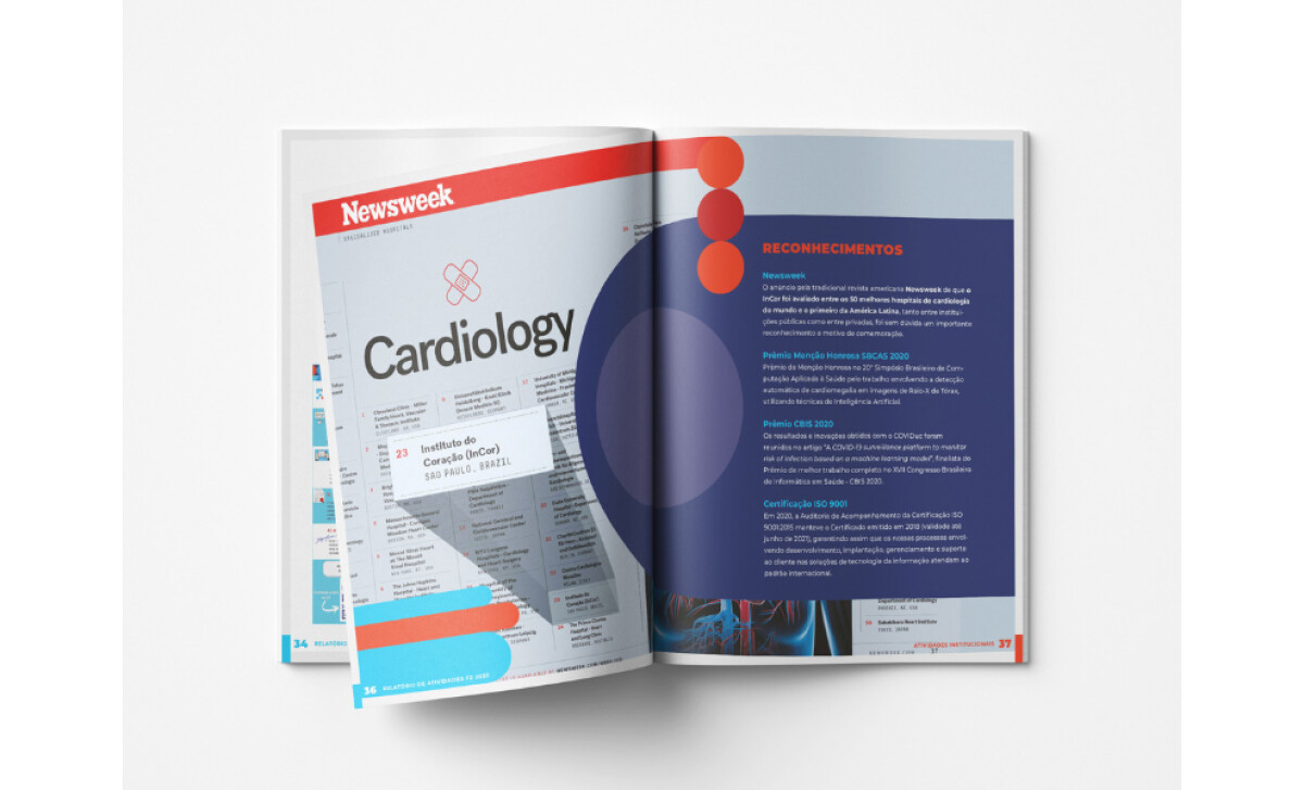
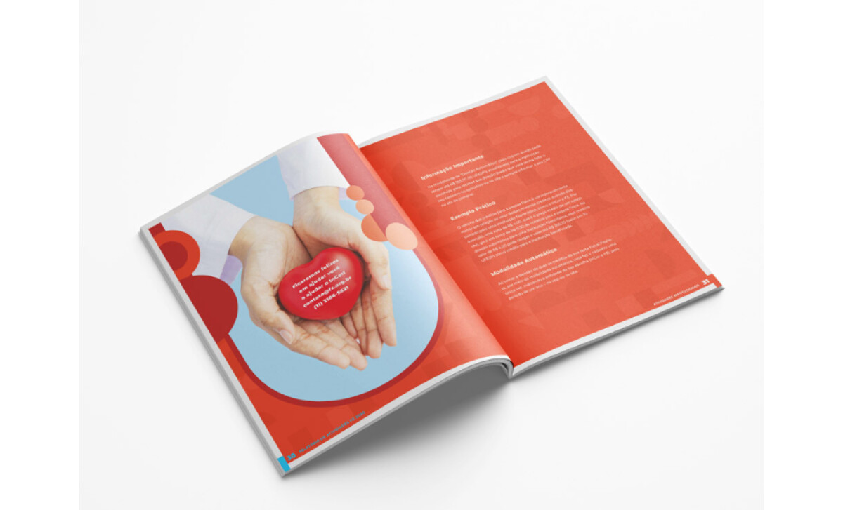
- Layout: I like how the layout favors spacious grids that break complex information into digestible sections. Bold graphic compositions add energy while keeping the report organized and consistent.
- Imagery: Imagery blends photography with geometric shapes that reinforce the Foundation’s branding. For me, this pairing helps humanize data-focused pages and adds warmth to the narrative.
- Production Quality: Production quality appears carefully considered, with color consistency and high-resolution elements across all 72 pages. The cohesive palette and clean margins help the report feel polished from cover to cover.
Collaborator Input
Here’s what the team shared about the project.
Word from the Agency
“For four consecutive years, we’ve developed the layouts for the FZ Foundation’s (Fundação Zerbini) Annual Report. The 2020 edition came with an exceptionally tight deadline, but through close collaboration with the Foundation’s team, we delivered all 72 pages on time, maintaining high visual and print quality throughout.”— Felippe Piccolo
Client Testimonial
“We had a very urgent demand for our 2020 annual report and as we have worked with Felippe in the past, we knew we could count on him for this job. Again, he exceeded our expectations with incredible work and meeting our super tight deadline.”— Wagner Santana, FZ Foundation
What Brands & Agencies Can Learn from FZ Foundation’s Annual Report
Felippe Piccolo’s 2020 report for FZ Foundation is a strong example of how clear structure and bold visual decisions can turn dense information into an engaging reading experience. It shows how design can guide attention, simplify data, and elevate credibility.
1. Use Spacious Grids to Make Complex Content Approachable
The report organizes information into clean sections that keep readers oriented. Generous spacing and a steady layout rhythm help transform long-form reporting into something easy to digest.
2. Combine Data and Imagery to Humanize Information
Photography paired with geometric branding elements brings warmth to numbers-heavy pages. It reminds brands that even analytical content benefits from human context and visual balance.
3. Establish Hierarchy Through Confident Typography
Strong titles and clean body text create a hierarchy that speeds up comprehension. This approach shows how typography can act as a navigation tool, not just a style choice.
About DesignRush Featured Designs
At DesignRush, we review hundreds of agency projects each month. The featured selections stand out for clarity, creativity, and execution across digital and brand experiences.
Exceptional works proceed to our Monthly Design Awards, where they’re recognized as leading examples of design craft.
Explore standout print design projects that push creativity forward:
- Best Print Designs
- Best Website Designs
- Best App Designs
- Best Logo Designs
- Best Packaging Designs
- Best Video Designs
For a full list of design agencies and related services, see our Agency Directory.
-preview.jpg)