Standout Features:
- Poster typography forming architectural shapes
- Tailored design styles for poster versus book
- Prominent documentary photos in book and gallery layout
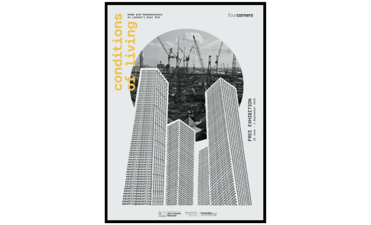
For the Four Corners Gallery exhibition "Conditions of Living," exploring a century of housing and homelessness in London's East End through archival photography, art director Raffaella Losito developed print materials that effectively convey the show's challenging themes.
The designer utilizes typography to create striking architectural forms resembling tower blocks dominating the center, visually constructed from the tightly repeated word "squatting." The text towers directly evoke themes of dense urban housing, immediately communicating the exhibition's challenging subject matter with thought-provoking force.
There’s also an intentional style difference between the attention-grabbing poster and the more detailed catalogue. The poster aims for bold visual impact. The book, however, adopts a cleaner, more academic approach — using serif fonts for easier reading and showcasing photos clearly.
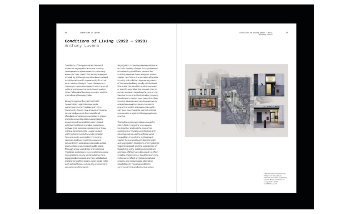
Inside the book, the design highlights the core content effectively: the archival documentary photos. Just like the rest of the gallery with its framed photos, the catalogue’s spreads feature layered composite images (like building facades, doorways, details) directly illustrating the housing conditions being discussed.
For poster print designs meant to inform, educate, or provide deep context, prioritizing content clarity through clean layouts and highly legible typography remains paramount for effectiveness. Letting the crucial archival photos and explanatory text speak clearly for themselves fundamentally respects the core content.