Standout Features:
- Deep wine-red as a symbolic brand anchor color
- Modular grapevine icon with symbolic geometry
- Quiet, humanist typography
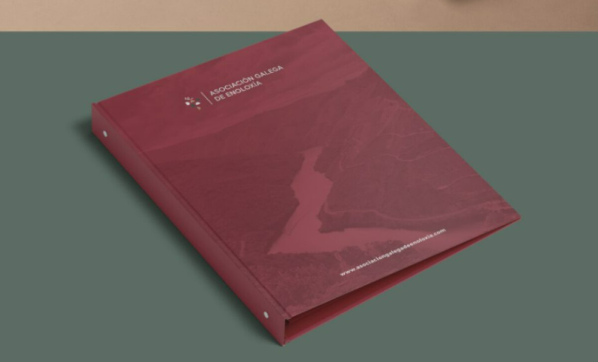
Representing Galicia's winemaking tradition and science, the Asociación Galega de Enoloxía required print collateral reflecting its deep regional roots. Amanita Studio designed a stationery suite that is notably steeped in the earthy tones characteristic of the area's vibrant wine culture.
A rich, muted wine-red is the cornerstone of the color palette for these print materials. This specific shade, leaning towards burgundy or terracotta, provides an immediate connection to oenological traditions. It ensures communications feel warm, elegant, and deeply rooted in Galician wine culture, lending an air of heritage.
The association’s logo features a modernized symbol of a grape cluster. It consists of small colored circles in a minimal triangular arrangement with a slender stem. This icon appears in various layouts, offering a clever blend of natural and scientific representation for the brand.
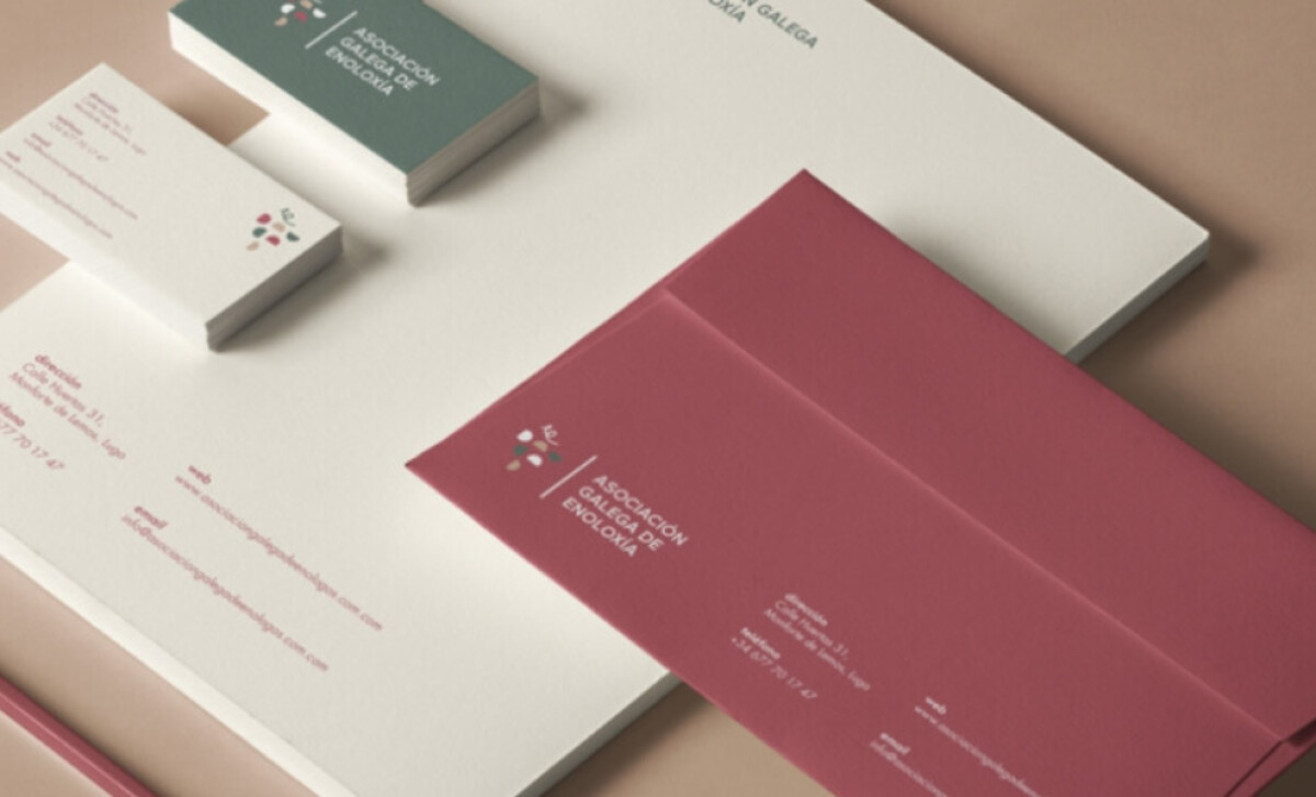
Throughout the print suite, a clean and minimal humanist sans-serif font is employed. This typography features well-spaced characters and thin strokes, providing high legibility. The text is consistently aligned and uses subtle, complementary colors, supporting the logo's visual charm while maintaining professional clarity.
This project highlights that for nonprofit organizations, print design emphasizing respectful restraint and symbolic depth can significantly elevate public presence. By avoiding overt commercialism in favor of muted elegance, the association's collateral effectively communicates its serious purpose and unique regional character.