Attending venues for benefit dinners is a great way to gather a group of people for a great cause. In the spring of 2014, a benefit dinner for the Maison Théâtre Foundation raised money to provide underprivileged children a chance to experience the theater.
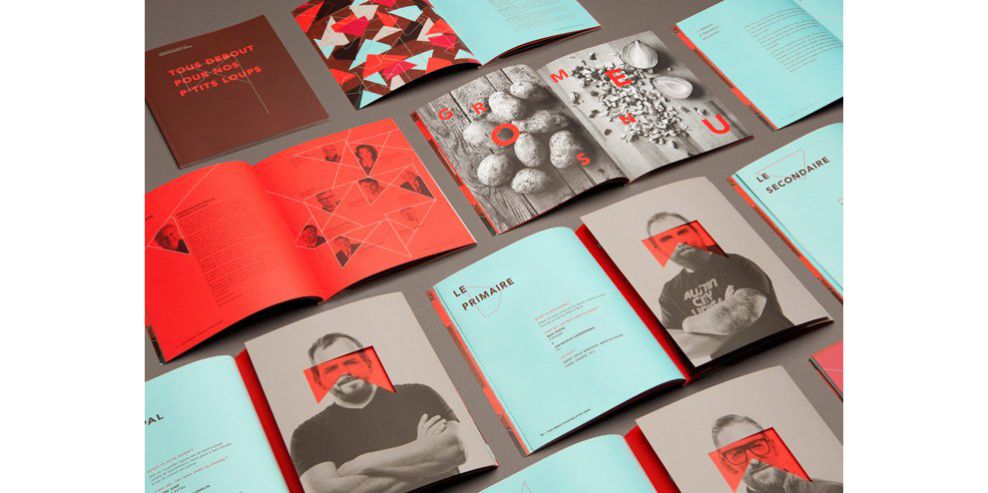
The event paired creative directors and chefs where they worked together to create an updated version of their favorite childhood dishes for attendees -- and LG2 Boutique created an amazing lookbook as a souvenir. The book was handed to all attendees and features stunning best print design practices like creative fold-outs and lush colors.
The wonderful color contrasting is seen with a light blue and deep orange. These colors enhance the field of view for the reader and allow them to focus attention on the subject matter.

A geometric theme inspired the masque for the evening, which was the overall concept of the dinner. Here we see the various geometric shapes that combine to create an abstract yet creative collection that gives viewers curiosity while also focusing their attention.

The book features the profiles of all creative directors and chefs of the evening. The cutout shape in orange can fold over each person and unifies them, symbolizing their support for the cause.
Creativity and thoughtfulness bring a metaphor to life through the physical design element of a fold-out. After all, people are enticed to learn more if they have something to grab or interact with. They can grasp the fold in their hands and match it with each creative director or chef, and feel the unification of the evening.
It also is important to note therobustness of the pages in this book. This is a souvenir. It is something for attendees to cherish as remembrance for a night that they supported an amazing cause.
They are enabling underprivileged children to achieve their dreams and attain a feeling of hope and positivity for their lives. It is a book that the children as well can keep with them to cherish forever.
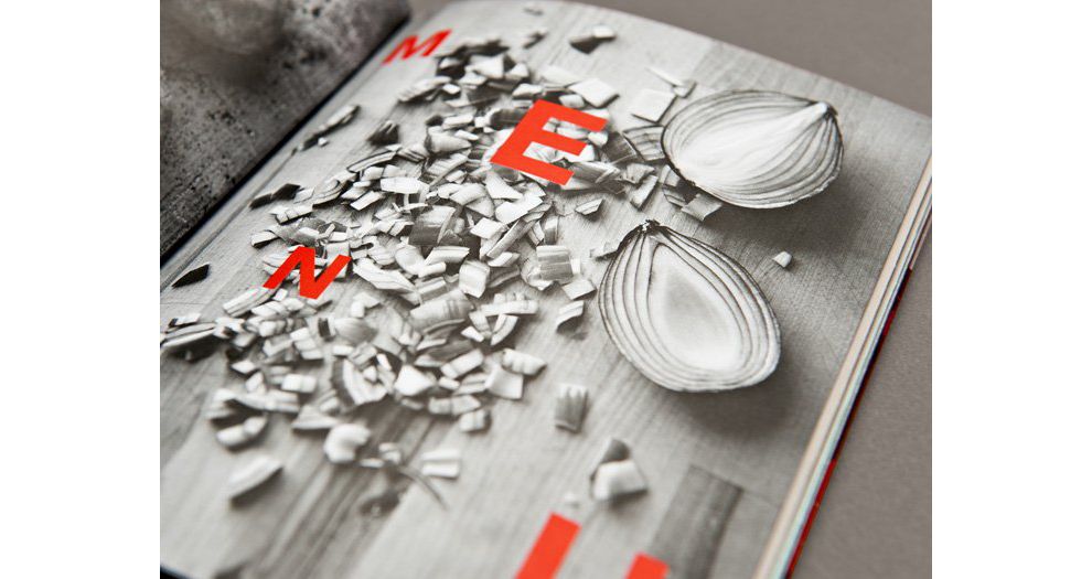
The book features black-and-white photos of fresh ingredients spread across cutting boards in various settings. The high-resolution images are crystal clear and contain bright orange letters on them that correspond to the subject matter on the page.
This is another example of phenomenal color contrasting. Bright and vivid colors against black and white backgrounds, when executed correctly, can actually enhance the background image and bring it to life.
On a side note, if you are looking to increase brand and product awareness, check these leading Boston advertising agencies.
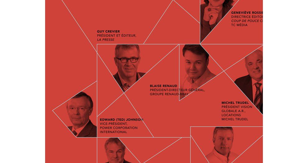
Creative directors and chefs with brief descriptions appear within the theme of geometric shapes. But ultimately, they all blend into the orange background. Even though they are from different industries, their credentials do not matter. They are all united under one color: Orange. This symbolizes them coming together for the same great cause and is a beautiful example of thoughtfulness in print design.
LG2 Boutique demonstrated how to execute stunning color contrasting, unifying themes and physical fold-out elements to craft a book that is worthy of that great cause.
Underprivileged children surely left the event with a new outlook on life. Meanwhile, the guests and attendees will have a souvenir to cherish in the form of a sturdy and gorgeous book, helping them remember the event for the rest of their lives.
The Maison Théâtre Book is a beautiful print design in the Entertainment, Food & Beverage and Non-Profit industries.
-preview.jpg)