Team Behind the Agency
For BIMAL, the leading edible oil manufacturer in the Balkans, MicroMedia was tasked with a campaign titled “Kupuj domaće” (“Buy Local”).
It connects BIMAL’s oils to their natural origins, using immersive imagery and heartfelt copy to highlight a message of trust, continuity, and tradition.
Print Design Analysis
A strong print campaign often succeeds by finding emotion in simplicity.
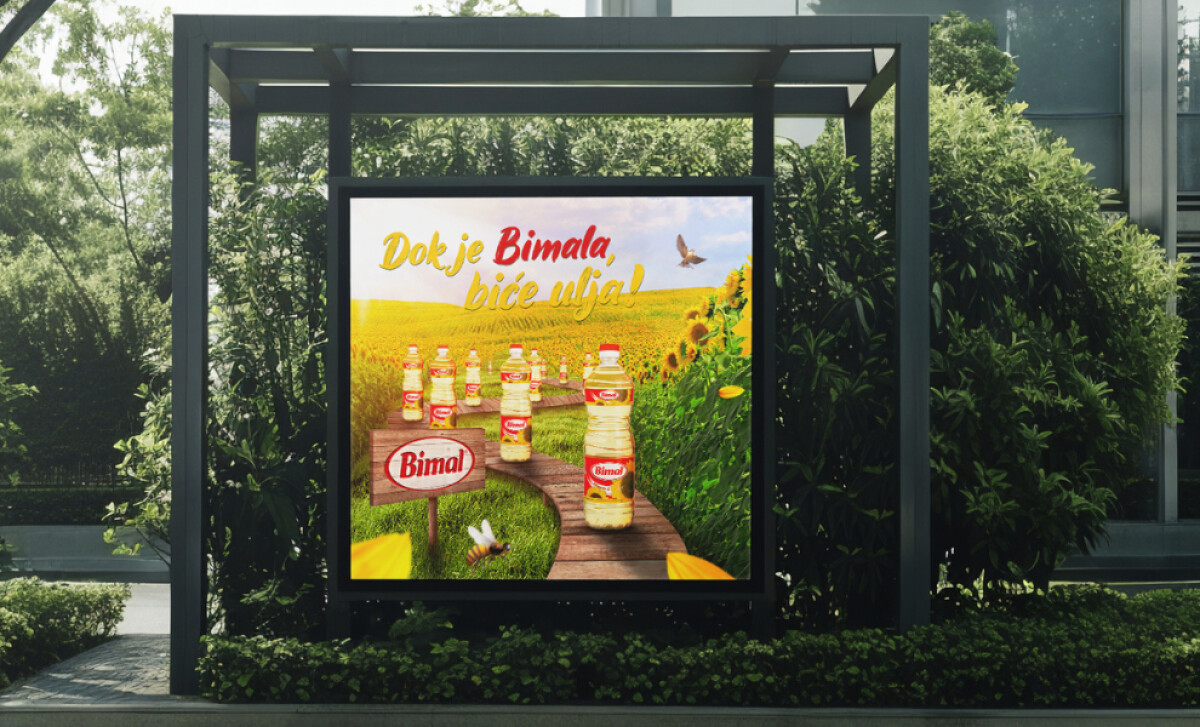
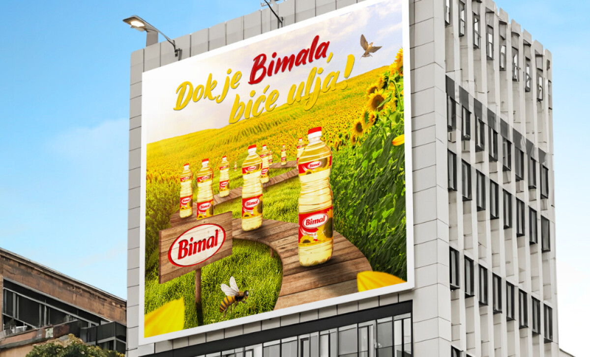
BIMAL’s outdoor series achieves this through natural storytelling, color harmony, and cultural context. Every visual detail feels intentional, from the glow of the sunflower fields to the typography that echoes optimism and care.
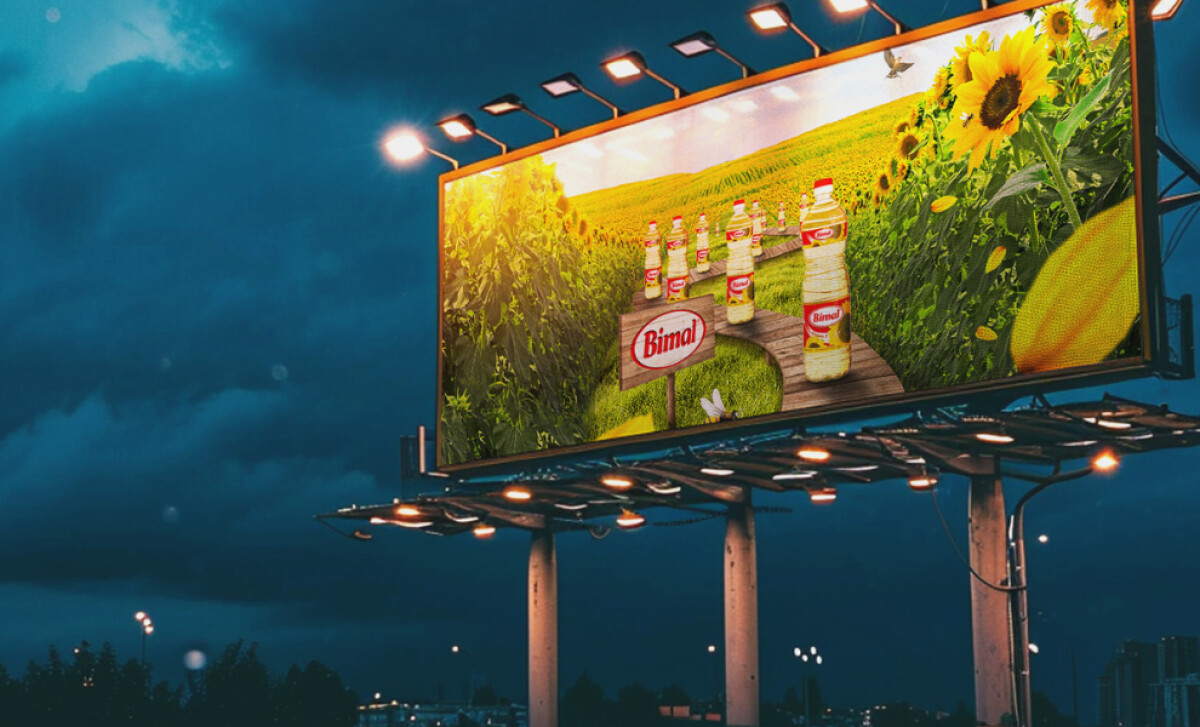
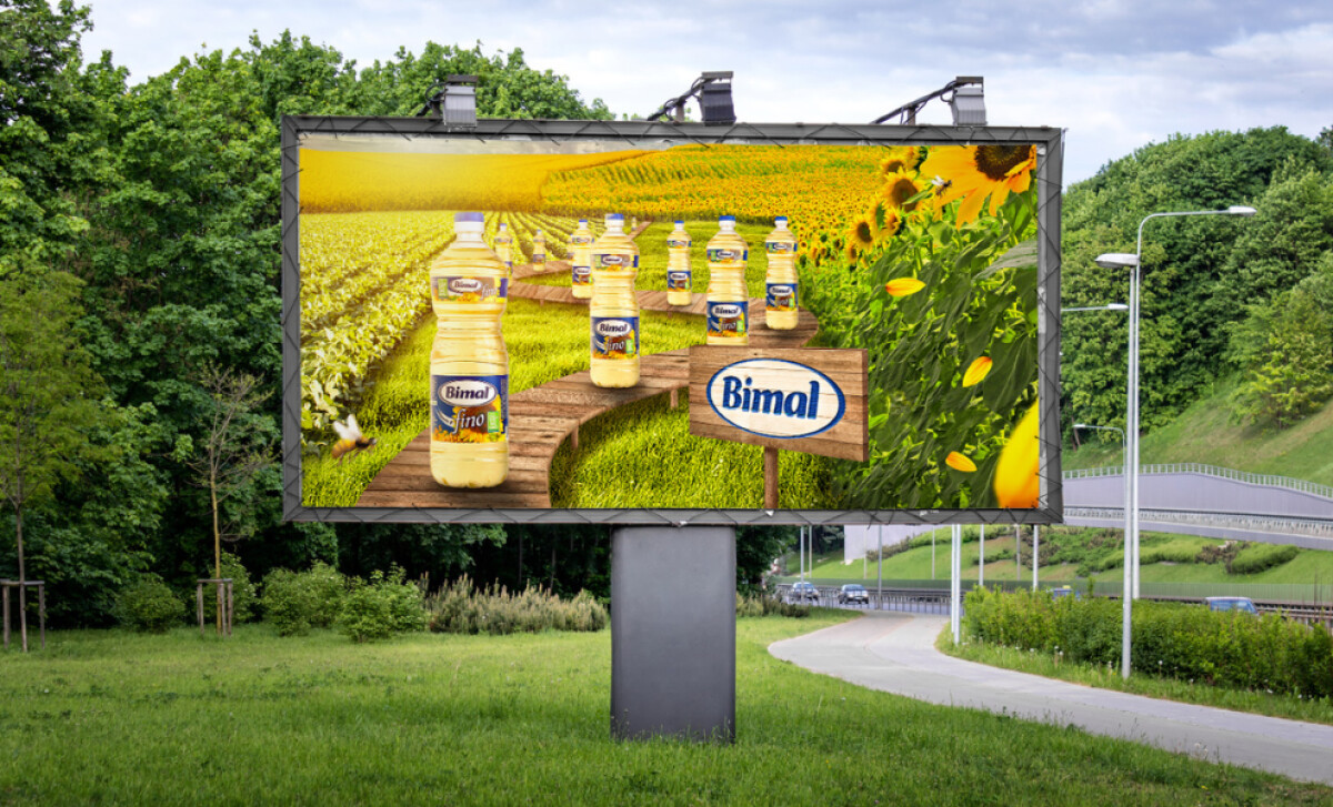
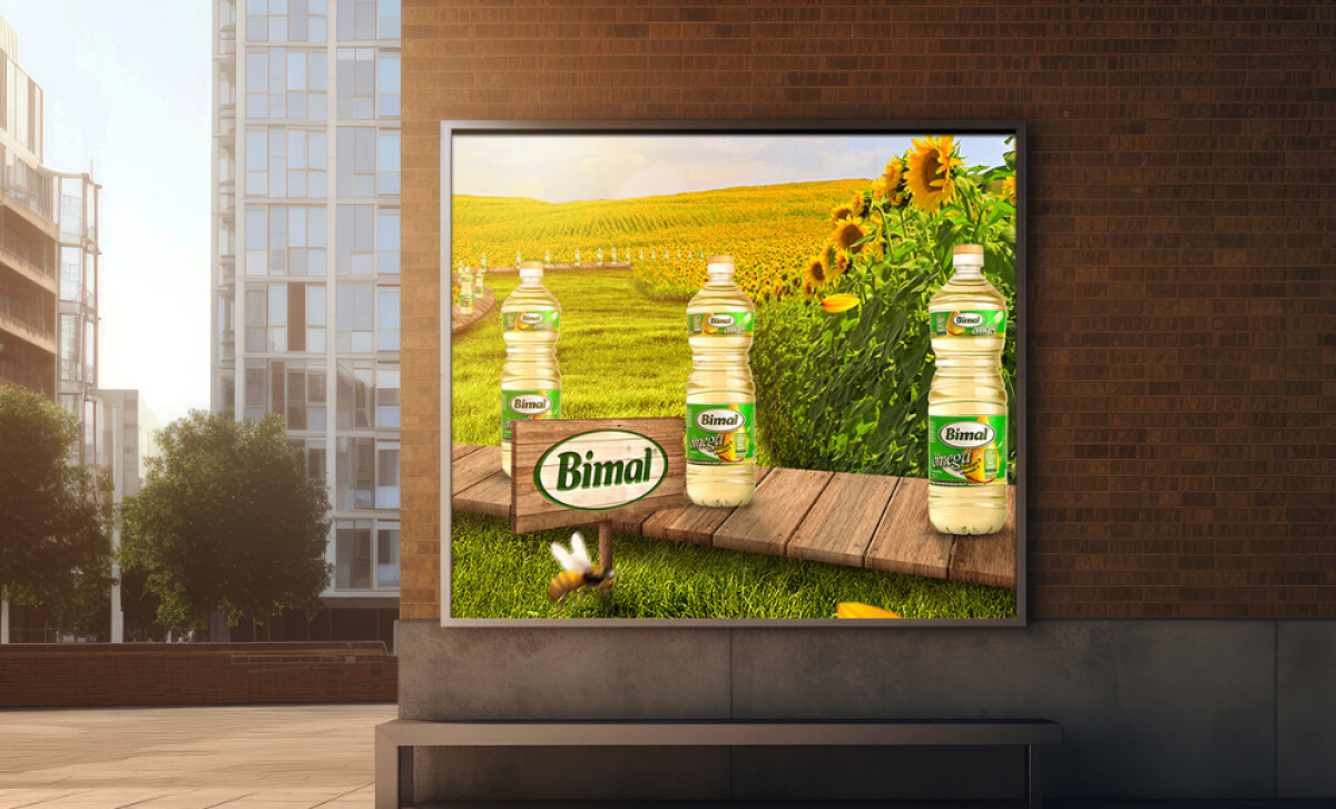
- Immersive Photorealistic Concept: The imagery captures sunflower fields bathed in golden light, with bottles on a wooden pathway. I like how this approach transforms a standard billboard into a visual narrative, inviting viewers to step into BIMAL’s world.
- Emotional Copywriting and Local Pride: The slogan “Dok je Bimala, biće ulja!” (“As long as there’s BIMAL, there will be oil!”) feels personal and reassuring. I appreciate how the warm typography and color pairing echo the brand palette, amplifying both familiarity and optimism.
- Consistent Multi-Format Design System: The campaign adapts seamlessly to billboards, citylights, and LED panels without losing coherence. This consistency shows careful planning and a deep understanding of real-world visibility. It ensures that whether you pass it on a highway or a busy street, the brand identity remains unmistakable.
- Visual Harmony Between Nature and Industry: The blend of natural textures and product precision is handled gracefully. Subtle details like bees and birds remind the viewer of authenticity, while the crisp bottle design reinforces modern quality. To me, this duality feels like the essence of BIMAL’s identity — traditional yet forward-looking.
- Color Palette and Lighting for Emotional Effect: The golden yellows and rich greens evoke warmth and optimism. The lighting feels nostalgic, like late summer afternoons. It’s one of those rare print campaigns where you can almost feel the temperature of the scene, and that sensory detail makes it memorable.
Impact and Recognition
The BIMAL Outdoor Campaign became one of the brand’s most recognizable visual assets across Bosnia and Herzegovina.
- Brand visibility and engagement increased significantly during the campaign period.
- The campaign reinforced BIMAL’s brand, becoming one of its most recognizable outdoor assets.
Collaborator Input
For an inside look at the project, here are takeaways from the creators.
Word from the agency
''The design successfully bridged the emotional and functional aspects of the brand, portraying BIMAL not just as a product, but as a symbol of home-grown excellence and continuity.''
- MicroMedia Design Team
What Brands & Agencies Can Learn from BIMAL
This campaign offers a fine example of how agencies can develop regional or heritage-based outdoor work.
1. Anchor Design in Emotion
Visuals that convey pride, nostalgia, or optimism often resonate deeper than pure product imagery. Find the feeling that defines the brand and make it visible.
2. Translate Local Culture into Universal Visuals
MicroMedia used familiar rural imagery to communicate authenticity. Agencies can learn from this approach by building cultural cues that appeal beyond language barriers.
3. Design for Scalability Across Formats
Outdoor work must retain its power across formats. Consistent framing, typography, and lighting make a campaign feel cohesive wherever it appears.
About DesignRush Featured Designs
At DesignRush, we review hundreds of creative projects each month across print, digital, and outdoor media. The featured designs stand out for their originality, storytelling, and execution.
Only the most impactful projects advance to become Monthly Design Awards winners, representing the best in visual communication.
Explore standout print design projects and related categories:
- Best Print Designs
- Best Website Designs
- Best App Designs
- Best Logo Designs
- Best Packaging Designs
- Best Video Designs
For a full list of design agencies and related services, see our Agency Directory.