Standout Features:
- Green-dominant color palette
- Bold sans-serif typography
- Iconic abstract arrowhead-tree symbol
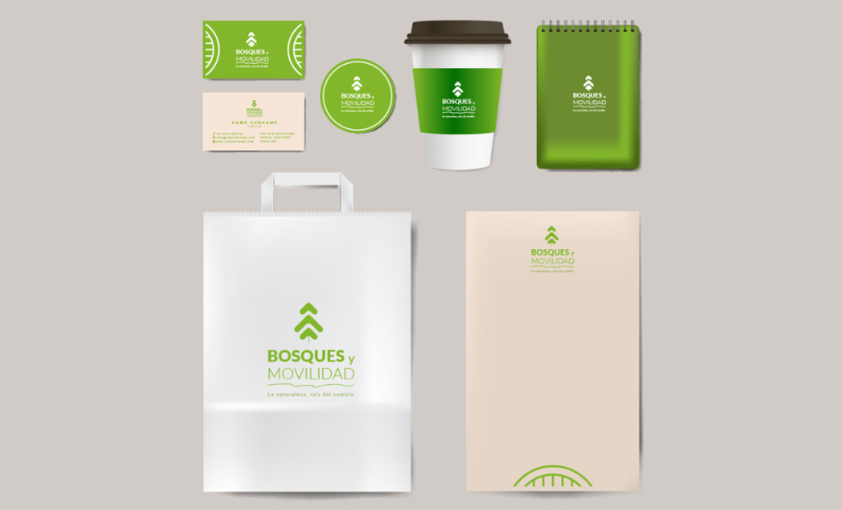
Bosques y Movilidad focuses on helping clients reach carbon neutrality in Spain. Green Hat Workers designed its print collateral to communicate the company's mission of promoting sustainable practices through tangible reforestation efforts.
Shades of green, from a light lime green to a richer grass green, define the color palette, complemented by neutral tones. This nature-centric scheme avoids flatness through varied green hues. The overall effect is modern and accessible, communicating the brand’s environmental focus.
The selection of green is especially pertinent, as research by Sun & Wu (2023) indicates that a preference for this color, often associated with nature, can foster connectedness with the environment and thereby promote sustainable consumption behavior.
A modern, rounded geometric sans-serif typeface is used for the wordmark. The line weight contrast within the name itself — “Bosques” in a bolder font, “Movilidad” in thinner lines — is a standout feature. This creates a visual rhythm and aids in parsing the brand’s focus on forestry (bosques) and mobilizing sustainable initiatives (movilidad).
The logo features an iconic abstract symbol: an upward-pointing, tree-like form made of stacked arrowheads. This mark is consistently positioned above the wordmark. Its symmetry and boldness make it memorable even at small scales, such as on business cards.
This print design illustrates that for environmental brands, a more refined, modernist aesthetic can be highly impactful. Bosques y Movilidad’s structured layout and symbolic iconography allows its core message of carbon neutrality through reforestation to be delivered with confidence.

-preview.jpg)
-preview.jpg)