Branch Creative's Prints Use Bright Color To Grab Customers' Attention & Make An Impact
In a creative business, it’s crucial to have impressive and thoughtfully branded material; it's a clear indicator that a company will take the same care in creating the same experience for their clients.
Stationary materials have creative flexibility -- they can come in unusual shapes, or be made with unique paper and printing techniques. Interesting stationary can also be achieved through clean and striking typography. Branch Creative accomplishes all of this.
Branch Creative is an industrial design and branding agency in San Francisco, California. It works with a lot of big-name clients and creates stunning identities and collateral for them.
But in order to show off your creativity to your clients, you need to be able to create your own pieces that show your ingenuity and strengths.
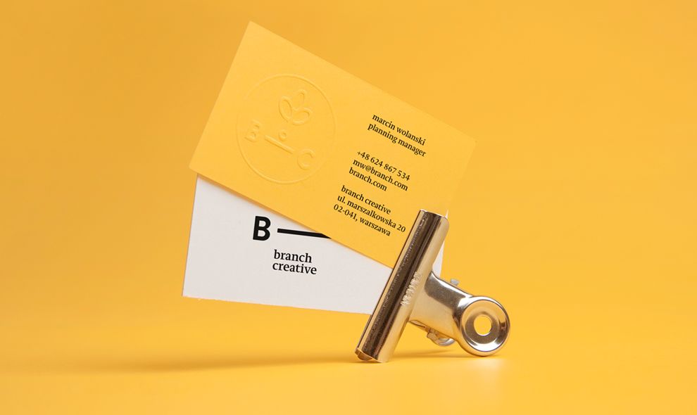
Branch Creative does so with a host of print materials including captivating and impactful business cards.
A business card should be like a handshake -- firm, meaningful, and engaging, and the embossing on these Branch Creative business card creates a memorable tactile experience.
But what ties all of these designs together — from business cards to letterheads and pins — is the very bombastic coloring.
The color is unmistakable and unmissable — yellow is a high-energy color and gives the impression of a very friendly and personable experience with Branch. Combined with white and black, this striking stationary has plenty of contrast.
There’s a mood and a personality when it comes to color — especially colors like yellow. They are full of energy and life and excitement. They exude a creativity and a feeling of warmth that is welcome and inviting.
And in this instance, they grab attention and demand to be seen — showing clients right off the bat that this agency knows a thing or two about design and branding.
Branch Creative’s Innovative Logo Design Captures The Brand’s Personality
Living on these print materials are a number of subtle design elements in the forms of letters, words and images. There is a simplicity and a minimalism here, and that helps the logo really jump from the pages.
The Branch Creative logo is extremely creative. The simple letters "B - C" with a straight line indicating a 'branch' subtly convey confidence. The logo is repeated on the back of the stationary in an almost scientific, methodical way. It’s very straightforward and eye-catching, created in a black, sans-serif font and bolded to ensure that anyone that looks at these prints notices the symbol. It’s innovative and creative but gives off a very palpable authority that gives viewers a taste of what the agency is all about.
Logo design is important, and branding specialists understand its significance in establishing a strong brand identity. It’s the visual marker of a brand and is oftentimes how a brand is remembered. And here, with such a clean, simple and captivating logo, Branch Creative is letting viewers know who they are, what they’re about and how their passionate spirit is infused into all aspects of their work.
It’s clinical, yet creative. It’s simple, yet full of meaning. It’s the perfect combination and we can’t get enough.
This logo is extremely successful, and the designers made a smart choice in using it as one of the main focal points of its print designs.

Clean Typography Adds An Authority And A Credibility To The Print Designs
These print designs are robust and clean. And what aids in their pleasing nature is the straightforward typography that lines the pages.
As we’ve said, these designs are minimal. And they are made up mainly of the logo itself, as well as a subtle flower image. But another element is the stand-alone letters that sit on the pages— sometimes in an organized fashion, and sometimes haphazardly. Professional print designers typically use this style as a typographic element to add visual interest and create a dynamic composition.
These words and letters are written out in two separate, but distinct fonts that exude an authority and a credibility. These fonts promote the brand and show that it means business. There’s an authenticity from the use of typography here — the brand wasn’t trying to do too much with it or say too much with it.
They let the letters do the talking, and it captivates in a very mysterious and out-of-the-box way.
This brand wants to captivate more than it wants to inform. And that’s very obvious here. And it works.
A Minimal Aesthetic Portrays The Brand As Modern And Sophisticated
The minimal aspect of these print designs aligns the brand in a certain way. The minimalism shows that this is a modern brand that understands the market and its audience. It shows that this agency is in-tuned with current design trends and is up-to-date on the evolving market.
And that’s vital in pulling in new customers and making sure people have faith in your services.
Minimalism is an evolving and exciting design trend. It’s been around for decades and can be seen everywhere from interior design to web design and beyond. And that’s because it’s timeless, poignant and impeccable.
The minimal nature is apparent in many ways. For starters, these prints — regardless of type — include a hefty amount of white space. There is plenty of breathing room, with space to explore and uncover.
There is also the simple, straightforward typography as we’ve already discussed. This gives off an integrity, but the minimal nature of the words and letters used to let viewers use their own imagination and come up with their own interpretations.
And the limited amount of images used also adds to the minimalism, but additionally, it says a lot about the professional vibe of the brand and the services it provides. This is a creative agency, yes, but one that’s steeped in experience, prestige and honor.
They know what they’re doing. And they’re good at it. And they're using a minimal aesthetic to let you know.

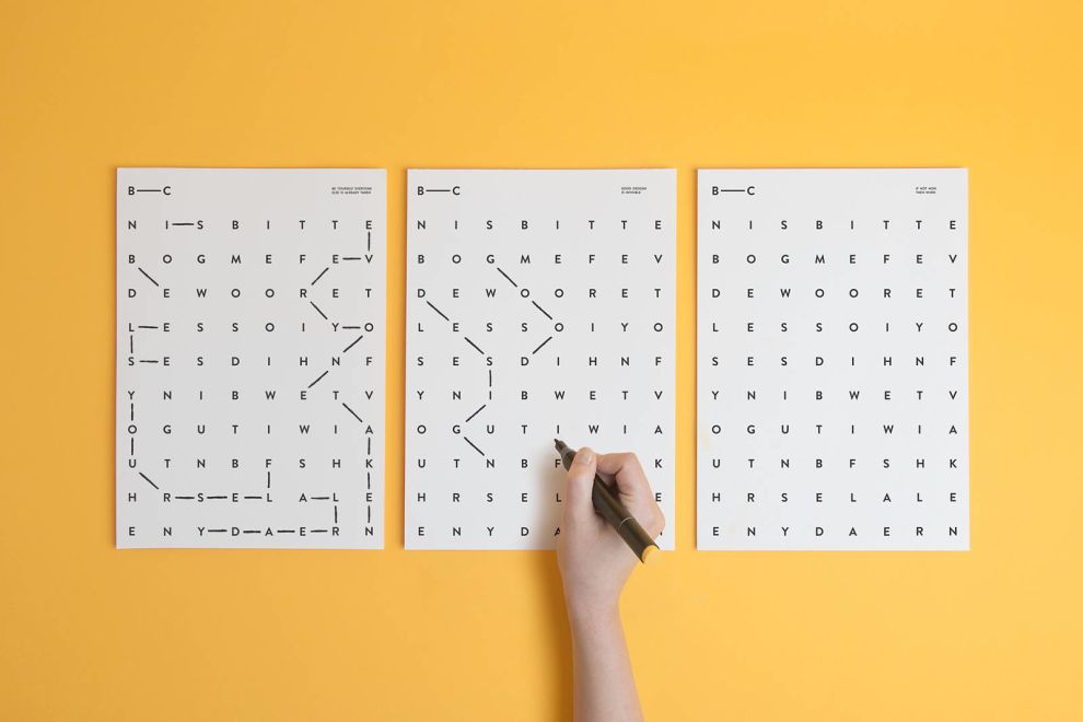
A Creative Crossword Promotes A Positive Message
An ingenious aspect of this print design is the crossword puzzle-like nature of some of these prints that details a very organic and heartfelt message.
In this crossword is a message that shows the real people behind the brand: “be yourself, everyone else is already taken”
This same pattern and organizational structure of letters are present throughout the designs in some way shape or form, and it calls back to this smile-inducing message almost instantly. And that’s the point.

What Is Branch Creative?
Branch Creative is a full-functioning industrial design and branding studio based in San Francisco, California. It works with clients all across the world and is known as one of the most successful agencies to date.
Here’s a section from the Branch Creative website:
We believe products should have a positive, lasting impact on people and the world around them. Partners Nick Cronan and Josh Morenstein founded Branch to solve complex industrial design and branding challenges for clients ranging from Fortune 500’s to start-ups. Branch designs iconic, enduring experiences that captivate the curiosity and attention of consumers; our products, packaging, and branding innovations enable our clients to differentiate themselves and define their markets.They work in a wide variety of design niches, building brand’s and helping them grow successfully. But in order to reach these clients and show their expertise, the designers needed to roll out their own creative collateral to inspire and engage.
The result was an extensive print campaign full of business cards, letterheads, pins and more which were all created to dazzle and captivate audiences. And they certainly grab attention for a number of reasons.
But they couldn’t do it all themselves, and enlisted the help of design agency NO-EE-KO to come up with a logo design and visual identity that would steal the show.
According to agency NO-EE-KO:
Branch Creative is an executive production and advertising house that represents a pool of photographers, illustrators and commercial directors from around the world. We have created a sophisticated identity system based around a playful word-search format. The overall idea encourages the viewer to engage with the stationery, making connections between letters to establish the overarching message of “be yourself, everyone else is already taken”There is a heart and soul infused into these print designs. And they pack a punch — in the best way possible.
Branch Creative’s Powerful Prints Give Off A Meaningful First Impression
Branch Creative is a robust design agency, and these prints match that spirit succinctly.
They’re minimal in nature, bright and eye-catching. They show that this is an agency that knows what it’s doing and is good at it. There is a corporate feel here, but it’s not cold or unfeeling. And the logo helps to elevate the sophistication while giving it a touch of style.
There is also a personality and an emotion infused through a cleverly hidden message that can’t be ignored.
Print designs are the first physical contact clients and consumers have with a brand — and when they look this good, you’re bound to see the after-effects.
Explore these graphic design and print design agencies for help creating your own print campaign!
-preview.jpg)