Standout Features:
- Clean and vibrant aesthetic
- Functional layout for easy accessibility
- Thoughtful use of NHS branding elements
The Bridgewater Community Healthcare NHS FT print design by Jayde Creates exemplifies how design can balance professionalism with visual engagement in the medical and pharmacy sectors. The clean and vibrant aesthetic, underscored by the strategic use of color, creates a welcoming and approachable visual tone.
The vibrant illustrations of urban and natural landscapes on the cover encapsulate the essence of community healthcare, immediately resonating with the target audience. This artistic direction not only emphasizes accessibility but also promotes inclusivity, a vital theme in public healthcare communication.
-desktop.jpg)
Inside, the layout prioritizes functionality and readability. Color-coded palettes and precise typographic hierarchy make critical information easy to locate and comprehend. This is especially important in medical and pharmacy print designs, where clarity is paramount.
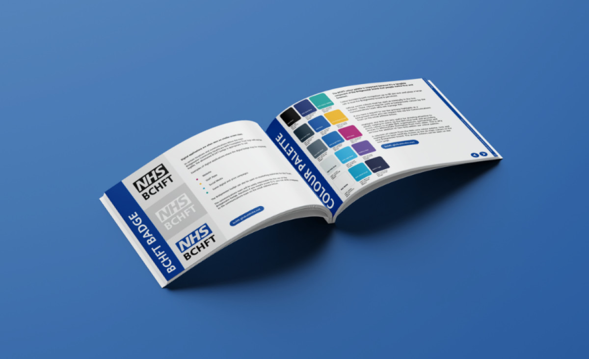
Incorporating NHS branding elements, such as the recognizable typeface and logo, maintains a strong connection to the overarching brand. The palette, inspired by the NHS brand identity, aligns seamlessly with its broader visual guidelines. This not only builds trust but also ensures consistency across various touchpoints.
Through this design, Jayde Creates successfully captures the essence of community healthcare, making it an excellent model of accessible, professional, and visually appealing print media. By harmonizing modern design principles with NHS branding, the design communicates effectively while standing out in its category.