Vizcaya Museum and Gardens Print Design Shows How To Combine The Past And Present Through Floral Patterns And Mask Shapes
Vizcaya Museum and Gardens is a villa and estate open to the public in the Coconut Grove neighborhood of Miami, FL. It features vast gardens in the Italian Renaissance style: both the landscape and the architecture were influenced by the Venetian and Tuscan homes and were designed in the Mediterranean Revival style with Baroque elements.
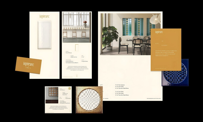
The Copper Portico branding agency developed the brand identity for Vizcaya’s annual Gala, including program books, signages, post office exclusive stamps, menus and other materials.
As shared in the agency’s case study information, the design is inspired by Truman Capote’s legendary 1966 Masquerade Ball, honoring the centenary of Vizcaya’s garden.
The agency expounded their reasoning behind the chosen aesthetics:
“Our vision for the invitation was to work with vintage flower illustrations and create a flower composition inspired by the shape of a mask to bring a bit of the theme of the ball. We worked with black and white illustrations, leaving a touch of red only to some of them, representing the richness of the Vizcaya gardens.”

Hints Of Abundance Linger On Vizcaya Ball Program Book’s Elegantly Mysterious Cover
Seeing as the collection of print material for this client was to signify an elegant, luxurious event, the agency had to strike a perfect balance between tasteful restraint and ostentation.
To do that, they created a program book with a generally muted cover that only features the text “The 64th Annual Vizcaya Ball – The Party of the Century!” against a solid ivory white background.
The only other element on the cover is an image of an extravagant mask, countering the absence of any flair with its decidedly Baroque display of flamboyance.
The mask’s complex design consists of curvy, elegant lines of varying thickness. The image’s attention to detail is staggering, which is evident in dozens of ornamental details and impeccable symmetry of objects.
On the mask’s sides and eye holes are hints of repeated floral patterns that are clearly visible, lending splashes of black, grey and red to a mostly white design.

Intricate Shading Evokes Substance To Vizcaya’s Austere Use Of Colors
One of the Vizcaya Museum and Gardens collaterals is the CD insert for the Silent Auction material. The Copper Portico seized the opportunity to unleash their creative potential upon this piece of material that is generally used as a medium for artists to channel their imagination (for example, music album covers.)
The all-over floral print, with the exception of the bottom segment that repeats the copy from the previous section, results in a very striking and attraction-grabbing appearance.
Floral patterns usually come in full color as they are supposed to represent the vibrancy of flowers’ seemingly infinite palette. However, in this case, we have a mostly black and white image adorned with red accents on certain flowers.
What gives this image its lush effect is the extensive use of shading that creates a lot of variations and mid-hues of white, grey, black and of course, red.

Recurring Elements Prove To Be The Key To Consistency In Vizcaya Print Design
Despite the difference in format and size of various print deliverables, Vizcaya Museum and Garden print design manages to achieve a consistent appearance across the entire range of materials.
Uniform coloring, unfluctuating use of imagery and well-defined fonts are the three vital factors that play a role in this consistency.
Once the agency has established these visual elements as principal, they also set the foundation for a print design that would tell a steady, invariable story across multiple mediums. The story makes sense to all the viewers, no matter which medium they interact with.
The typography, although quite simple, is custom-tailored for this institution and used as a big part of its branding.
The familiarity of the font’s shape, the unique take on famous floral patterns and a color scheme reduced to bare essentials are the threads that bind all of the Vizcaya Ball print design deliverables.
Vizcaya Museum and Gardens Print Design Uses Revival And Nostalgia To Light The Flame Of Modern-Day Grandeur
The Copper Portico’s print design for Vizcaya Museum and Gardens hits the sweet spot of nostalgia with its well-thought-out throwback to Renaissance and the last era of decadent Masquerades.
Despite being distinctly wistful and evocative, this print design is also rooted in the latest best practices and principles of good design.
This is what makes it much more than just a look back at fond memories and distant past – it's what makes it the winner of the Best Design Award for the Print category.


-preview.jpg)