- Designer: Zhuo Sun
- Category: Print Design — Travel
- Location: Toronto, Canada
- Project Brief: Develop a conceptual print identity that reinterprets Kowloon City’s past, present, and future through visual systems rooted in history, transformation, and speculative urban ideals.
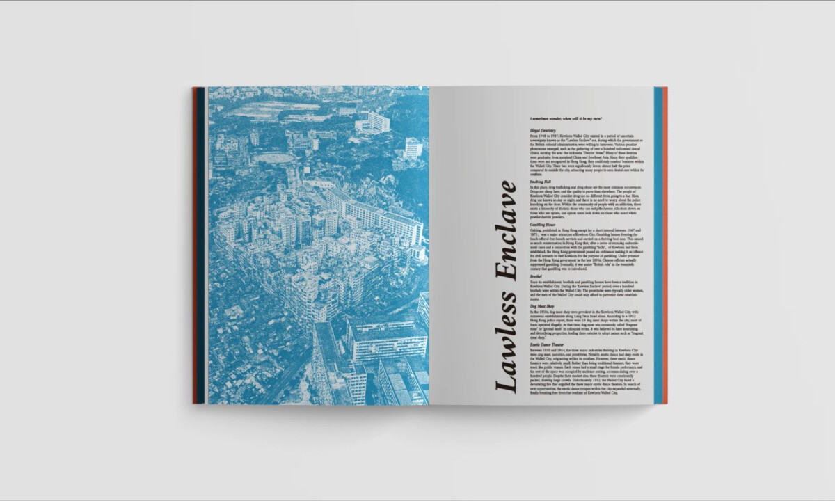
While most travel publications prioritize the literal gaze, Eutopia by Zhuo Sun adopts a more analytical perspective.
This work succeeds by deconstructing the urban fabric of Kowloon City into structured, typographic experiments that explore how cities remember and reinvent themselves.
- Conceptual Framework & Narrative: The project is grounded in the tension between memory and progress, using Kowloon City as a case study for idealized urban renewal. I find the past–present–future framework effective in giving the project intellectual structure without relying on literal storytelling.
- Typography & Hierarchy: Typography is treated as both information and form, with stretched letterforms, vertical typesetting, and restrained bilingual use. I like how the type shifts between expressive and utilitarian, reinforcing the balance between ideology and infrastructure.
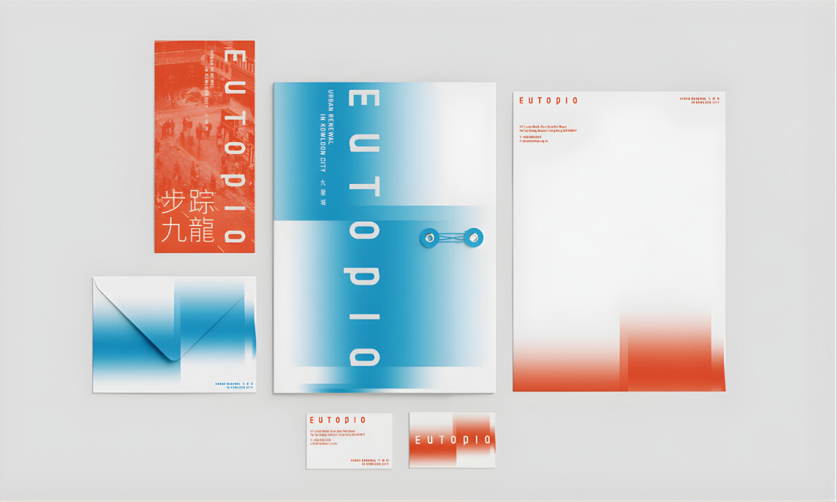
- Color & Gradient System: Blue and red gradients function as temporal and emotional markers, suggesting calm continuity versus friction and disruption. I think the soft transitions help humanize dense urban themes while maintaining visual cohesion across formats.
- Layout & Materiality: The layout translates consistently across books, ephemera, bags, and apparel through modular layouts and controlled negative space. I appreciate how the tactile outcomes reinforce the idea of print as an immersive, physical extension of urban experience rather than a purely graphic exercise.
What Brands & Designers Can Learn from Eutopia
This project shows how editorial and print design can move beyond documentation to become a tool for critical urban reflection. Here are three key lessons from Eutopia:
1. Use Structure to Frame Abstract Narratives
The past–present–future framework gives intellectual clarity to complex urban themes. Strong conceptual scaffolding allows design to communicate ideas without relying on literal imagery.
2. Let Typography Act as Both Content and Form
Expressive, stretched, and vertical type treatments function simultaneously as information and visual architecture. When typography is treated as form, it can embody the subject matter itself.
3. Build Cohesion Through Systems, Not Ornamentation
Gradients, modular grids, and negative space create consistency across print, objects, and apparel. System-driven design ensures that experimentation remains unified and scalable.