Chamdor Nigeria Print Design Shares How To Celebrate Priceless Moments
Chamdor, one of the highest-selling alcohol-free wine brands in Nigeria is made from the highest quality and carefully selected grapes.
What separates it from similar non-alcoholic beverages and even plain grape juice is its class and sophistication that oozes from every single bottle.
To properly highlight these attributes, Grey Design created a striking print campaign that quite literally pops, as it features “the art of celebration.”
Chamdor Nigeria print design presents the brand as a refined, drinking experience rushing to immortalize every special moment in life.
Contrary to popular belief, a high-quality wine is not graded by the presence of alcohol. What gives it a distinct “sharpness” is the so-called acidity. A “well-balanced” quality wine has acidity, sweetness and tannin in perfect harmony.
Chamdor wines are made from a high-quality, low acidity grape variety of Chenin Blanc and Muscat from the Robertson wine district in South Africa. The resulting wine is smooth, sweet with an accentuated festivity that’s sensational to share with any sommelier.
Each Variant Of The Chamdor Nigeria Print Design Has A Relatable Story To Tell
“A picture is worth a thousand words”
Visual storytelling can make even the most complex of stories understandable by a wide audience, as it requires their direct emotional input and identification.
Chamdor Nigeria print design’s visual storytelling relies on conveying implicit narrative with salient imagery to ensure three basic storytelling components are always present throughout the images: authenticity, relevance and sensory experience.
- Authenticity: It establishes an emotional connection
- Relevance: It appeals to the core values and mindset of viewers
- The sensory experience: It uses symbolism to inspire
Chamdor Nigeria print design is a creative narrative tool.
Every day of our lives is a special occasion and within each day are moments to celebrate, big or small. Visual cues create stories and thus, meaningful experiences.
These ads let the audience experience the feeling of achievement after graduation or the high of getting engaged with a significant other.
Those selected moments are intoxicating by themselves, so celebrating them with alcohol, although customary, is redundant.
Wine, on the other hand, is a universal symbol of seduction and connection. From ancient Greece to modern times, wine has been central to the communion of most religions, as well as picturing forth the love and communion shared between one another.
Chamdor Nigeria print design captures all of the above, enticing viewers to narrate their personal stories from the first glance.

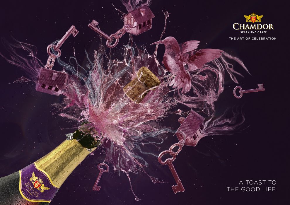
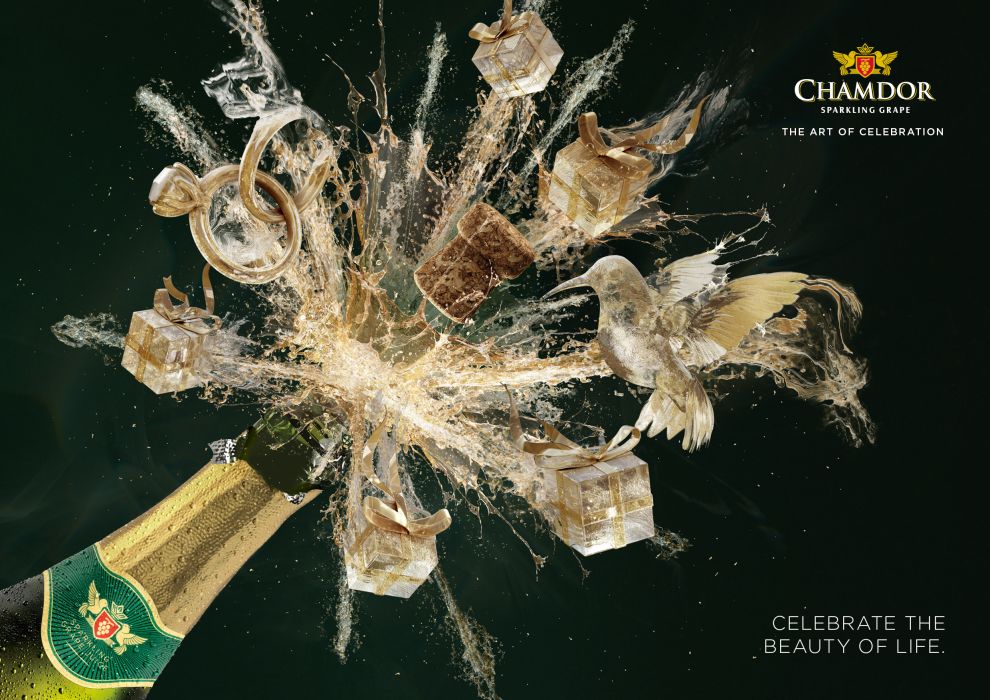
Chamdor Nigeria Print Design Proves That A Non-Alcoholic Wine Can Also Radiate Panache and Timeless Class
Chamdor Nigeria print design draws inspiration from the packaging design. Mainly, the bottle and the label.
Although affordable, the Chamdor bottle uses a high-end champagne-style packaging with a recognizable heraldry-like logomark and the gold foil at the top. The prints use this to fuel the prominent taglines that play with the inherent inability to put a price on a genuine experience.
There’s a dynamic quality to these prints that come from the movement of the 3D rendered images morphing into lasting memories and the brand’s symbol, a lovely hummingbird.
With Chamdor, each of these elements is elevated with a touch of elegance. They manage to convey class and sophistication despite the sudden burst of bottled-up energy.
These designs are special and attention-grabbing – they perfectly capture the essence of Chamdor wines.

The Chamdor Color Palette Is More Than Just An Appealing Design Choice
The aforementioned attributes like “elegance,” “sophistication” and “class” are not often synonymous with “luxury” and “exclusivity”.
Chamdor Nigeria print design showcases the brand’s roots and its sophisticated yet inclusive nature by using colors normally associated with wine. The classic Red, white and gold palette stand out splendidly against the black background.
More websites, apps and marketing materials opt for the “dark side” due to its magnetic appeal, so it’s no wonder that Grey decided to adapt the popular graphic design trend for Chamdor Nigeria print design.
A dark background not only looks polished and more dramatic but also makes the elements stand out.

Chamdor Nigeria Print Design Is Worth Celebrating
The consistency in design is mirrored across all areas of printed print advertisements. The same wine-splashing design is taking the center stage in banners, billboards, posters, hanging flags, etc.
This consistency is vital in creating a cohesive experience for the users. Although it may seem too uniform to the untrained eye, this is a smart choice, considering many competitors often don’t have the level of cohesiveness when it comes to design and branding.
The brilliant minds behind the Chamdor Nigeria print design definitely deserve a toast for their creative work, but most importantly, they also deserve to win the DesignRush Best Print Design Award.