


- Agency: Notorious Agency
- Client: I Biscotti di Efren
- Category: Print Design — Food and Beverage
- Project Brief: Reposition a beloved Italian cookie brand through a print catalog that does more than list flavors and SKUs. Efren brought in Notorious Agency to sharpen the identity and shift perception toward premium. Alongside a refreshed website, new ad videos, and social strategy, the catalog had to justify the price on the tin.
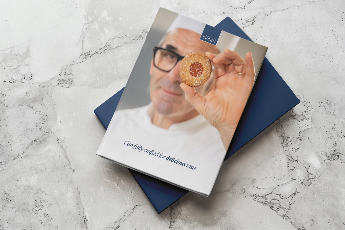
Most cookie catalogs are glorified order forms. I Biscotti di Efren's catalog refuses that job description.
Notorious Agency took the brand's pastry shop heritage and built a print design that behaves more like a small monograph, where the products eventually show up but only after the reader has been walked through provenance, technique, and the kind of stubborn sourcing that separates a real biscotto from whatever is stacked near the supermarket checkout.
The visual system runs on a tight palette that pulls double duty. Deep navy and midnight blue bring the editorial gravity of a hospitality menu, warm amber gold borrows from gilded café signage and good butter, and soft cream backgrounds keep the whole thing tactile and inviting. It feels old world Italian without leaning on clichés like checkered tablecloths or scripty logotypes.
Pacing is the catalog's secret weapon. Spreads alternate between mood and information, with atmospheric pages introducing the chef, the philosophy, and the ingredients in generous white space, while cleaner index pages handle the product roster. Readers move from feeling to fact and back again, which is the same rhythm a good restaurant menu uses to make you stop scanning prices and start ordering with your gut.
Typography stays disciplined throughout. Serifs handle storytelling and romance, sans serifs handle practical labels and product specs, and the hierarchy never raises its voice. Photography sits against neutral grounds and treats the cookies the way fashion editorial treats accessories, lit with intention and shot to suggest weight, texture, and the work of real hands rather than just appetite.
Efren is structured to live on a counter, not in a drawer. It functions as both a sales aid and a brand artifact, meaning a deli owner can hand it to a curious customer and have it do real positioning work without a sales pitch. The system is also flexible enough to absorb new product lines, seasonal launches, and future market expansion without breaking its core identity.
Impact and Results
- Lifted Efren out of the everyday cookie category and into a premium gourmet positioning through editorial design language.
- Built a cohesive visual identity rooted in navy, gold, and cream that carries across print, web, social, and packaging.
- Balanced emotional brand storytelling with practical product information through alternating spread rhythms.
- Reinforced the brand's connection to its Cipriani trained heritage with photography and typography that signal craft.
- Established a flexible print system that supports new collections and content without redesigning the catalog's core structure.
