Standout Features:
- A soothing color palette
- Clean and simple
- Foolproof iconography
DropStat is a service specializing in optimizing nurse staffing at hospitals. The brand launch was a success with the help of BLNKT Agency, whose team developed a holistic healthcare design and branding experience to promote the service.
The app’s simplicity is first portrayed through a sleek logo design. The emblem is straightforward and clean, with an easy-to-read blue logotype and a stylistic touch on the “A” glyph that resembles a minimalist representation of a nurse's trademark tool: a stethoscope. What makes this icon incredible is its adaptability and mobile-friendliness. The sign alone serves as a shortened logo.
If you like simplicity in modern healthcare services, don’t miss this list of the best medical website designs.
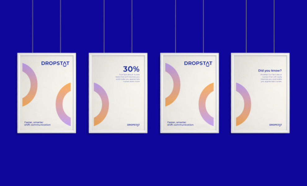
The marketing materials promote the app through clean posters with semi-circular warm-and-cool color gradients and a blue typeface on a white background. There’s also merchandise, like tote bags, with similar iconography, emphasizing the brand’s identity.