Standout Features:
- Vibrant, health-focused color palette
- Product-centric imagery of active lifestyle
- Clear, direct product messaging
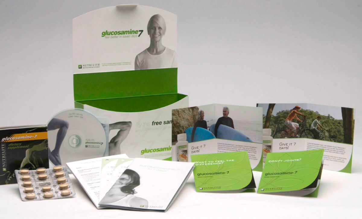
Glucosamine-7, a dietary supplement designed to support joint health and mobility, aims to empower an active lifestyle. Visual Alchemy Inc created print materials that uses a fresh, health-focused green palette and relatable imagery to resonate with individuals seeking to maintain or regain their physical vitality. The medical print materials are dominated by fresh, natural tones of green. This widely recognized symbol of health and vitality immediately communicates the product’s association with wellness. The use of white as an accent enhances the clean, approachable aesthetic, building trust in the product's natural and beneficial qualities.
You'll see product-centric imagery of an active lifestyle, showcasing healthy individuals, particularly seniors, enjoying activities like surfing and cycling. This visual storytelling directly connects the supplement with the desired outcome — improved mobility and the ability to maintain an active life.
The print design also emphasizes clear, direct product messaging, using short, impactful copy such as “Give it 7 Days!” and direct questions like “Want to feel the difference?”. These concise statements quickly communicate the key benefits and create a clear expectation of rapid, noticeable improvement.
The Glucosamine-7 campaign highlights the strategic power of color in health and wellness marketing. The green immediately conveys natural benefits and trustworthiness. For brands in this sector, carefully selecting a color palette that aligns with health and well-being can significantly enhance product perception and consumer confidence.