Standout Features:
- Soft, feminine muted pink color palette
- Elegant typography with a distinctive "e"
- Minimalist and thoughtful card layout
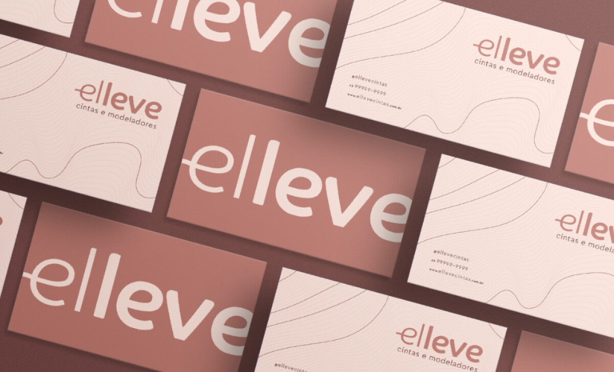
Imagine a brand dedicated to your comfort during post-surgical recovery — that's Elleve, which offers inclusive shapewear. Barradois Studio created their visual identity, and the business card is a key part. It’s designed to convey warmth, attention to detail, and the professional care you can expect from Elleve.
The dominant color on the business card is a soft, muted pink. This creates a very welcoming and caring first impression. Pink often has a calming effect, which fits perfectly with Elleve’s goal of making your recovery period as comfortable as possible. It’s overall a very thoughtful and on-brand touch.
The lettering on the business card is clean, modern, and has a gentle look. The typeface used for "Elleve" features soft, rounded corners and the unique shape of the "e" is a clever touch that makes the logo memorable. It’s professional without feeling harsh, which is great for a personal care brand.
The business card’s design is clean and uncluttered, thanks to its minimalist layout. Ample white space lets the logo and text breathe. Important information, like contact details, is easy to spot. This simplicity helps the card feel professional and reflects Elleve’s focus on quality.
To sum it up, this business card design effectively communicates what Elleve is all about. The muted pink, distinct lettering, and minimalist style all point to a brand that values comfort, care, and sophistication. Barradois Studio did a great job making sure you feel that when you hold this card.