Team Behind the Design
Agency: Bob Barkowski Design
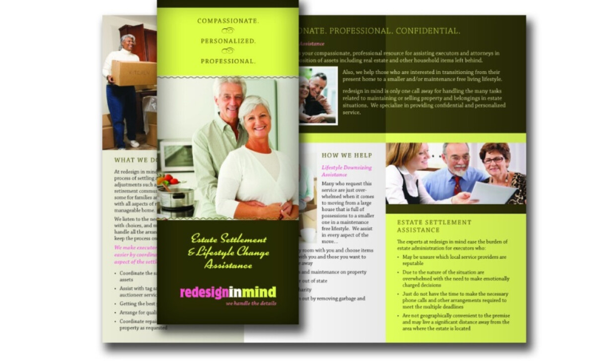
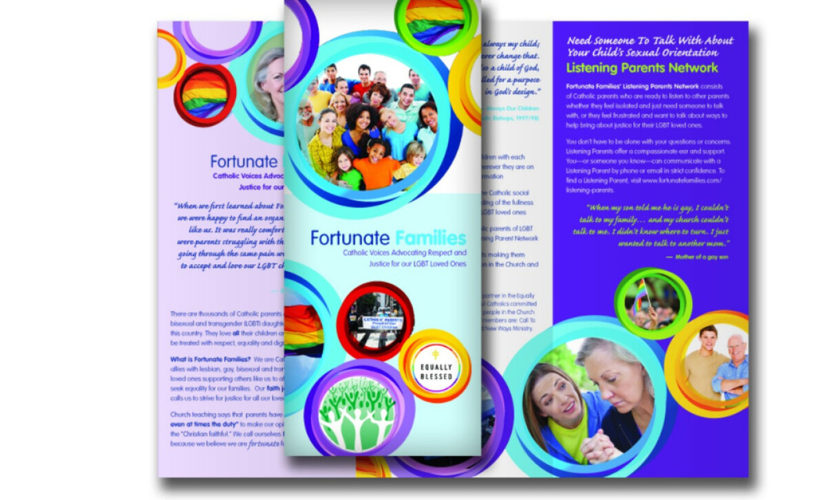
Client: Fortunate Families
Category: Print Design (Brochure)
Location: Schenectady, NY, United States
Industry: Legal & Insurance
Project Brief: Produce brochures for Fortunate Families that communicate sensitive topics with clarity and compassion, using strong imagery and balanced layouts.
Print Design Analysis
Related Articles:
When I review brochures, I often focus on typography, layout flow, imagery, and production quality.
Here’s how this design for Fortunate Families stands out:
- Typography: The typefaces are clear and legible, with thoughtful hierarchy. Headings stand out while supporting text flows naturally, guiding readers through sometimes complex or emotional information.
- Layout: The balanced structure across panels is appealing. The flow helps break down information into approachable sections, reducing overwhelm for readers.
- Imagery: The choice of real, relatable people adds warmth and authenticity. This visual storytelling helps connect with audiences on an emotional level.
- Tone Adaptability: What I find most effective is how the brochures adapt visually—one vibrant and colorful for advocacy, another more subdued for estate planning. This flexibility shows strong alignment with audience needs.
Get connected with the right print design agency for your project.
GET STARTEDAbout DesignRush Featured Designs
From hundreds of projects reviewed, only the most compelling are featured. The designs we feature distinguish themselves through originality, clarity, and strong brand impact.
And often, they go on to earn a place among the winners of the monthly DesignRush Design Awards.
Explore the best & latest in print design or browse top picks in other categories:
- Best App Designs
- Best Website Designs
- Best Logo Designs
- Best Print Designs
- Best Packaging Designs
- Best Video Designs
For a full list of design agencies and related services, see our Agency Directory.
Get a chance to become the next Design Awards winner.
SUBMIT YOUR DESIGN