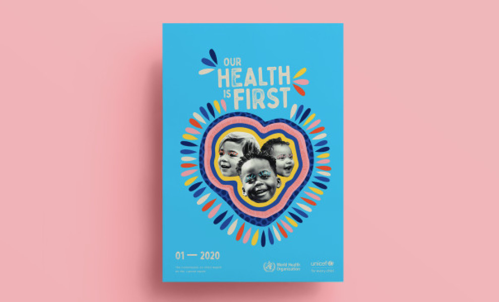
Standout Features:
- Pastel, gentle colors
- Lighthearted photography
- A touching, children-focused design
Opening our list of best healthcare designs is a joint campaign by WHO and Unicef. This tricky yet impactful awareness campaign was designed by Sebastian Pelaez. The idea is to give children a louder voice that echoes far and wide. Thanks to these designs, the message is delivered online and offline.
There’s something incredibly effective about stunning poster designs. This campaign uses different posters, but most feature a single pastel color to set the tone and real-life photos of children with their families smiling. The content is limited to one symbolic sentence that aims to raise awareness or at least remind the viewer of the significance of children’s healthcare.
The taglines are laid out as if they're the child's words and should be heard. With this narrative, the promo materials elicit an emotional response that no one can ignore.