Standout Features:
- Vibrant, energetic color palette
- Playful, engaging typography
- Dynamic food photography
Bulldog Sauce, a beloved brand in Japan known for its distinctive sauces, sought a fresh and energetic print campaign to promote their products. CHERRY, the agency behind the design, succeeded in capturing the brand's fun, bold identity through vibrant colors, playful typography, and engaging imagery.
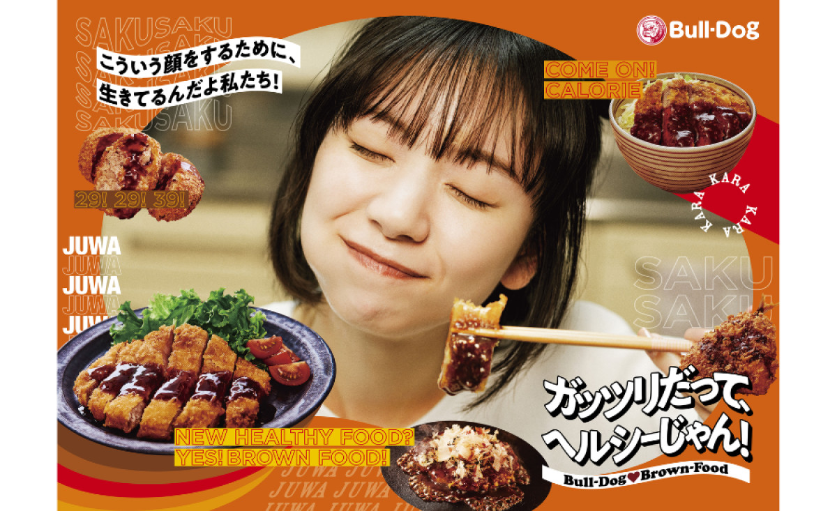
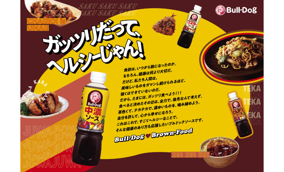
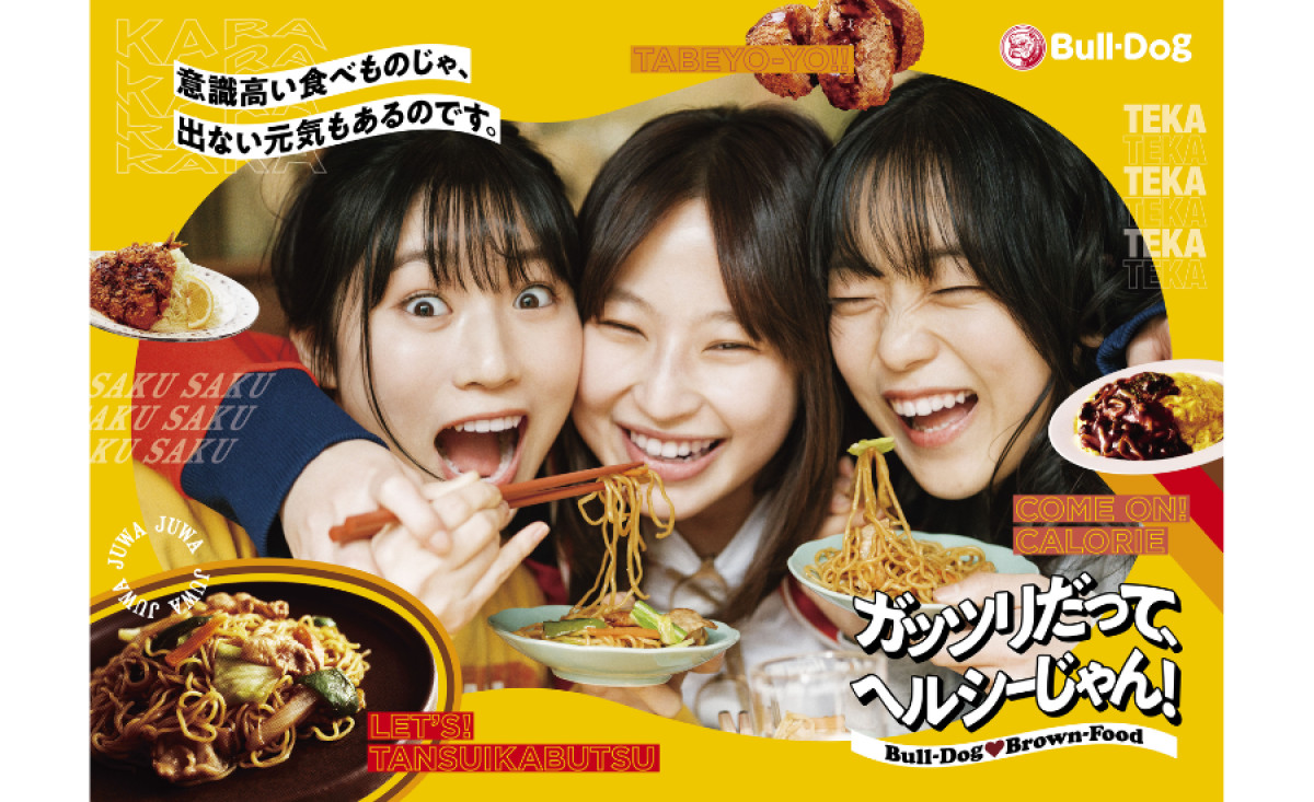
Bold yellows, reds, and greens fill the background and text elements, creating a sense of energy and excitement. These colors mirror the brand’s fun and lively approach to food while also attracting the eye of potential customers. The warm, rich tones also work well with the food-centric theme, evoking feelings of appetite and enjoyment.
The oversized, dynamic text interacts with the images and illustrations on the page, adding a sense of movement to the overall food print design. The text is fun and engaging, reflecting the brand’s light-hearted nature. By using bold letters and large fonts, the design effectively grabs attention and reinforces the fun, family-friendly vibe of the brand.
The high-quality images of dishes paired with Bulldog Sauce create a mouth-watering effect and visually showcase the versatility of the sauces. The action shots — people enjoying the food — add a dynamic element to the design, while the overall layout guides the viewer’s eye naturally to the product.
CHERRY’s print campaign captures the brand’s playful energy and culinary appeal. By using vibrant colors, bold typography, and captivating food photography, the design not only promotes the product effectively but also creates a connection with the audience, encouraging them to enjoy the flavors and fun Bulldog Sauce has to offer.


