Haines Watts is a UK-based financial advisory firm that supports business owners through pivotal moments like succession and exit planning.
To translate these high-stakes transitions into a tactile and visual experience, designer Dan Highwood created a printed handbook that pairs structure with clarity. The final piece is grounded in geometry, materiality, and visual rhythm.
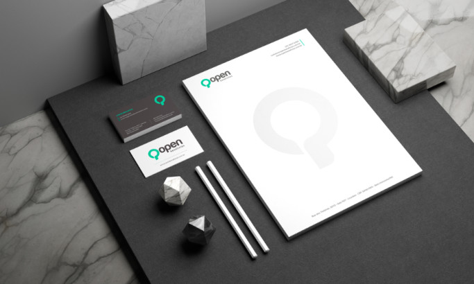
Industry Insight: Print marketing delivers strong results, with campaigns achieving an average 125% return on investment, making professional print designs a high-impact asset for service brands.
Haines Watts Print Design: Key Findings
Geometric Forms Visualize Business Transition and Continuity
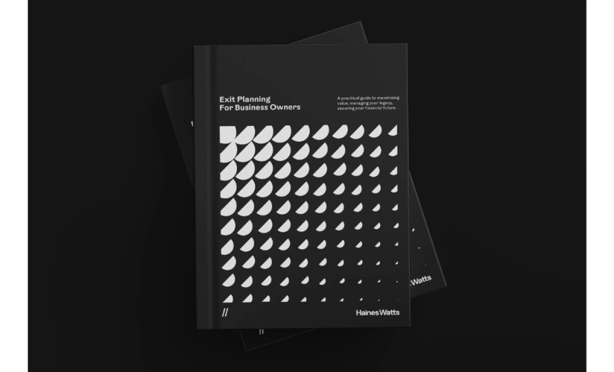
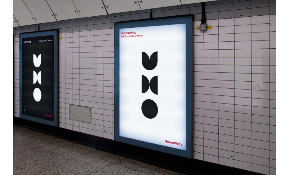
This design by Dan Highwood begins with a clear idea: exit from a business is not a final chapter but a transition into something new. Repeating circles and half-moon shapes symbolize that continuity and appear throughout the handbook.
Print design influences customer action. FedEx Office found that 85% of consumers are more likely to shop with businesses that use professionally printed materials, highlighting the credibility that professional print designs bring to financial communication.
This approach demonstrates the type of thoughtful, strategy-led work emerging from today’s leading print design agencies focused on brand transformation.
Bold Typographic Markers Establish Rhythm and Legibility
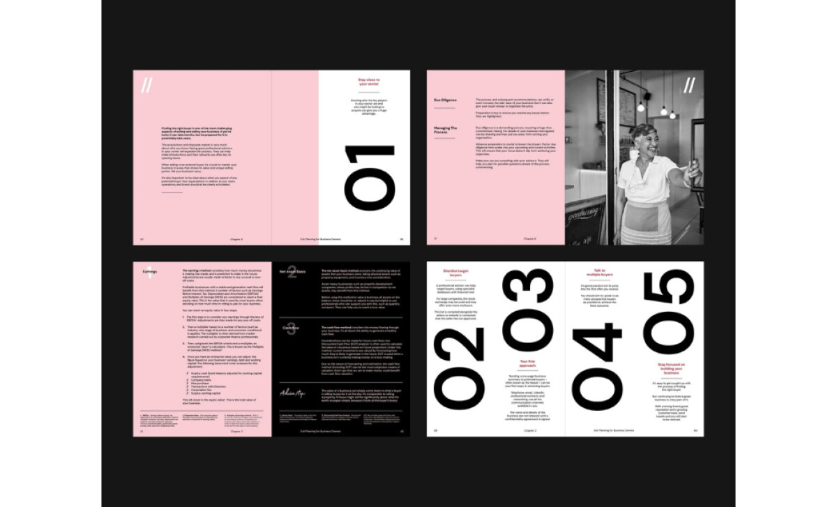
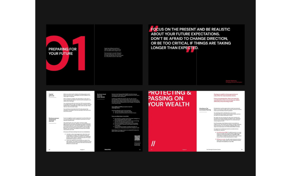
Bold numerals mark the start of each section, giving the layout a sense of pace and order. A serif body type balances legibility with a professional tone.
Print visuals shape behavior. According to a 2023 study, print design influences purchase intent by nearly 60%, especially when readability and structure are prioritized.
These are hallmarks of the best print design in professional services.
Tactile Matte Finishes Enhance Credibility and Perceived Value
The matte black cover is paired with embossed white shapes that create immediate tactile contrast. The texture signals professionalism before the reader even engages with the content.
High-quality material reinforces value. Expertly produced print pieces improve lead response rates and message retention, a key advantage of investing in professional print designs.
A Restrained Color Palette Balances Calm with Energy
Black, white, and coral red make up the restrained color palette. Red accents are used sparingly to energize key moments without overpowering the composition.
Consistent print branding builds trust and memory. Strong print design improves campaign recall by up to 70%, ensuring critical messages land and last.
"Bold words, and strong visuals convey meaning with each nuance. Dramatic meets understated simplicity."
— Brett Jefferson Stott, DesignRush Awards Jury
His words reflect how this design delivers tone and clarity without noise.
What Brands & Agencies Can Learn from Haines Watts
Haines Watts shows how thoughtful print design can make complex information feel engaging. Dan Highwood’s work proves that when material choices and structure align with message, print becomes a strategic tool rather than a static format.
1. Turn Concept into Composition
Abstract ideas like transition or growth can be translated visually through form. Using recurring shapes or geometry helps readers connect to the message on a subconscious level while keeping the design cohesive.
2. Let Texture Add Meaning
Material choices shape perception. A matte cover or embossed detail can signal quality and attention to craft, turning a business handbook into an object people want to keep.
3. Use Restraint to Build Trust
Limited color palettes and precise typography create calm and authority. By editing rather than adding, brands in professional services can communicate expertise with confidence and clarity.
About DesignRush Featured Designs
At DesignRush, we review hundreds of agency projects every month. The featured designs are among the most striking, standing out for creativity, execution, and relevance.
The strongest entries are later selected as our Monthly Design Awards winners, marking them as industry benchmarks.
Discover standout projects across industries:
- Best Print Designs
- Best Website Designs
- Best App Designs
- Best Logo Designs
- Best Packaging Designs
- Best Video Designs
For a full list of design agencies and related services, visit our Agency Directory.