Standout Features:
- Minimalist and modern aesthetic
- Cohesive black-and-white contrast
- Subtle yet impactful branding elements
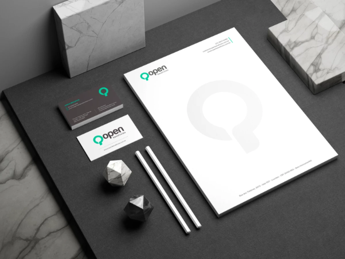
Open Benefits specializes in providing customized benefits solutions for companies, ensuring employees have access to high-quality services and perks. To align its visual identity with its corporate, forward-thinking mission, Clash Design e Comunicação developed a print design that is both modern and highly professional.
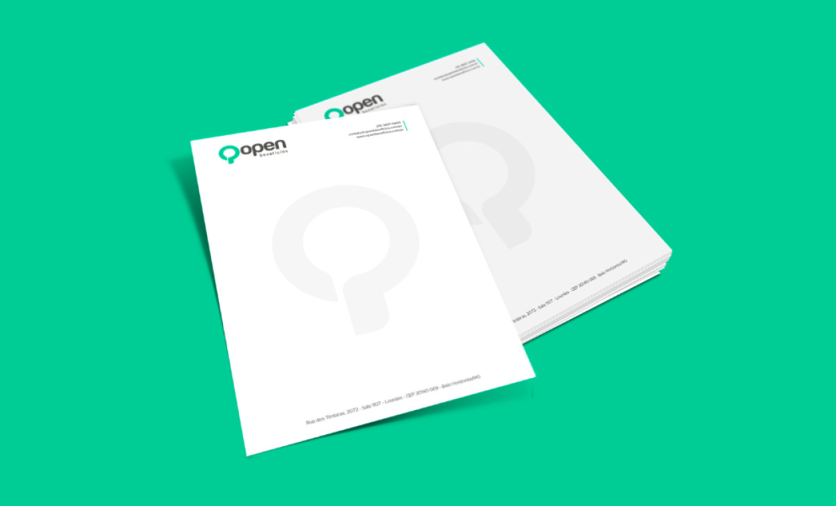
The design embraces a clean, minimalistic approach, using ample white space to create a sense of sophistication and clarity. The subtle embossed "Q" logo on the letterheads adds a refined touch, reinforcing the brand without overpowering the layout.
A striking balance between black and white backgrounds on the business cards enhances contrast, ensuring readability while exuding a sleek and authoritative presence. The inclusion of a vibrant green accent injects freshness into the monochrome palette, symbolizing growth, reliability, and innovation.
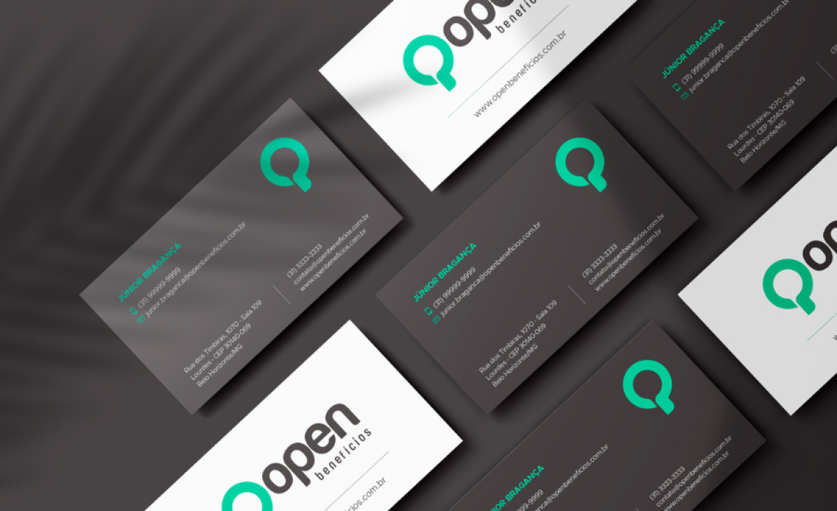
The logo, featuring a stylized Q-shaped speech bubble, subtly communicates Open Benefits’ commitment to communication and engagement. Meanwhile, the consistent typography and structured layouts maintain a strong corporate feel, ideal for professional correspondence and client interactions.
With its strategic use of simplicity, contrast, and subtle branding cues, Clash Design e Comunicação has successfully positioned Open Benefits as a trustworthy and contemporary brand. These professional services print materials leave a lasting impression on clients and partners.
_9fc3d6665b18-preview.jpg)
_b34c2bb88688-preview.jpg)