Standout features:
- Evocative topographic line art on the card's reverse side
- Custom logo featuring a stylized mountain and sun emblem
- Asymmetrical front layout with a balanced type hierarchy
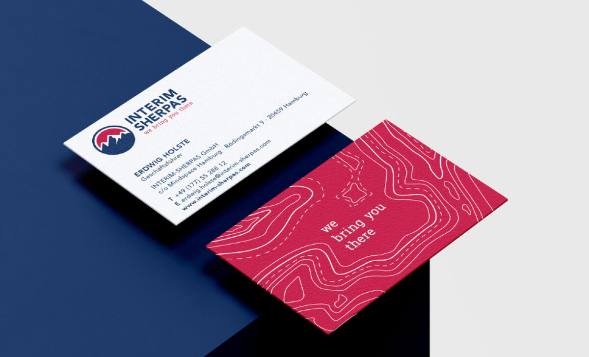
This business card by Frau Dörr MEDIENDESIGN is for Interim Sherpas GmbH, a management consultancy committed to navigating complex projects. The design visually translates the brand’s "sherpa" concept, using metaphor-rich graphics to convey its role in guiding clients to success.
A distinctive feature is the back of the card, adorned with white topographic line art on a deep crimson field. The brand's tagline, “we bring you there,” in a lowercase serif, complements this. This design choice instantly reinforces the "sherpa" narrative, symbolizing guidance through challenging project landscapes.
The logo design includes a deep navy silhouette of a rugged mountain range, with a crimson sun partially visible. The company name, "INTERIM SHERPAS," is set in a strong, stacked uppercase sans-serif. This emblem offers an emotionally resonant and recognizable icon that will help brand recall for the card's recipients.
The business card's front side is clean and asymmetrical. Contact information is aligned left, while the logo is placed in the top left. A contemporary sans-serif font with distinct weights for name, position, and details ensures a well-organized presentation.
Against the backdrop of a rapidly expanding digital business card market, projected to reach $505.2 million by 2032, this physical card's design plays a key role in conveying tangible brand value.
Overall, the design for Interim Sherpas highlights how a strong thematic concept — in this case, mountaineering and expert guidance — can be powerfully translated into tangible brand assets like business cards.