Standout Features:
- Logo-oriented visuals
- Purple as an accent color
- Clean, minimal look
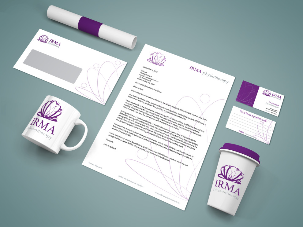
Melissa Whatman created the print design representing IRMA Physiotherapy, characterized by a uniform set of promotional logo-oriented materials to match the brand's joint concept.
The print design offers a clean, minimal look with lots of positive space that emphasizes the intriguing visuals. All the visuals stem from the logo design: a purple emblem that resembles a minimal digital iteration of an outlined lotus flower.
Purple is also an accent color that emphasizes the logotype and adds flavor to extensive white spaces. The light, curvy purple background lines also represent a scaled logo, reinstating the brand’s identity.
Get a chance to become the next Design Award winner.
SUBMIT YOUR DESIGN