Restorative Pain Management Print Design Achieves New Standards of Brand Overhaul
Restorative Pain Management (RPM) is a Missouri-based interventional medical practice providing a multidisciplinary approach to patients suffering from back and neck afflictions.
After such a long period of social distancing that resulted in stress, fear and solitude — supporting healthcare has never been more important. To reflect these new behavioral tendencies, RPM resorted to a total brand overhaul.
Helping them in this mission is Afflecto agency that worked with RPM’s lead physician, Gregory A. Stynowick, M.D. The task was to create a robust brand package, chief of which being the Restorative Pain Management print design.
Besides social media templates and a new website, Afflecto, aware that it holds special importance in the healthcare industry, primarily focused on print collaterals. You may also look into other professional print designers specializing in print visual assets.
With this material, which visually appeals to present-day trends, RPM casts a much wider net, or as the agency behind the design appropriately puts it:
“Just because Dr. Stynowick focuses on neck and back pain doesn’t mean his branding had to be all vertebrae and x-rays.”
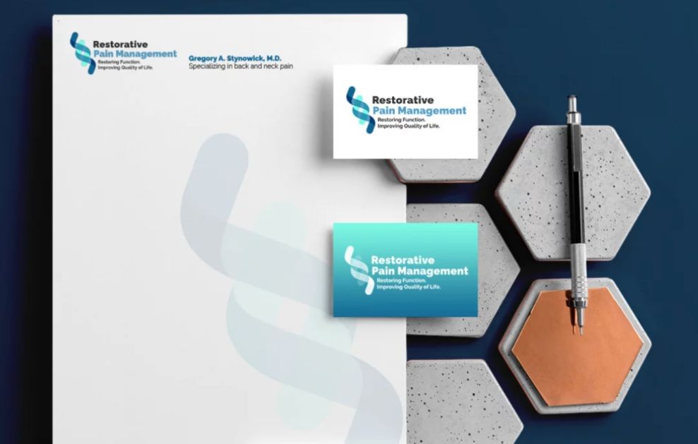
Restorative Pain Management’s Innovative Logo Takes the Spotlight in These Print Designs
When it comes to healthcare, the logo is more than a brand representation — it's a symbol whose values and goals should be clearly communicated as possible. It needs to strike a fine balance between universality and originality.
It may sound counterintuitive, but the problem with traditional medical symbols is their wide recognizability. While clear and discernable, they are often too closely associated with unpleasant maladies, to put it lightly.
Although Restorative Pain Management print design sports a logo that is somewhat rooted in these conventions, it uses them to convey tranquil restoration and renewal. Any branding agency would recognize that this is a brand that deeply cares about the well-being of its patients and knows intimately how to connect with its target audience.
It’s all the linework! While the curled shapes of the monogram distinctly represent the spine, the backbone (pun intended) of this logo lies in its multilayered symbolism. While modern and minimal, the intertwined lines resemble Asclepios’s snake, one of the oldest prophylactic emblems in Western civilization. Aside from the ancient Greek interpretation, snakes are globally viewed as chthonic beings that, again, represent rejuvenation.

Restorative Pain Management Print Design’s Color Palette Makes a Strong Branding Statement
Experienced graphic designers believe when choosing colors for print design, it is imperative to select those that complement each other well and communicate brand qualities.
Minimalistic and monochromatic only at first glance, Restorative Pain Management print design utilizes a three-color palette of black, cyan and dark blue (on white background) that effortlessly make an impact on the viewers’ collective psyche.
Dark hues are mostly used in typography and backdrops, while the vibrant sky-blue accents act as focal points. The color combination is not just sleek, modern and eye-pleasing, it’s also used to evoke earnest, calming emotions – the well-being of the body, mind and spirit.
It’s common knowledge that color inspires different feelings and communicates different qualities to the consumer or patients, in this case. Since blue is closely related to credibility, knowledge, professionalism, cleanliness and focus, it is an ideal choice for Dr. Stynowick’s medical branding.
Because it is already widely used by healthcare providers, viewers also customarily associate it with the field of medicine. The time-tested choice in RPM’s print design is further enhanced by the addition of a subtle green gradient effect that’s inherited from the previous design. It breaks the monotony by infusing the material with a sense of growth and balance, making it stand out among competitors.
These colors keep the design consistent and grounded, creating vital brand retention.

Inspiring Messaging Makes Restorative Pain Management Print Design Dependable and Approachable
As mentioned above, the global medical crisis, although largely suppressed, still lingers in our collective minds. The two-year delay of conventional medical care not only put everyone at risk but also brought a dilemma and, in some circles, doubt.
At such times riddled with ambiguity, patients need to know that it is absolutely safe to seek professional care.
For this reason, the Restorative Pain Management clinic insisted on clear and poignant messaging. It carries a universal optimistic feeling that offers peace of mind, besides efficient treatment.
The copy relies on adjectives and verbs such as “new,” “great," "restoring” and “improving” to educate and get rid of negative associations. The text in these prints does a good job of balancing casual and professional understandably and compellingly.
Restorative Pain Management has a purpose and it sticks to the integrity of that purpose without question. And that is exactly what makes these prints powerful.
To emphasize its clear-cut messaging, RPM print design opts for legible, sans-serif typography that perfectly contrasts the background. The headlines and most important bits are highlighted in bold typeface, while others use a lighter font version.
The color of text also varies depending on the complementing visuals. Pages with dark backgrounds have white text, while predominantly white pages use cyan or dark blue text, both perfectly contrasting the neighboring elements.
Restorative Pain Management Print Design Covers a Wide Array of Business Collateral
What exactly makes Restorative Pain Management print design stand out? The answer is convolutedly simple – nothing in particular and everything in unison. This design captures attention immediately with its simplicity and fluid aesthetics.
Everything about it is perfectly balanced: from typography and messaging to colors and innovative logo.
The appealing print collaterals such as business cards and brochures serve as the foundation of the new and improved patient experience.
Essentially, the first time you lay your eyes on Restorative Pain Management print design relieves much of the weight off your back and makes you one step closer to successful treatment — an achievement worthy of winning the Best Design Award.

-preview.jpg)