Standout Features:
- Dynamic 'swoosh' brand graphic
- Confident red, white, and blue corporate color palette
- Structured information and product segmentation
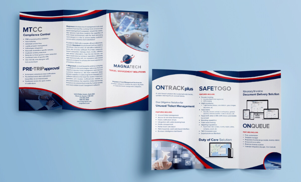
For Magnatech, a global travel technology company, Marianne De Bonis created a suite of professional services print brochures and leaflets. It projects an image of innovation and stability through its dynamic graphics and structured information design.
The primary visual identifier is a dynamic 'swoosh' graphic. This fluid, ribbon-like mark, with interlocking navy and red bands, frames content and contains images within the brochure layouts.
A deep navy blue, a vibrant true red, and crisp white form the authoritative color palette. Navy is used for backgrounds and text blocks. The red accent adds a sense of urgency and dynamism. This color trio is particularly fitting for a leading technology firm with North American roots.
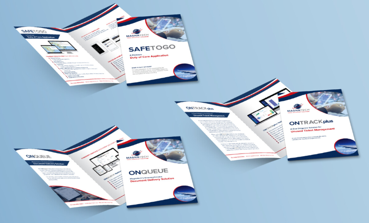
The main trifold brochure uses a three-column grid with scannable headings and bullet points. The company's offerings are also detailed in dedicated bifold leaflets for each solution.
This multi-format print strategy is effective, as leaflets in particular are a highly engaged medium, with as many as 79% of recipients keeping, sharing, or at least reviewing the material.
Magnatech effectively illustrates how a dynamic brand graphic, like the 'swoosh,' can unify a diverse suite of print materials and inject energy into corporate B2B branding. This approach is key for technology firms aiming to appear both stable and innovative, ensuring brand cohesion across all client-facing collateral.