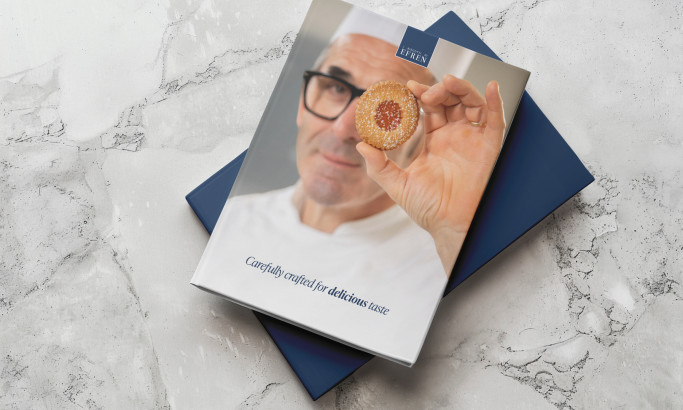
The Book’s Colors And Fonts Give The Reader A Taste Of Gourmet
Just by looking at the book cover design, readers know that they are in for an exquisite treat. The book not only features the beauty of well-prepared food, but also that of well-curated fonts and colors.
The beige background provides a clean slate for the design. The shade they used exudes class without saying a word.
The fonts don’t bring much attention to themselves. You know they mean business, but they don’t discriminate, inviting readers to open the book and see that it only gets more interesting from there.
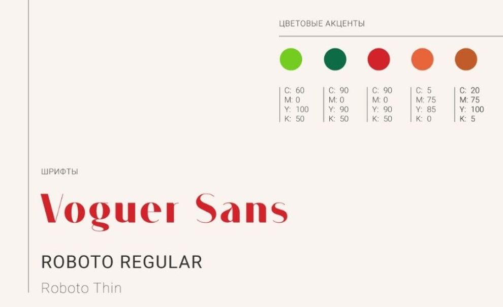
The book is divided into different chapters. However, this material refuses to be an ordinary read. Bold and vibrant colors welcome readers in every chapter ― the complete opposite of the book’s unassuming cover.
Great design thinking always serves a purpose. The lively colors are not only meant to complement the stunning food photography, they also make the book easier to navigate and guide readers into the different parts of the culinary journey.
The book also includes a layout template that further guides readers on what to expect in every chapter, without looking boring or sounding monotonous.
You may research some professional graphic designers for more insights on how to craft beautiful book pages that keep readers engaged.
Moloko Print Design Uses A Mouthwatering Collection Of Visuals
If a culinary book can be a page-turner, this is surely it. Moloko and Savushkin mastered the art of food photography, so much that readers are left craving more.
The designers know that food is just as visual and they were able to replicate the experience on every page. It almost feels like the food is being served right in front of you. Unfortunately, we can't eat those pages even if we try. This is where the recipes come in.
Moloko and Savushkin made the recipes engaging and easy to follow. They created icons to simplify and highlight important steps. Then even included a significant amount of infographics ― even the texture of cheese is visualized.
The book aims to engage and educate every reader, regardless of their experience or knowledge. As long as the reader shares the same passion for cheese, they are bound to enjoy and learn from this material.

Moloko Helps Savushkin Share Its Appetite For Everything Cheese
If there’s anything new our team knows about cheese, it’s because of this book. Created to become a “cheese encyclopedia,” this material managed to be that and more.
The stakes were high for Moloko when Savuskin approached them for the book's 5th edition. So much has been said about cheese, what is left for them to share?
The idea of bringing readers along for the journey proved to be a success as they found themselves with so much more to say. This concept paved the way for more delicious stories centered around cheese.
Although they tell stories about cultures that are centuries old, their modern approach to cheese makes the material relevant and a great resource for readers of all levels.
Moloko’s Print Design For Savushkin Dairy Products Is This Year’s Big Cheese
Like a fulfilling meal, this book gets better with every bite.
It was designed elegantly and purposefully. It’s able to replicate the sensory experience that food provides through the use of stunning and creative visuals. Most importantly, it includes information that beginners and experts alike will continue to benefit from.
It is not something that will simply be displayed in the library. It’s a book that is meant to be experienced over and over again. For this, our experts agreed to recognize this book as this year’s big cheese, pun definitely intended.