


- Agency: Daniel Shaskey
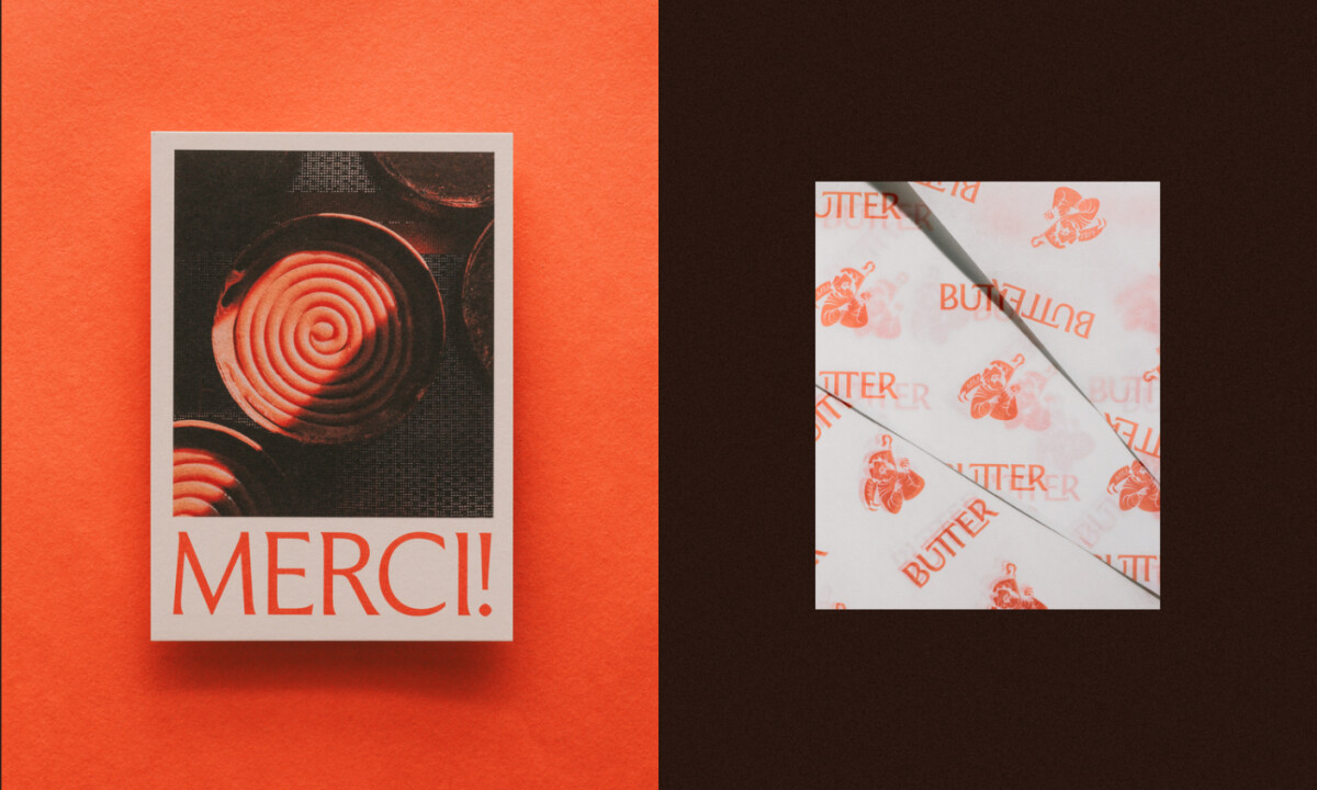
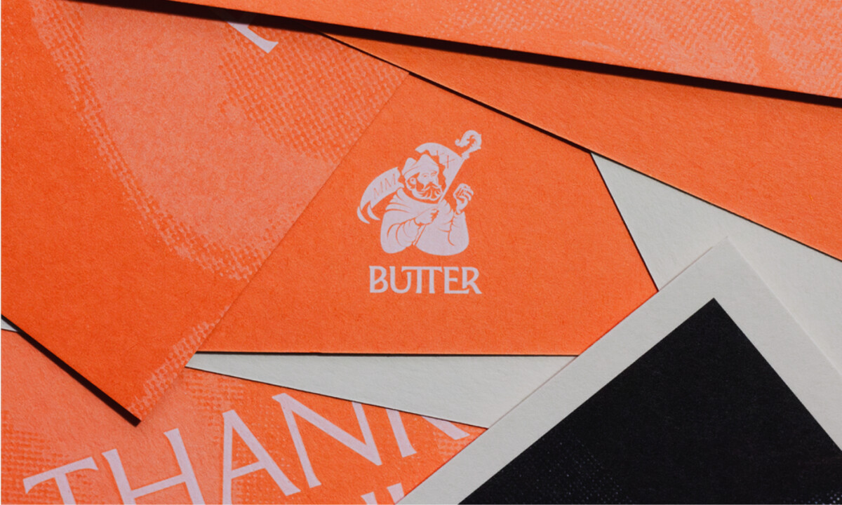
- Client: Butter Pastry
- Category: Print Design — Food & Beverage
- Location: Christchurch, New Zealand
- Project Brief: Create an authentic brand identity for Butter Pastry through print, packaging, and typography that reflects French baking heritage while elevating the presentation of Corentin’s pastries.
Strong food print design often blends storytelling with tactile visual identity. In Butter Pastry’s case, the design translates culinary craftsmanship into a distinctive graphic language, using historical symbolism and expressive typography to create a brand presence that feels both artisanal and contemporary.
Juror Andrea Owsinek-Brucker noted the masterful application that defines the label’s original perspective:
“Texture, color, technique elevates the brand and the strength of message to a truly unique level with a distinct point of view.”