Standout Features:
- Bold duotone color strategy
- Geometric image framing
- Modern typographic hierarchy
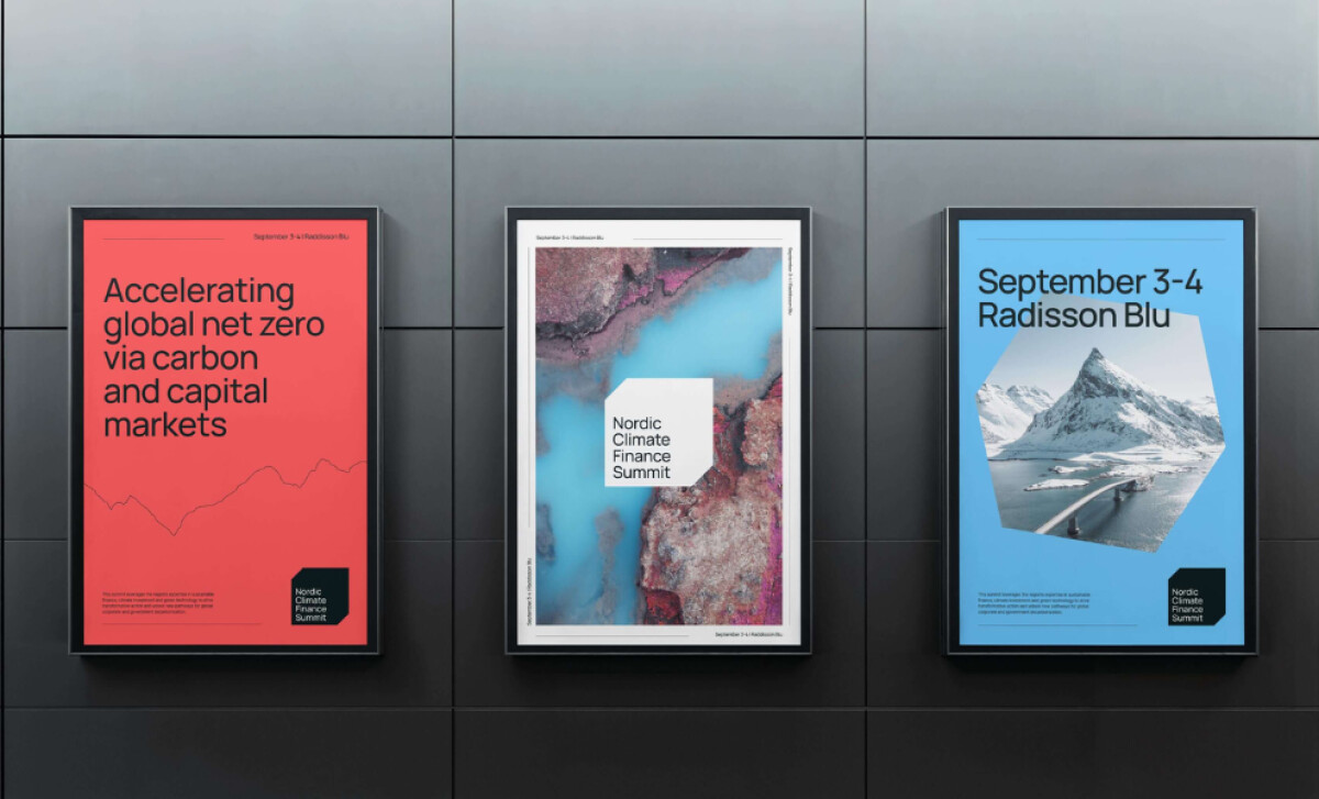
For the inaugural Nordic Climate Finance Summit, an event aimed at accelerating global decarbonisation, Yoke Ltd designed a visual identity that needed to help secure key sponsors and speakers.
A 2017 MarketingSherpa survey revealed that print is the most trusted advertising channel for consumers when making a decision. As such, the physical format of the posters is a key asset for this new event.
The posters leverage a confident duotone palette of red and an arctic sky blue.
These are paired with crisp white and deep black accents. Each hue dominates its respective layout, creating immediate differentiation between event messages.
You'll see that the images on the poster print designs are framed by geometric shapes. This asymmetrical cropping is a unique way to present the photography. It also lends the brand a proprietary visual signature that can be carried across all mediums.
The primary typeface used is a neo-grotesque sans-serif with open counters and uniform stroke widths, similar to Helvetica Now. Large, high-weight headings dominate the upper half of the posters.
This typographic system maximizes clarity, which is critical for an event that is targeting decision-makers.
Yoke Ltd's work for a first-year event is a great example of branding for momentum. The bold, confident, and highly visible design proves that a strong brand is a crucial foundation for a successful launch.
A bold, professional brand identity can be helpful for building credibility and attracting key partners.
That's why brands turn to expert partners, and our team has ranked the best agencies worldwide to make finding them simple.
Visit our Agency Directory for the Top Print Design Companies, as well as:
Our design experts also recognize the most innovative design projects across the globe. Visit our Awards section to see the best & latest in print design.