Team Behind the Design
Print Design Analysis
For professional service print designs, I look at how identity, function, and clarity merge to express authority across varied formats.
I also consider how well the design scales, since institutions require visuals that work consistently from event flags to magazine covers.
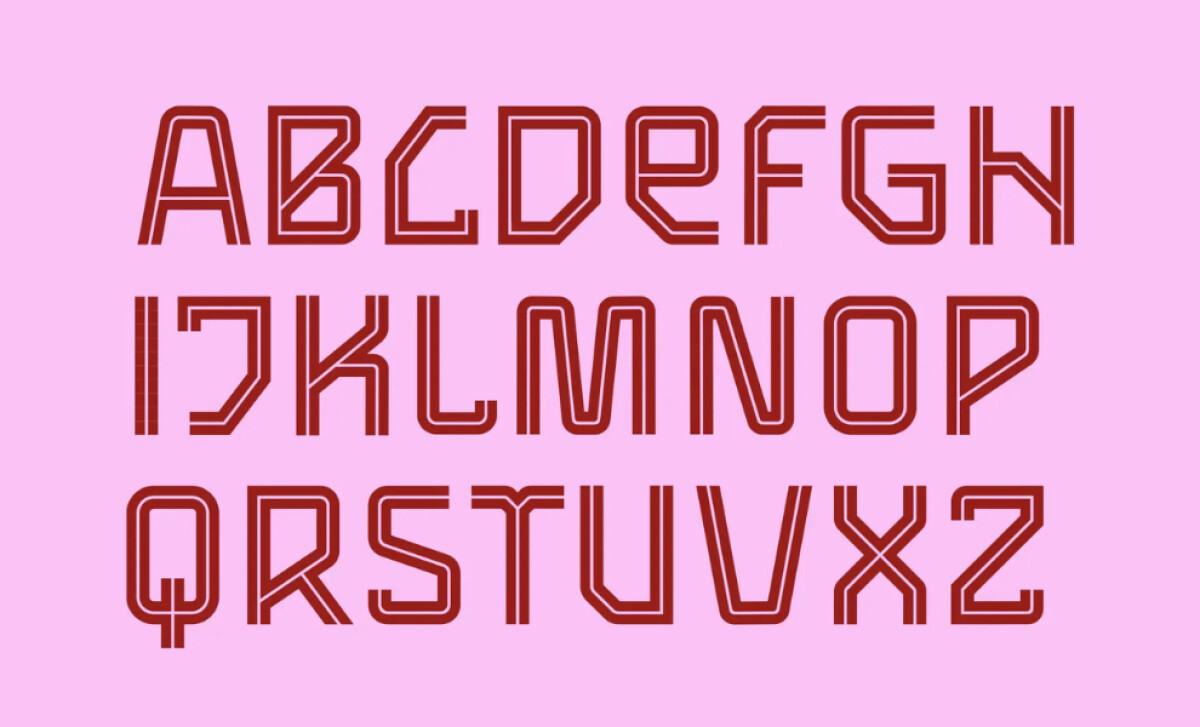
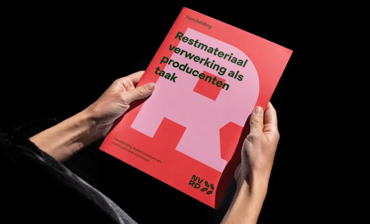
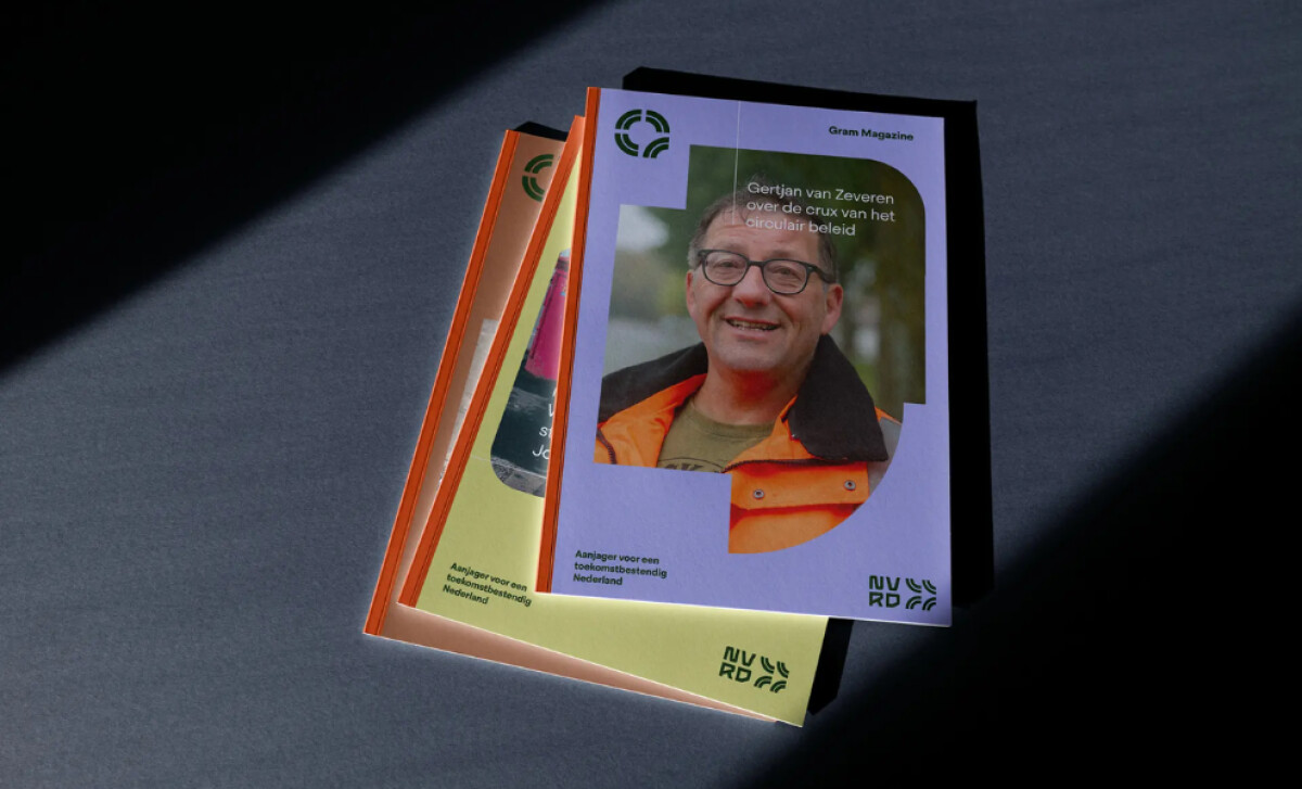
- Typography: The custom letterforms are engineered, not decorated. Their angular structure mirrors NVRD’s emphasis on data, systems, and future-facing civic work, but the spacing and stroke decisions keep the type approachable. This is the kind of typography that reads cleanly on a street banner at 20 feet and still holds character on a ballot-guide footer.
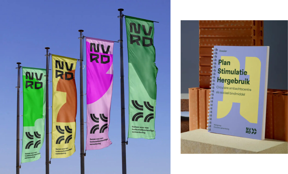
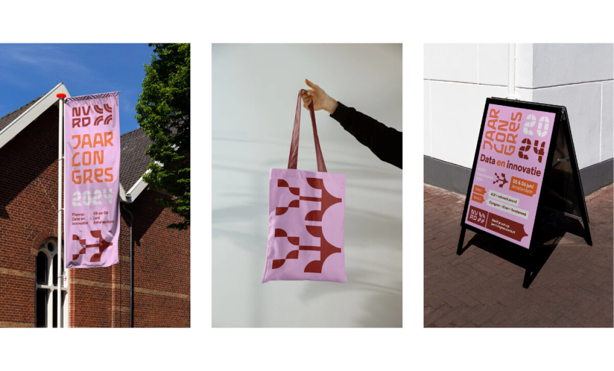
- Layout: The compositions rely on bold modular structures that adapt across banners, booklets, signage, and merchandise. This gives teams the freedom to scale the campaign while keeping visual order intact, even as content volume and formats change.
- Imagery & Color: The vibrant palette (greens, purples, oranges, and pastels) creates immediate recognition across platforms. Paired with distinctive abstract forms, the visuals communicate innovation without losing warmth or accessibility.
- Production Quality: From flags to printed reports, the identity holds its clarity and impact. Colors remain stable across substrates, and the geometric forms don’t deform when scaled or applied to fabric, corrugated board, or coated print. That level of fidelity matters, especially for organizations that rely on public trust and need every asset to look intentional, not improvised.
Word from the Agency
“We’re incredibly happy with our rebranding—both the process and the result. Short lines of communication, highly flexible, a pleasantly critical approach, and creative craftsmanship. A collaboration that definitely leaves us wanting more!”— NVRD
What Brands and Agencies Can Learn from NVRD
Here’s what the NVRD rebrand shows about building a powerful and adaptable print communication system.
1. Build a modular structure that works everywhere
NVRD’s grid-first layout proves how a strong system can flex across flags, posters, reports, and event materials without losing clarity. A modular approach reduces design drift and keeps large organizations visually aligned.
2. Use color as an instant recognition tool
The bold palette helps NVRD stand out across public spaces and printed assets. Consistent color cues become a shorthand for the brand, making communication faster and more memorable.
3. Create typography that carries personality and authority
The custom letterforms show that professional institutions can be both approachable and distinct. Typography that balances character with readability supports trust while giving the brand its own visual voice.
About DesignRush Featured Designs
At DesignRush, we review hundreds of agency projects each month. The featured selections stand out for clarity, creativity, and execution across digital and brand experiences.
Exceptional works proceed to our Monthly Design Awards, where they’re recognized as leading examples of design craft.
Explore standout print design projects that push creativity forward:
- Best Print Designs
- Best Website Designs
- Best App Designs
- Best Logo Designs
- Best Packaging Designs
- Best Video Designs
For a full list of design agencies and related services, see our Agency Directory.


