Standout Features:
- Handwritten cursive typography
- Balanced color scheme
- Personal, approachable design
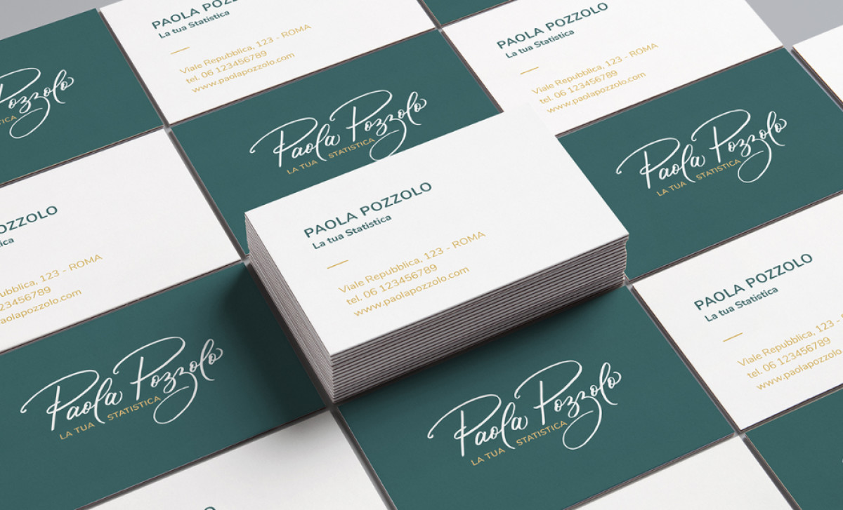
The business card for Paola Pozzolo, designed by Cristina Guareschi, is a perfect example of how to balance professionalism with personality. Paola works in the statistical fields of veterinary, medical, and psychological research. The goal of this design was to soften the typically rigid, academic image that often accompanies such professional fields, and the card succeeds in doing so with its elegant, handwritten cursive.
A standout feature of this business card is the handwritten cursive typography used for Paola’s name. Designed to resemble a signature, the cursive introduces a warmth and approachability, deviating from the typical cold, static fonts usually seen in academic or research-based business cards.
The teal background creates a sense of calm and professionalism, while the gold accents used for Paola’s name and contact details provide a luxurious, refined touch. This combination of colors ensures that the card feels sophisticated and not too formal or unapproachable, helping it stand out among other business cards in the same field.
The overall layout of the card is clean, with ample white space allowing the typography and color scheme to shine. The use of a simple and organized design ensures that the card remains legible while emphasizing the essential information: Paola's name, title, and contact details.
In summary, Cristina Guareschi’s business card design achieves a perfect balance between professional and personal. The handwritten cursive, color palette, and clean layout all contribute to a design that feels warm, approachable, and sophisticated.


