- Agency: Martum Design
- Client: Save What’s Left Conservation Society
- Category: Print Design — Brochure
- Location: Nelson, Canada
- Project Brief: Design a visually clear and accessible discussion paper advocating for reform of BC Timber Sales, timed to coincide with a government review. The publication needed to balance emotional impact, policy credibility, and ease of navigation for a broad public audience.
Effective brochure design must communicate authority without alienation.
Public Forests, Public Trust Brochure succeeds by grounding its argument in clarity and restraint, allowing the content to lead while the design reinforces trust and urgency.
- Editorial Structure & Layout System: The publication relies on a disciplined, modular grid that supports long-form reading while allowing flexibility for imagery and data. I like how this structure creates a steady reading rhythm that prevents visual fatigue across dense policy sections.
- Typography & Hierarchy: Typography is treated as a tool for clarity, with a strong hierarchy separating section titles from body copy. I believe this intentional restraint reinforces the report’s institutional credibility and makes complex information much easier to scan.
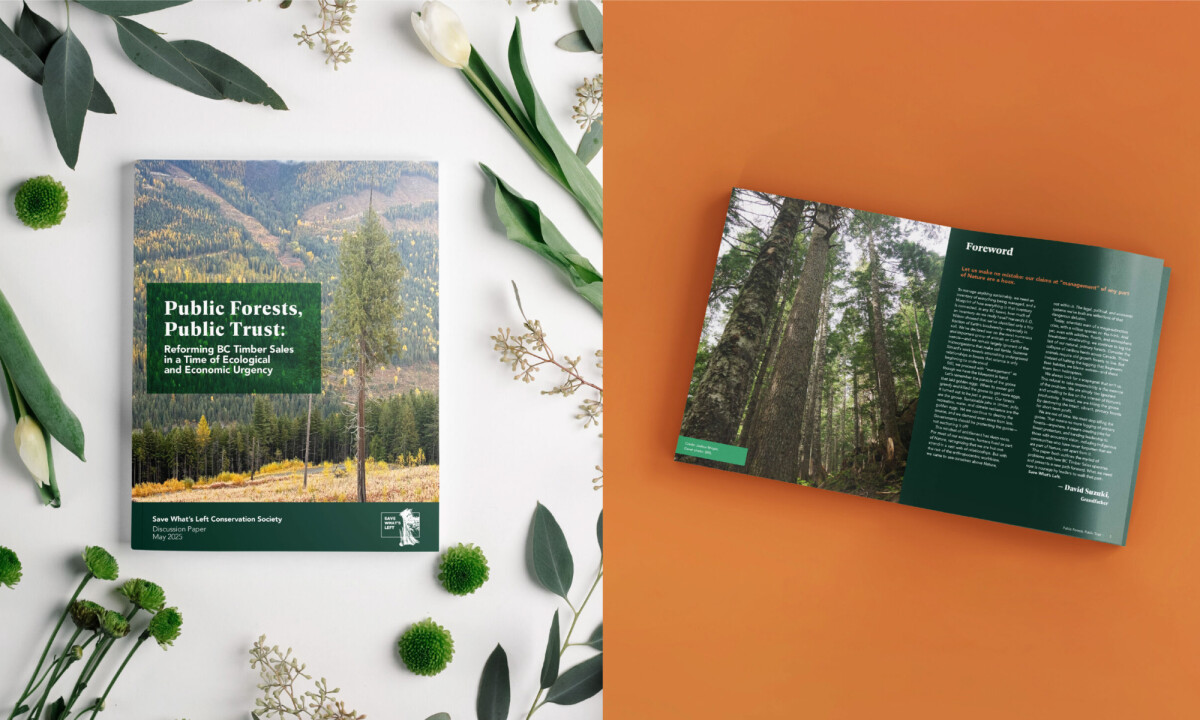
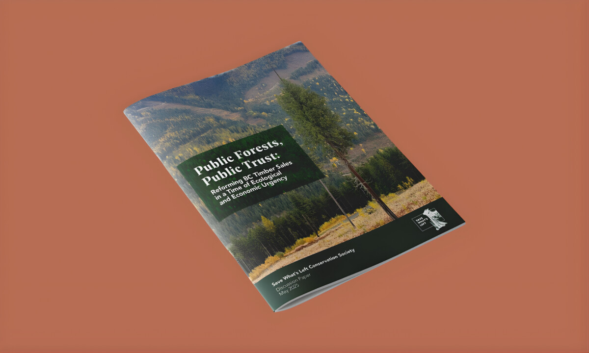
- Photography & Visual Evidence: Large-scale forest photography anchors the publication in real landscapes, reinforcing the stakes of the policy discussion. I think these images function effectively as visual evidence rather than decoration, maintaining a sense of documentary integrity.
- Color Palette & Environmental Tone: A restrained palette of forest greens and muted earth tones reflects the natural subject matter without romanticizing it. I appreciate how color blocks are used strategically to guide my attention and emphasize key arguments within thematic sections.
What Brands & Designers Can Learn from Public Forests, Public Trust
1. Use Structure to Support Credibility
A disciplined grid and modular layout create a steady reading rhythm across dense content. Clear structure reinforces trust, especially in policy-driven publications.
2. Let Typography Prioritize Clarity Over Style
Strong hierarchy and restrained type choices make complex information easier to scan and absorb. When typography serves understanding first, authority follows naturally.
3. Treat Imagery as Evidence, Not Decoration
Large-scale, documentary-style photography grounds the argument in real-world context. Visuals are most powerful when they support the message rather than embellish it.