Standout Features:
- Tactile materiality with metallic bronze foil stamping
- Bold and hierarchical typographic system
- Atmospheric workshop photography with asymmetrical composition
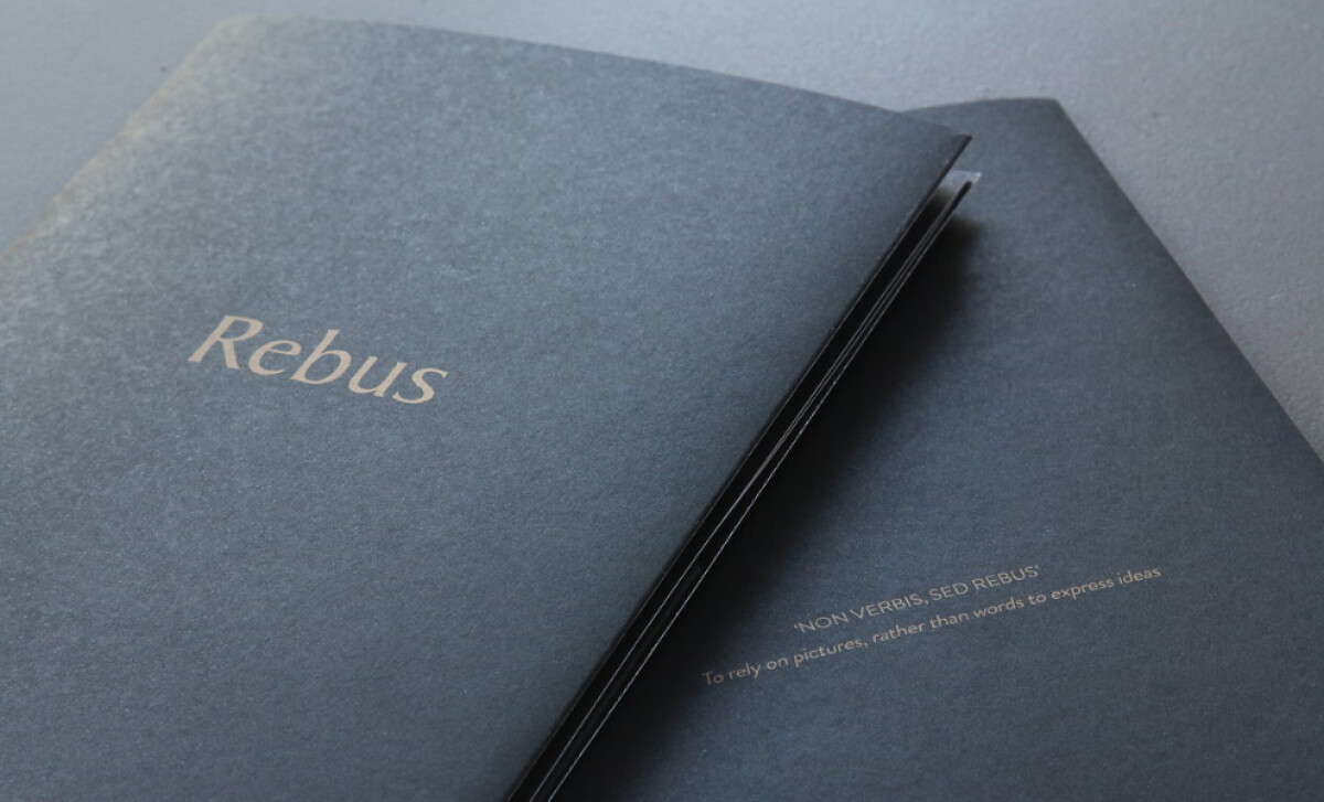
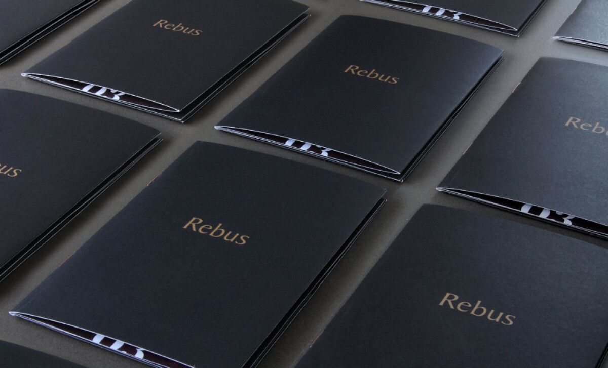
For Rebus, a luxury jeweler in London's Hatton Garden, Slurp Creative designed a brochure that is a true class act in physical media. It functions as a guide to the art of hallmarking and signet ring craft. The brochure balances a gritty, authentic workshop feel with the refined elegance befitting a luxury brand.
The design is built on a premium, uncoated deep charcoal gray paper stock with a fine texture. Key text elements, like the "Rebus" logotype, are rendered in a warm, metallic bronze foil stamp. This creates a subtle debossed effect, mirroring the client's own meticulous process of engraving metal.
A classic serif for the "Rebus" logotype contrasts with a bold, geometric sans-serif for internal headlines. The headlines are set in all-caps for impact, with ample negative space to command attention. This strong typographic structure makes the detailed content highly scannable.
Atmospheric, high-contrast photography of the workshop is a key element. These images, focusing on the craft process, are arranged in a clean, asymmetrical layout. Structured, right-justified text blocks offer a stable contrast to the imagery.
Showcasing the creation process in this way directly addresses the growing consumer demand for transparency, a factor that over 90 percent of shoppers now say is important to their purchase decisions.
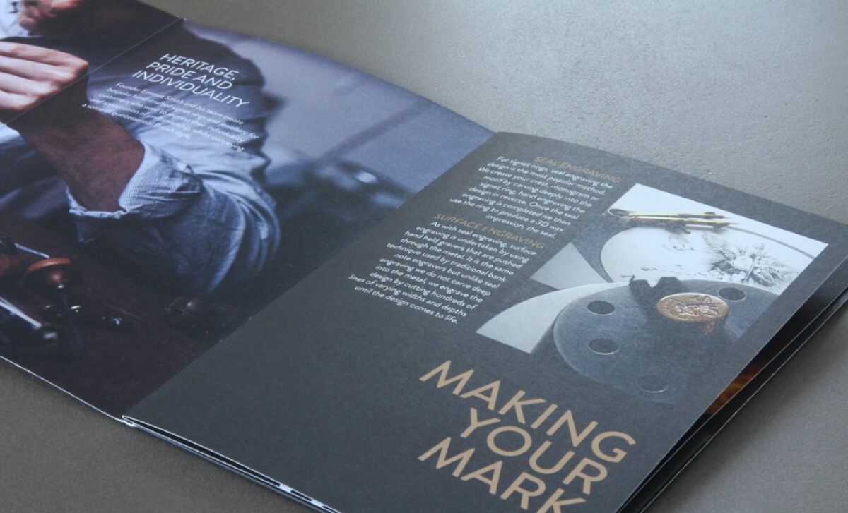
Rebus highlights that storytelling that focuses on the creation process itself can be incredibly effective. The use of authentic, "in-situ" workshop photography in the Rebus brochure builds a narrative of transparency and human connection, a key insight for brands aiming to foster a deeper appreciation for their craft.
-preview.jpg)

