- Agency: Kyle Harris Design
- Client: Reebok
- Category: Print Design — Sports
- Location: Salt Lake City, Utah, United States
- Project Brief: Launch a Reebok-branded basketball system through print, OOH, and product design that extends the brand’s dominance from grassroots courts to professional play, while driving measurable retail performance.
Sports print design should translate complex values into a singular, balanced form that remains functional across all scales.
Reebok excels through a series of visual experiments that prioritize street authenticity and structural authority over standard athletic ornamentation.
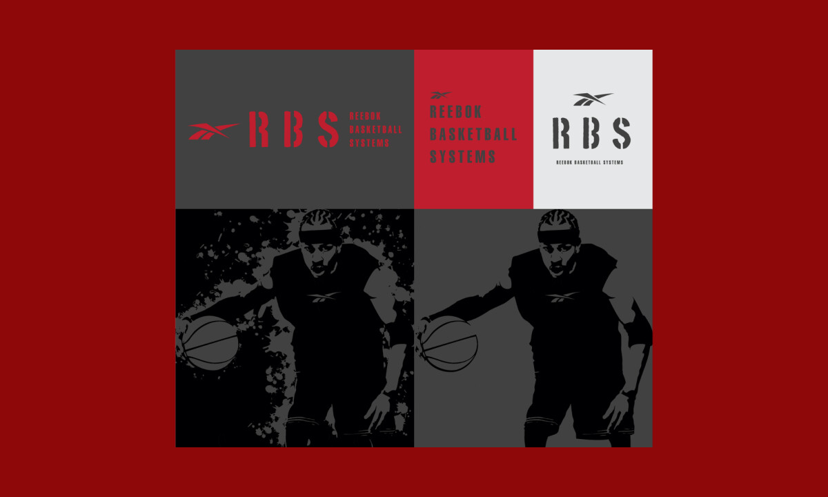
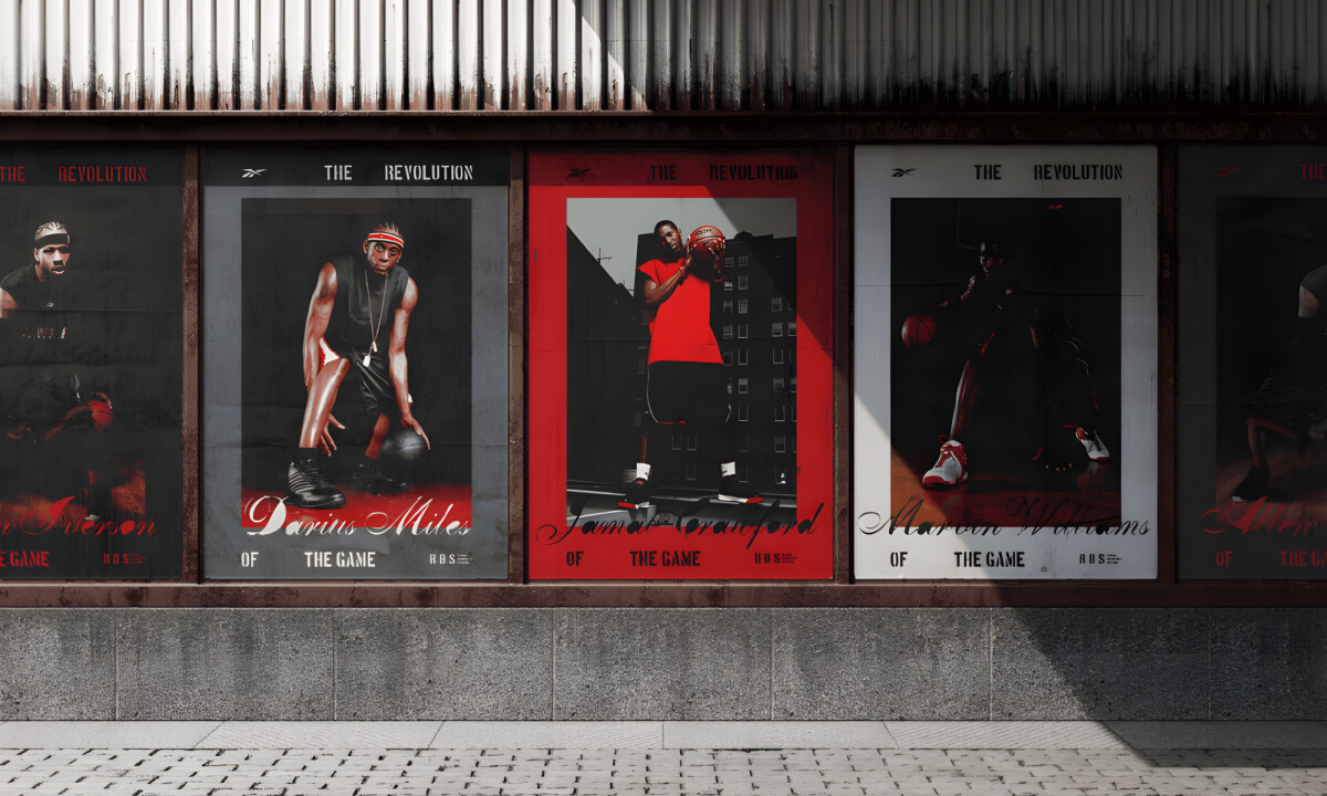
- Visual System & Texture: I like how the campaign leans into high contrast and distressed textures to reflect the cultural weight of basketball. The use of torn-paper compositions and a stark red-and-black palette grounds the work in a sense of grit while maintaining clarity through disciplined grid structures.
- Iconic Typography: I appreciate the balance between aggressive stencil-style lettering and restrained brand marks to reinforce a sense of authority. This typographic strategy ensures the messaging is powerful enough to compete with bold imagery without losing the core brand identity.
- Portraiture & Symbolism: Treating player portraits as icons rather than casual lifestyle moments successfully positions athletes as symbols of discipline. This approach elevates the campaign, focusing on the dedication and progression inherent in the game rather than just the product.
- Ecosystem Consistency: I like how the design frames the sport as a complete ecosystem encompassing training, environments, and aspiration. This broad perspective allows the brand to feel expansive and credible across urban contexts and various retail touchpoints.
Results & Impact
- Achieved 1-year sales goal in 3 months
- Top-selling basketball system at Costco
- Top-selling basketball system at Dick’s Sporting Goods
- 20% increase in basketball sales overall
- Validated Reebok Basketball Systems as a scalable product category
- Strengthened Reebok’s presence across grassroots to professional basketball markets
What Brands & Designers Can Learn from Reebok
1. Use Texture and Contrast to Convey Cultural Authenticity
Distressed surfaces, torn-paper compositions, and a disciplined red-and-black palette communicate grit without sacrificing clarity. Texture can signal street credibility when anchored by strong structure.
2. Let Typography Carry Authority
Stencil-style lettering paired with restrained brand marks balances aggression and control. Powerful type ensures messaging holds its own against bold imagery.
3. Elevate Sport Through Symbolic Representation
Treating athletes as icons emphasizes discipline and progression over lifestyle aesthetics. Symbol-driven portraiture helps sports branding feel aspirational and enduring.