Brandlab created a stunning 2012 Annual Report for San Fernando which happens to be one of the most beloved brands in Peru. According to Brandlab, San Fernando is based on authentic families.
Annual reports are a company’s yearly rundown that is provided to their shareholders, and documents the company's activities and finances from the previous year. These reports typically house a lot of information, and although, very important, can become a lot to read and understand. This is where good design comes in. BrandLab created the concept of memory (families with future) that highlighted the path the company was taking and graphically explained it throughout the report. It used simple icons as a guiding thread throughout.
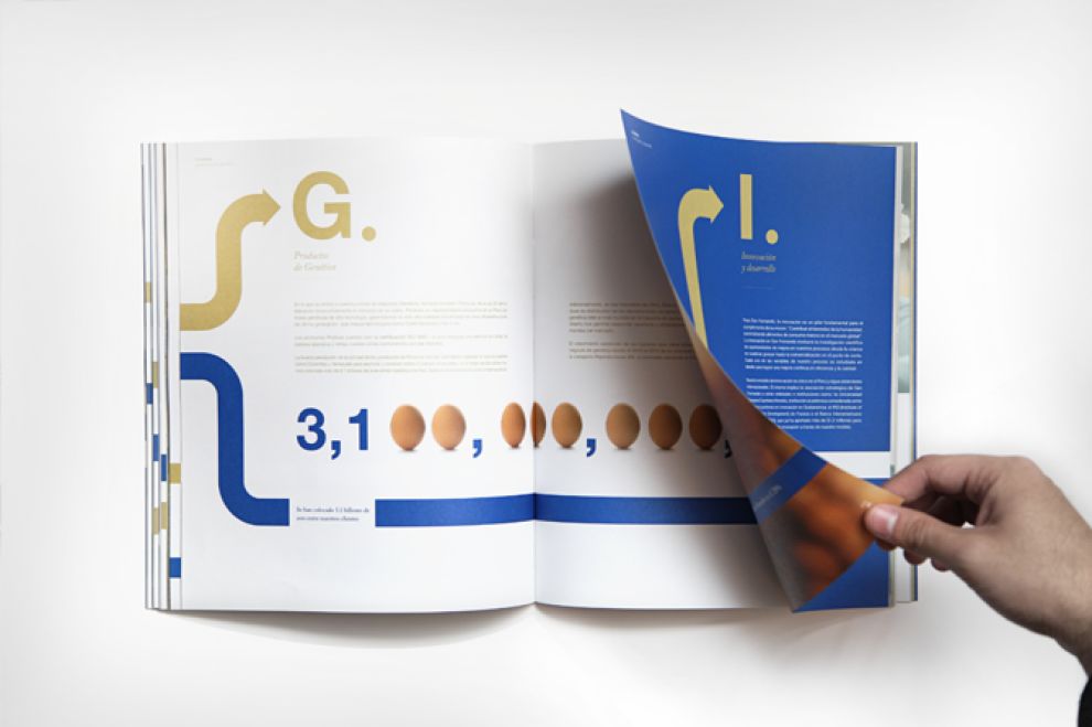
The design is beautiful -- from the simple color palette, to the asymmetrical grid that houses content and imagery, to the black and white photography, to the icon placement that directs the users eye across the page.

Fold-out pages house additional content within each section as well as add visual interest while users navigate the content. The typefaces also maintain a sense of connectivity that enhances the look and feel of the concept.
San Fernando Reporte Anual 2012 is a top print design in the Non-Profit industry.