




- Agency: Gebr. Silvestri
- Client: Serious Play
- Category: Print Design — Arts and Recreation
- Location: Amsterdam, Netherlands
- Project Brief: Create a print publication that showcases experimental typography and contemporary type design through a comprehensive visual archive.
A print design publication in the arts and recreation space justifies its physical existence when the object itself makes an argument the content alone cannot. Serious Play, produced by gebr.silvestri across 768 pages, treats typography as simultaneously a rigorous discipline and a genuinely playful one.
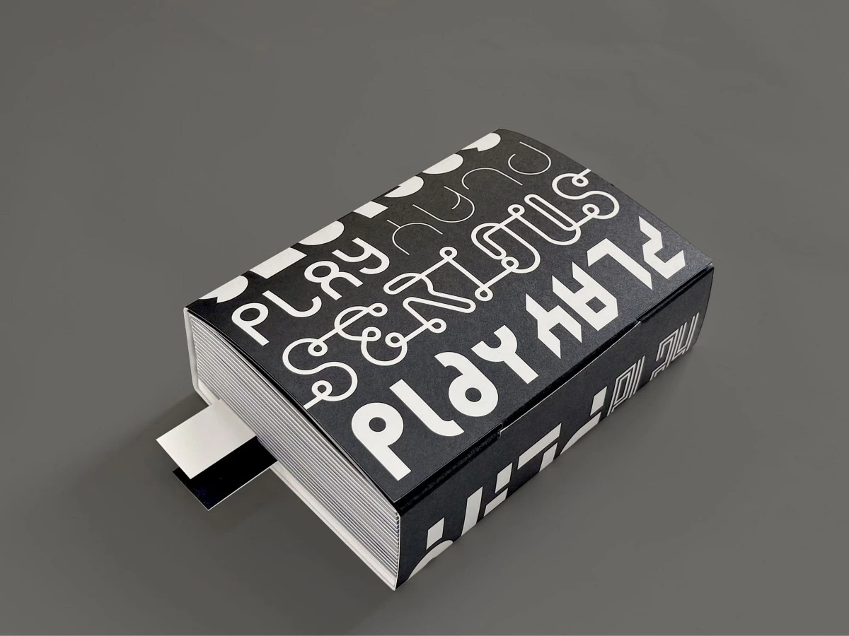
The cover sets the tone before the book is opened. "Play" repeats across the black surface in multiple typefaces at once, each rendering a different personality of the same word — the book's central argument made physical before a page is turned.
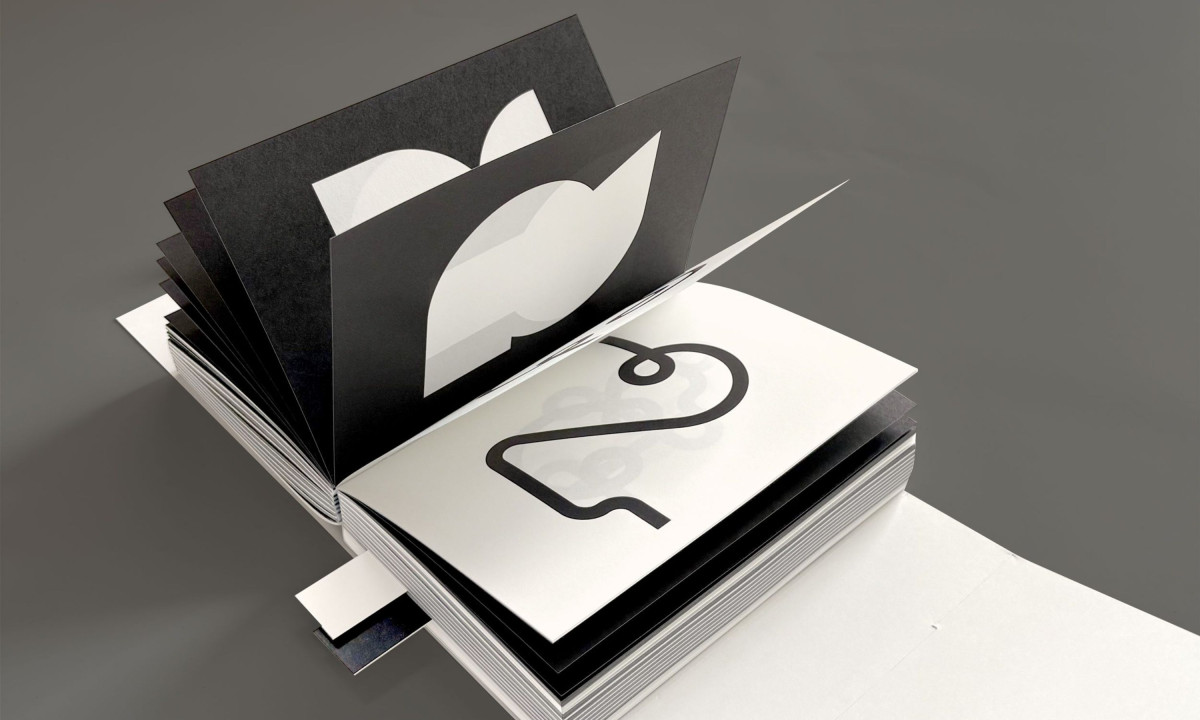
Inside, complete alphabets and numeral systems run in strict black and white, letting structural logic and rhythmic variation carry the visual weight without color. Dense contour-line letterforms map each character like a topographic survey, showing the depth of thinking behind a single glyph.
Critical essays by Edgar Walthert and Maurice Meilleur provide intellectual framing that lifts the publication above a visual catalog. Gebr.silvestri and robstolk® Printing deliver something that functions as a reference, a manifesto and a designed object at once.