Standout Features:
- Customized geometric sans-serif logotype with a unique "M"
- Professional color palette with dynamic blue and yellow accents
- Dynamic 'layered card' graphic
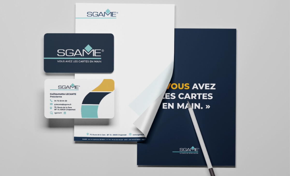
Groupe Spirale created the brand collateral for SGAME, a French card manufacturer with a human-focused, precision-oriented approach. The design system is carefully balanced, communicating professionalism and technical expertise.
Geometric color blocking is a primary visual feature, seen on business cards and folders. It employs a striking combination of Charcoal Navy, Warm Mustard, Cool Teal, and light gray-white.
The deliberate inclusion of navy and teal is a strategic move to inspire confidence, as Adobe research has shown that 54% of consumers perceive blue as the most trustworthy brand color.
A key feature is the custom logotype with its symbolic typography. In the "SGAME" wordmark, the "M" includes a teal-filled diamond, a likely nod to the brand’s cards manufacturing industry. This element makes the logo unique while embedding industry relevance directly into its form.
Across all collateral, typography maintains a clear hierarchy using a strong sans-serif font for both body content and headers. The design smartly uses high contrast white on navy and vice versa to guide the viewer’s eye and ensure maximum readability in all contexts.
This project demonstrates that a balanced visual system for its print collateral —combining a custom logotype, a professional yet dynamic color palette, and meaningful abstract graphics — can create a sophisticated and approachable identity that resonates with modern business clients.