Team Behind the Design
Print Design Analysis
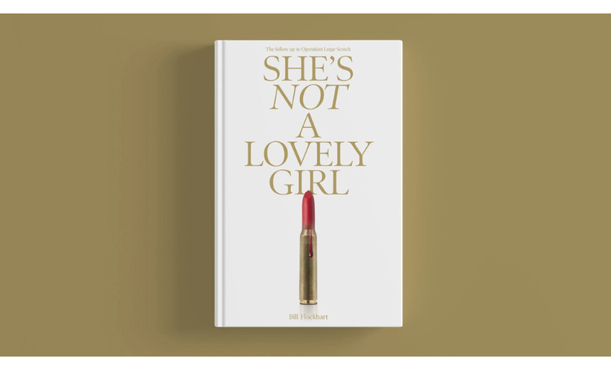
I always see a book cover as more than packaging. It is the first conversation between a story and its reader. My attention often goes to how the design sets the tone before a single page is turned.
The cover for She’s Not a Lovely Girl feels like that quiet moment before impact. It doesn’t shout, it lingers.
- Typography: I like how the title is almost hidden in the background. Its faint, embossed lettering suggests something repressed, as if the story’s truth is being deliberately kept out of sight.
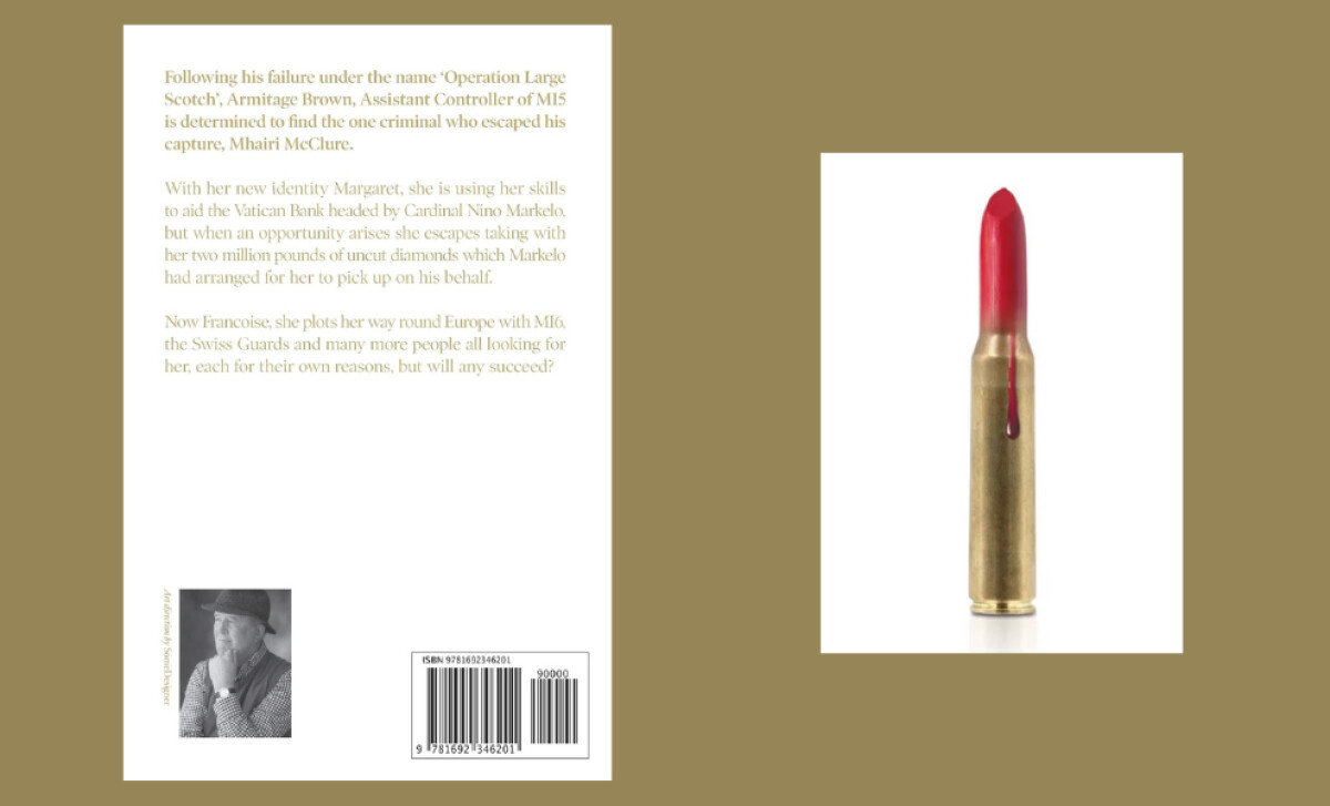
- Imagery: The single bullet tipped with lipstick struck me immediately. It’s clever and unsettling, a visual metaphor for beauty mixed with danger. That tension tells you everything you need to know about the world inside.
- Layout: I appreciate the restraint here. The open space lets the image breathe and gives the viewer room to interpret, which adds depth to the minimalism.
- Production Quality: The matte finish and crisp printing make the cover feel tactile and deliberate. Every element feels considered, which gives the book a sense of quiet confidence.
What Brands & Agencies Can Learn from She’s Not a Lovely Girl
She’s Not a Lovely Girl's book cover shows how minimal design can speak volumes. It relies on a single image and measured typography to build tension and meaning without excess.
1. Use Restraint as a Form of Power
The cover’s quiet composition makes the central image unforgettable. By holding back on detail, the design draws readers closer and invites interpretation, proving that subtlety can be more evocative than spectacle.
2. Let Symbolism Lead the Story
The lipstick-covered bullet distills the novel’s dual themes of allure and danger into one visual metaphor. It reminds designers that a strong concept can do the narrative work that multiple elements often try to achieve.
3. Treat Print as a Sensory Experience
The tactile surface and careful printing choices turn the book into an object of value. Readers not only see the story’s tone but feel it in their hands, reinforcing the connection between physical form and emotional impact.
About DesignRush Featured Designs
At DesignRush, we review hundreds of agency projects every month. The featured designs stand out for their creativity, execution, and ability to resonate with audiences.
The most compelling projects go on to be recognized as Monthly Design Awards winners, highlighting industry excellence.
Explore standout print design projects that push creativity forward:
- Best Print Designs
- Best Website Designs
- Best App Designs
- Best Logo Designs
- Best Packaging Designs
- Best Video Designs
For a full list of design agencies and related services, see our Agency Directory.