Standout Features:
- Bold neon yellow and dark color contrast
- Geometric and minimalist card layout
- Creative "O" symbol logo representation
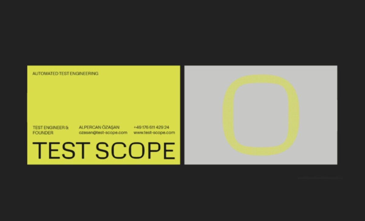
MAY Studio designed the business card for Test Scope, specialists in ensuring top quality for electronic assemblies through advanced testing. The card itself needed to communicate precision and modernity. You can see how it uses a bold visual style to make a strong statement about their expertise in the tech field.
The designers at MAY Studio chose a high-contrast color palette: neon yellow paired with dark grey or black. This makes the business card very noticeable. That bright yellow stripe on the front, for instance, immediately draws your eye. It’s a look that feels both modern and full of energy.
This business card features a crisp, geometric layout. It’s not cluttered; instead, it uses space and simple shapes effectively. You might see a bold graphic "O" on one side, with text neatly organized elsewhere. This precision in design mirrors the precision Test Scope brings to its testing services.
That large "O" symbol you see, made from yellow lines, is a clever take on their logo or brand mark. It’s smoothly worked into the card's design. This "O" could make you think of completeness or the precision of a scope, tying right into their electronic testing work.
Test Scope’s business card is a great example of modern, impactful design. MAY Studio used bold color contrast, a minimalist layout, and a clever logo element to reflect the company’s high-tech services. If you receive this card, you’ll know Test Scope is all about precision and quality.