Talavera Print Design Envelops A Variety Of Products And Collaterals
Talavera is a luxurious, Bohemian-style 11-suite boutique hotel in Palm Springs, whose new owners wanted to give it an entire brand overhaul and repositioning.
To help the hotel “establish a new name, brand awareness and a reimagined guest experience,” Clark Studios branding agency revamped its entire visual identity, including custom amenity design and packaging, monument and property signage, as well as guestroom collaterals.
Talavera print design stays in line with the branding redesign of its digital assets, including mobile and desktop website. The visual consistency – an elementary constituent of any successful branding effort – has been achieved with the well-defined brand book, developed by a top-class brand agency, that contains the instructions on the proper use of all their visual elements.
The print collaterals, with a new look, serve as the foundation of the new and improved guest experience Talavera is going for since its change of management. Many of the amenities used by hotel guests bear the print design developed by Clark Studios.

Mellow Autumn Colors Provide A New Look And Feel For Talavera
The color palette for Talavera print design consists of six very particular shades, inspired by the autumn season and the hotel’s signature guest sections.
Brown, dim yellow, light gray, dark orange/copper, olive green and beige are the hues used in different amounts and combinations across all of the hotel’s print materials.
For example, Talavera’s in-house brand of shampoo, conditioner and body wash all have custom-made labels in all-brown or copper with highly contrasting fonts. Bar soaps come in a different design altogether but with consistent lettering, sporting lighter shades like gray and yellow.
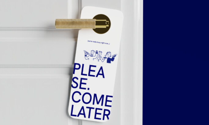
The signage systems and welcome notices are all mainly yellow with intricate graphic elements in any of the above colors at the back.

Talavera Proves That Minimal Design Doesn’t Always Mean Simple
The very name of the hotel, Talavera, is borrowed from the Spanish and Mexican pottery tradition originating in Spain’s Talavera de la Reina region. The design of these pottery pieces is heavily regulated by the tradition of the area and uses the trademark ethnic cues in its embellishment.
Hotel Talavera’s print design sources its inspiration from this convoluted ornamentation for the added touch on much of its materials. The visual vernacular and amenity designs feature arabesque-like motifs on the front and the back. This makes for a refreshing change of pace from the mostly minimal layout.
The recurring motifs are the thin outlines of differently shaped flowers and plants, intersecting and overlapping each other. This creates a fractal-like visual experience that is not too obtrusive and is easy on the eyes, thanks to expertly executed proportions and its pleasing contrast with the white background.

Talavera Print Design Shows How To Use Complementary Fonts For Different Purposes
Talavera print design uses two tailored fonts across all of its facets: a sans-serif and a complementary serif typeface.
The latter is mostly used in digital media, to lend a different feel to sections that should stand out, like article headings. The former is exclusively prevalent on print material, as it is easier to read and better fits the particular amenities.
The sans-serif font comes in different “weight” varieties – there are bold, medium and lean versions that are often used together on a single collateral. They are strategically used to signify an important message – like whether the guests’ room has been sanitized – or to declare the effects of a certain product the hotel has on offer.
The font is not only highly legible and easy to understand on any surface and medium, but it is also quite contemporary-looking in its elements’ ratio, spacing and overall feel. Along with the colors, the new typography is a defining element in the hotel’s rebranding.
Talavera Print Design Is A Successful Mix Of Simplicity And Complexity
Although the main impression of Talavera print design is that of remarkable simplicity and even minimalism, a closer inspection reveals astounding attention to detail and level of complexity.
The solid colors and straightforward typeface are countered by elaborate structures. The seemingly simple shapes in said structures are in fact very complicated forms. The logo is a combo of all of these constituents that work well on their own and in a group.
As such, this design is an on-brand solution that reflects the high-end, luxurious personality of the hotel. At the same time, graphic design agencies strive to create visuals that communicate well with the audience. Talvera's print design does that masterfully by conveying exclusivity and attainability to all potential target audience segments.
For its well-balanced character, contemporary leanings and best practices that make a timeless and classic look, Talavera print design is DesignRush’s winner in the print design category.


