Tasked with disrupting the traditionally soft-spoken world of baked goods, designer Joe Powderham helped the brand translate its bold, no-apologies personality into every printed surface. From cookie wraps to shipping boxes, the identity is loud, irreverent, and unmistakably clear on one message: indulgence should never be subtle. Key Insights for Brands:
- Use bold typography and saturated color to cut command visual attention
- Replace literal imagery with abstract patterns to build emotional intrigue
- Build a modular print system for brand consistency and efficient scaling
Oversized Typography and Color Density Deliver Instant Brand Disruption
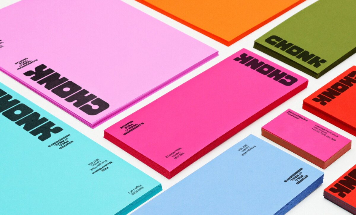
Chonk hits like a sugar rush. Its chunky wordmark grabs attention on impact, and its secondary font of Pangram Pangram’s Agrandir typeface adds just the right mix of punch and personality.
This is no accident. Joe Powderham’s take taps into the principle of perceptual disfluency, a phenomenon where harder-to-read elements command more attention and leave a stronger impression.
A 2022 study found that disfluent fonts significantly increase cognitive engagement and message retention in advertising. Chonk’s bold, deliberately imperfect type treatments apply this insight to ensure the brand doesn’t just get noticed, it gets remembered.
Color plays co-conspirator. Chonk’s use of intense, saturated hues grabs attention and signals indulgence and energy. According to one 2025 study, warm and vivid colors increase perceived flavor intensity and trigger stronger emotional appetite cues. For a brand built around maximal joy and sensory payoff, this is behavioral design.
See how colors shapes perception and drives decisions. And in a category full of soft pastels and wellness palettes, Chonk’s aggressive use of color and type isn’t just different, it’s a market positioning tool. One that grabs attention instantly and establishes the tone before a single bite is taken.
Tactile Abstract Patterns Evoke Flavor Without Defaulting to Food Imagery
We live in a world increasingly dominated by screens, with our connection to the physical world growing thinner. This trend is evidenced by Deloitte’s Connected Consumer Survey where 40% of consumers aged 18–40 feel their device usage may be weakening that connection. It's a signal that consumers are craving more tactile, grounded experiences.
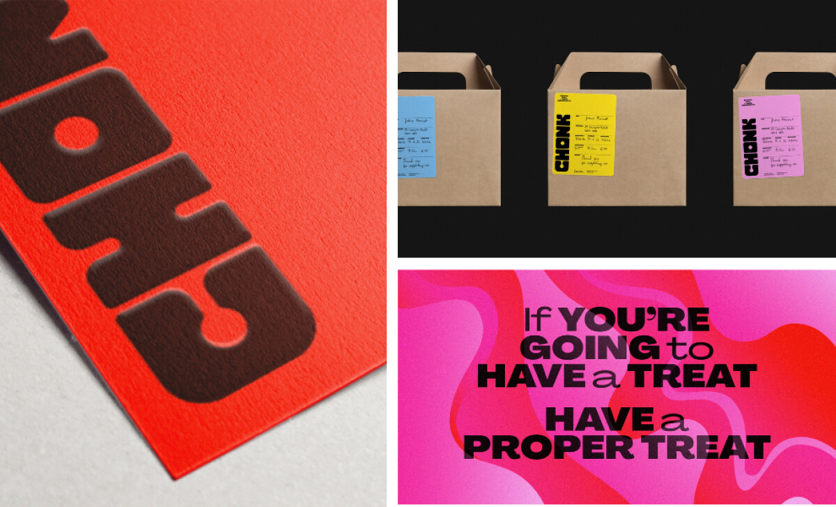
Chonk answers that craving through its use of rich, organic forms evoking texture and flavor without relying on literal food imagery. These abstract, fluid shapes stimulate the imagination and suggest gooeyness, warmth, and indulgence. In doing so, they reintroduce visual tactility into a world oversaturated with flat, sterile interfaces.
Tactile design, whether physically felt or visually implied, can reinforce memory and deepen emotional engagement, transforming even everyday packaging into a sensory experience. Chonk’s visual language does exactly that. It isn’t just pleasing to the eye; it creates an emotional shortcut to craving and connection.
By steering clear of food clichés, Chonk stays flexible and future-ready. Its abstract patterning scales easily across SKUs, limited runs, and seasonal offerings without running into the creative dead ends of literal or nostalgic design.
In a category often dominated by artisanal tropes, Chonk’s conceptual tactility marks a sharp, strategic departure, pushing the baked goods space forward with a language that is fresh, modern, and feels as good as it looks.
Uncover how visual communication drives clarity, action, and connection.
Consistent Layout Logic Across Print Assets Strengthens Recognition and Retention
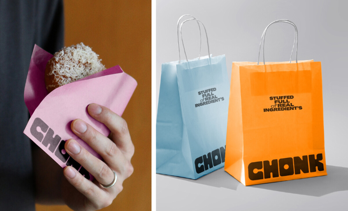
Chonk’s print system is engineered for consistency. From greaseproof wraps and shipping labels to retail boxes, every asset follows a unified structural language: bold wordmark placement, high-saturation color blocks, and minimalist supporting text. This tight visual discipline turns every physical touchpoint into a brand reinforcement opportunity.
In a baked goods category where product differentiation is slim and brand memory is fragile, visual repetition builds familiarity fast. According to a Marq's Brand Consistency Report, 68% find that brand consistency has contributed from 10% to more than 20% to their revenue growth.
Operationally, this system thinking pays off. The modularity of Chonk’s layout makes onboarding future print partners and scaling SKUs frictionless. Print vendors don’t need to guess. Production doesn’t slow down. There’s a rulebook and it’s clear, repeatable, and efficient.
For fast-moving consumer brands, this is where great design meets operational strategy. A well-governed, expertly designed print system minimizes noise, maintains brand integrity at scale, and ensures every box, bag, or label does its job: to be unmistakably Chonk.
Print-First Brand Voice Translates Brand Values Into Tactile Moments
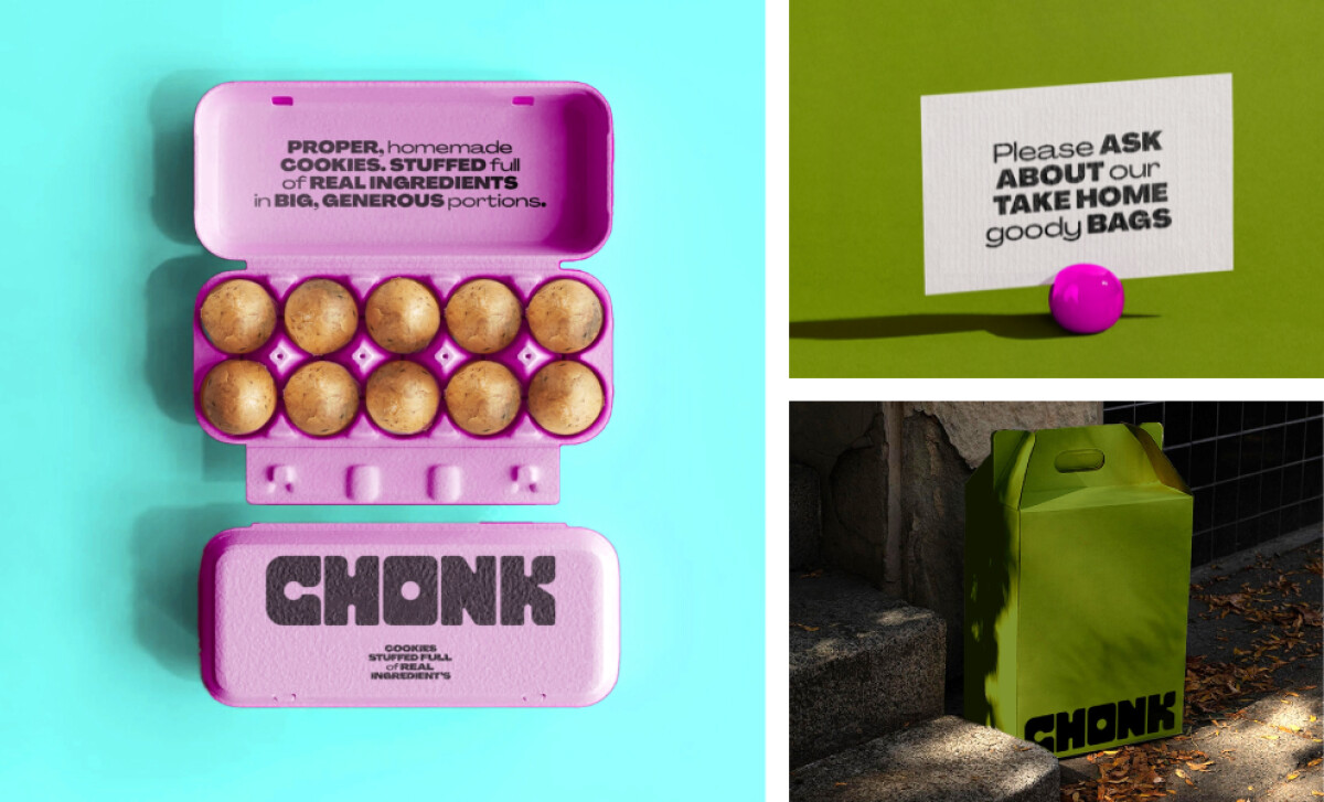
Where most brands reserve personality for ads or digital content, Chonk brings it to the packaging. All of it. The copy is direct, playful, and deliberately oversized, turning slogans like “Stuffed full of real ingredients” into bold declarations. Even mailing labels, product sleeves, and box interiors — every inch becomes a stage for tone. And it’s a smart strategy.
A study sponsored by Canada Post shows that print communication can deliver up to 70% stronger brand recall than digital, due to its tactile engagement and lower cognitive load, especially when the messaging is clear, distinctive, and well-integrated into the design. Chonk leverages this insight fully, letting its attitude bleed through the ink.
Print isn’t dead. It’s strategic. Learn what print design really means and why it still matters.
By treating print copy as a core branding element, not an afterthought, Chonk builds emotional equity in places most brands leave blank. Joe Powderham’s print system for Chonk Cookies is a standout example in emotional design, brand distinctiveness, and scalable production.
It shows how visual language, when tightly controlled but creatively expressive, can define a brand’s entire market presence. As this month’s Design Awards winner, Chonk is proof that the best print design is only one piece of a bigger brand ecosystem — and great print can carry just as much weight.