Standout Features:
- Symbolism of peace through design
- Use of blue and white color palette
- Focus on impactful typography
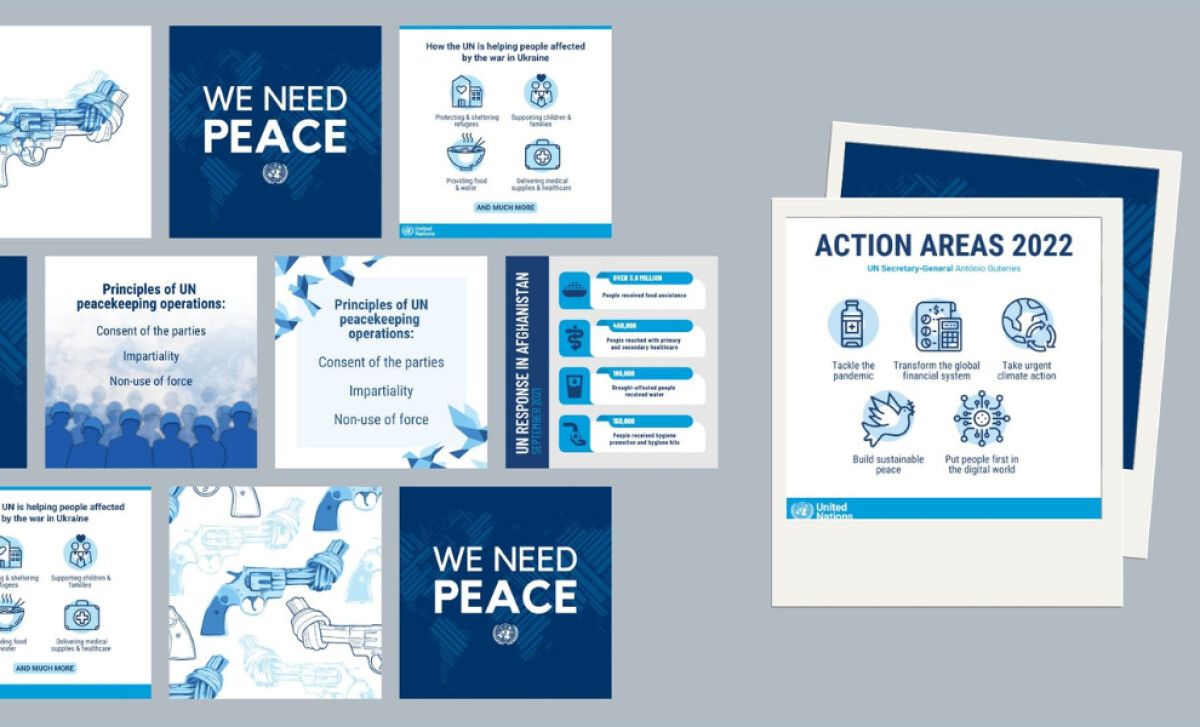
The United Nations Peacekeeping prints, designed by M. Noelle Studios, communicate the pivotal role the organization plays in supporting countries transitioning from conflict to peace. Through strategic design choices such as impactful visuals, clean typography, and a consistent color scheme, the materials aim to evoke trust, peace, and unity.
Peace is a central theme in the design, particularly highlighted by the image of a gun being tied in a knot. The visual metaphor of “tying up weapons” suggests the cessation of violence, perfectly complementing the UN's commitment to peace. This iconic symbol conveys the organization’s core message in a memorable way.
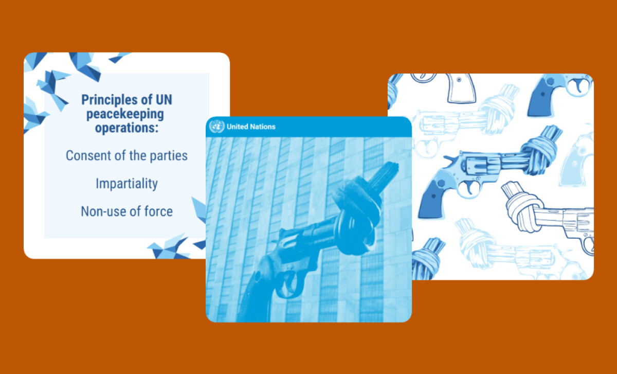
The color palette of blue and white is employed throughout the print materials to communicate calm, trust, and professionalism — values that align with the United Nations. The use of blue, often associated with stability, wisdom, and peace, reinforces the notion of UN Peacekeeping as a dependable, authoritative force for conflict resolution.
Finally, the clean, bold, and easy-to-read typefaces used for headings and key messages ensure clarity and accessibility. The font choice is modern yet authoritative, and the large, bold fonts stand out and draw attention to the key messages of the campaign, reinforcing the urgency and significance of UN peace efforts.
The United Nations Peacekeeping print materials designed by M. Noelle Studios offer a compelling visual narrative that effectively communicates the mission of UN peace efforts. The use of universal symbols of peace, paired with strategic design elements, enhances the non-profit print materials' ability to reach and resonate with a global audience.