Team Behind the Design
- Agency: Ocular Lab
- Client: McDonald’s Italia
- Category: Video – Animation
- Location: Milan, Italy
- Project Brief: Design an educational internal video for McDonald’s Italia that trains restaurant staff on handling gender-based violence incidents with empathy, awareness, and clear procedural guidance. The video should be both visually engaging and emotionally grounded to foster understanding and accountability.
Video Design Analysis
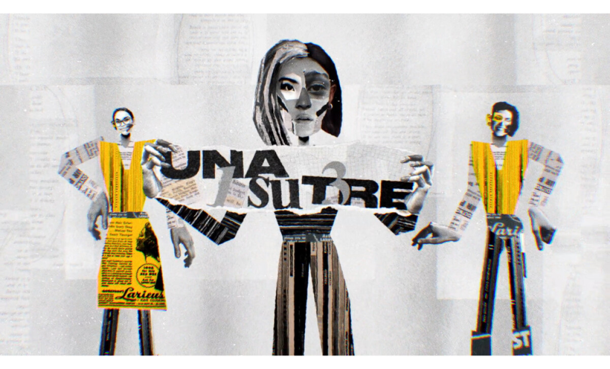
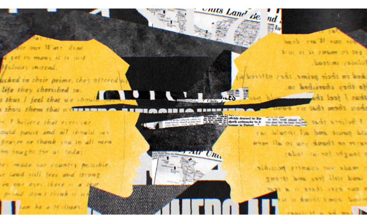
A good internal training video does more than inform. It also builds empathy and reflection. McDonald’s Contro la Violenza di Genere does exactly that, using a collage-driven narrative to turn policy into something felt.
The film blends texture, rhythm, and symbolism to help every viewer connect with its message of awareness and responsibility.
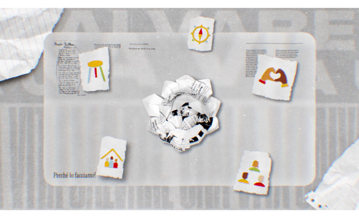
- Concept and Message: The film translates a serious subject into a visually compelling story that maintains respect and emotional gravity. The collage style evokes fragmented experiences, reinforcing the message of restoration and awareness.
- Animation Style: Mixing stop motion and motion graphics, the team achieved a layered texture that feels both handcrafted and dynamic. The movement of torn paper and type lends rhythm and immediacy to the narrative.
- Color and Texture: Muted yellows, grays, and blacks create a restrained palette that reflects sensitivity. The paper-cut aesthetic brings warmth to a subject that could easily feel distant or procedural.
- Sound and Pacing: Audio cues punctuate transitions without overwhelming the narrative. The pacing and rhythm respect emotional weight instead of rushing toward a call-to-action that would undermine the message's gravity.
What Brands & Agencies Can Learn from McDonald’s Contro la Violenza di Genere
Ocular Lab’s work for McDonald’s shows how visual design can make corporate communication truly human. By using art direction and storytelling with sensitivity, the video proves that training content can inform and move people at the same time.
1. Treat Internal Campaigns with Creative Respect
Training materials deserve the same level of craft as public campaigns. When internal communication feels designed with care, employees engage more deeply and absorb the message with trust.
2. Use Visual Metaphor to Simplify Complexity
Collage and stop motion techniques can translate abstract or emotional topics into something tangible. Visual texture gives audiences a way to connect intellectually and emotionally without relying on heavy language.
3. Balance Aesthetic and Responsibility
Color, pacing, and tone should always serve the message. A restrained palette and deliberate rhythm keep attention on empathy rather than spectacle, ensuring that design amplifies sensitivity instead of diluting it.
About DesignRush Featured Designs
At DesignRush, we review hundreds of agency projects each month. The featured works represent standout storytelling and craftsmanship across digital media.
The most compelling campaigns like this often go on to be recognized in the Monthly Design Awards, spotlighting creativity and strategic excellence.
Explore More Designs:
- Best Video Designs
- Best Website Designs
- Best App Designs
- Best Logo Designs
- Best Print Designs
- Best Packaging Designs
For a full list of top creative agencies and digital partners, visit our Agency Directory.