Standout Features:
- Sophisticated light and dark theme color system
- Clean sans-serif typography
- Intentional imagery and custom iconography
Prismatico Studio crafted the website for Asquith Bradley Consulting, a consultancy focused on R&D Tax Relief and maximizing innovation investments. The professional service site achieves clarity and professionalism by making a complex topic both engaging and easy to understand through its website design.
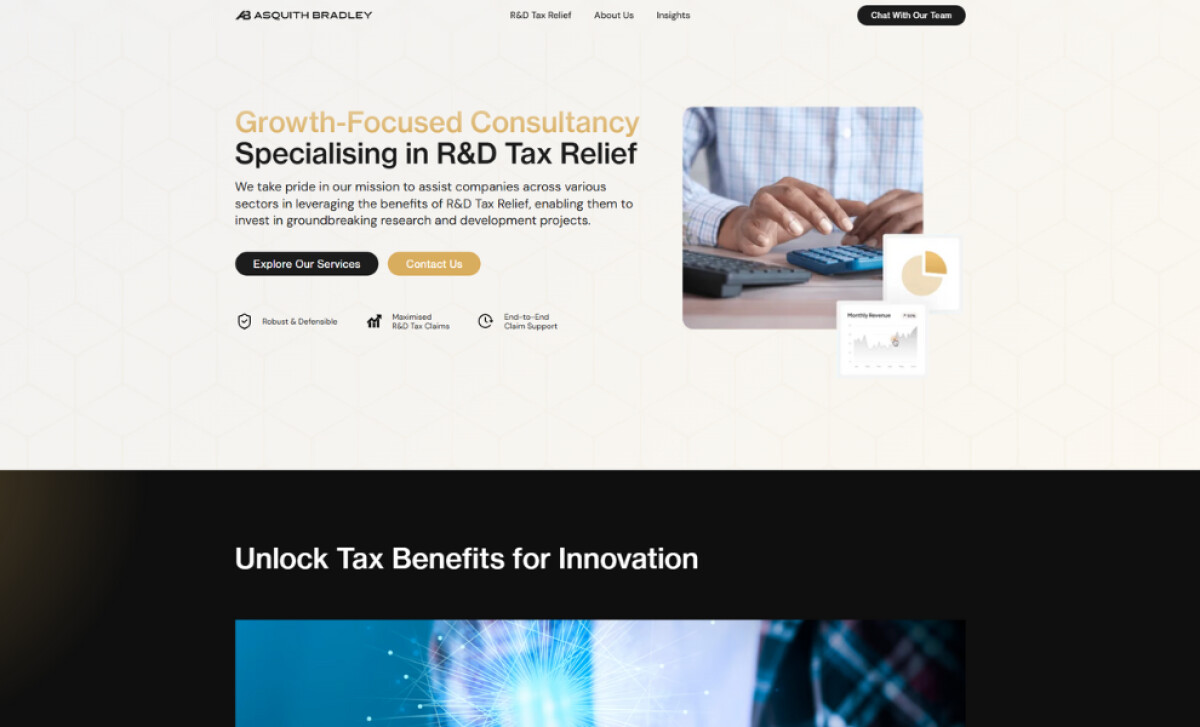
Firstly, a sophisticated color approach defines the visual experience. The initial hero section uses a soft cream background with golden accents and black type. Further sections employ a high-contrast black theme with white and gold. This strategy segments different types of information for the user.
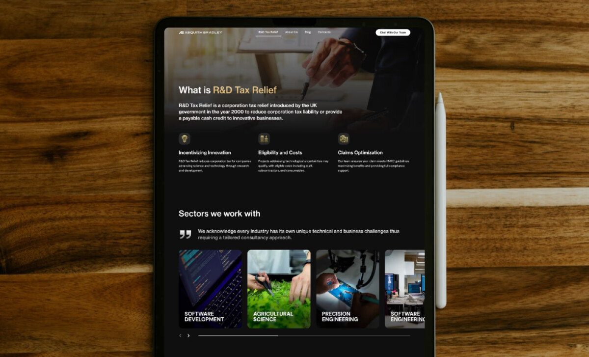
The typographic system uses a clean sans-serif, with emphasis done through weight and color contrast. Bold gold headlines stand out against black subheadings. This allows large volumes of text, common in consultancy sites detailing complex services, to remain organized and digestible for users.
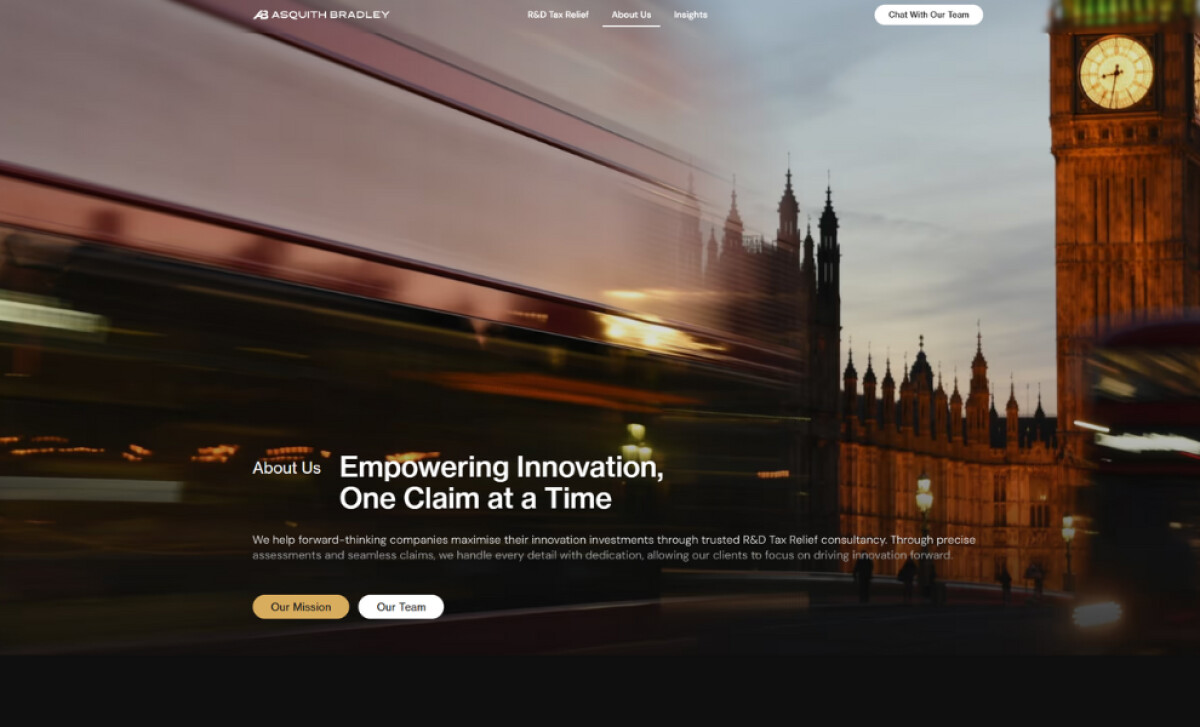
The site employs intentional imagery, including relevant business visuals like calculators and charts. Custom icons represent service features clearly. An "About" section image uses a London backdrop with motion blur. These assets help make the consultancy look modern and even localize its operations.
All these design elements are critical for a B2B brand, given that websites are key touchpoints in the B2B world, where a significant portion of buyers (56%) start their research directly on vendor sites, and an even larger number (61%) begin with a general web search.
In conclusion, the design for Asquith Bradley Consulting highlights how, for consultancies dealing with dense, technical content, a design that prioritizes clarity through typographic hierarchy and visual segmentation is paramount.


