Team Behind the Design
Website Design Analysis
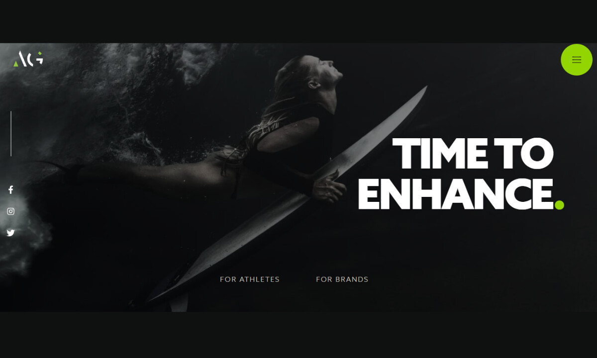
Strong professional-services websites communicate confidence within seconds.
Athelo Group’s site does this through restraint, contrast, and measured pacing, creating visual intensity that feels deliberate rather than overwhelming.
- Concept: I appreciate how the site positions Athelo as a performance brand rather than a service provider. The experience feels decisive and aspirational, framing the agency as a catalyst for growth. That intent is clear from the hero and remains consistent throughout.
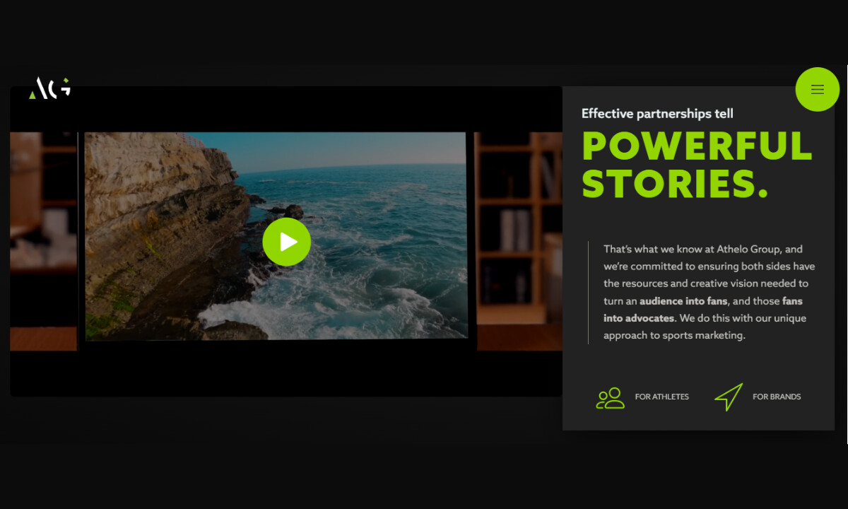
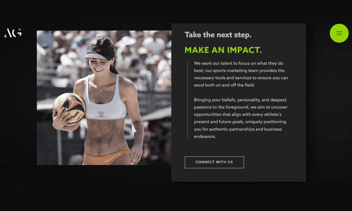
- Visual Language:Cinematic photography carries much of the message. Dark, high-contrast imagery with controlled lighting creates focus and intensity. I like that the visuals feel editorial rather than promotional, reinforcing Athelo’s alignment with performance culture and elite competition.
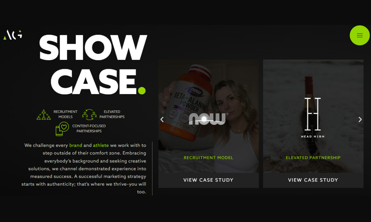
- Color System: I find the black-and-white foundation, punctuated by neon-green accents, handled with real discipline. The green never dominates the page; instead, it guides my attention where it matters most. This restraint keeps the experience feeling premium while still injecting energy.
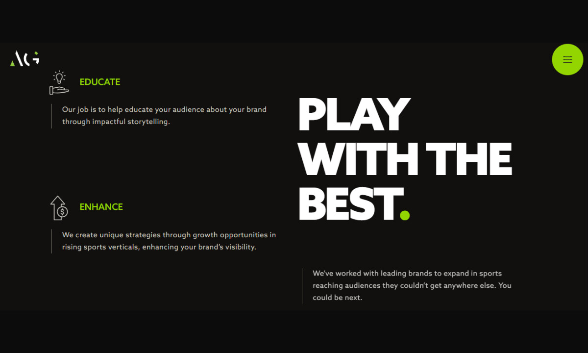
- Typography: The bold, uppercase headlines communicate authority without feeling aggressive to me. I’m especially drawn to the balance between oversized headlines and readable body copy, which supports both quick scanning and longer reading.
- Layout & Rhythm: From my perspective, the modular sections create a steady narrative flow. Alternating image-led and text-led blocks keeps the experience dynamic and prevents visual fatigue. The spacing and pacing make the site feel intentional and confident, rather than dense or overproduced.
What Brands & Agencies Can Learn from Athelo Group
1. Design for Positioning, Not Just Content
Athelo’s site works as a positioning tool first. Clear hierarchy and restraint communicate authority faster than heavy explanation.
2. Use Contrast and Rhythm to Project Confidence
Dark palettes, bold type, and deliberate spacing create control and momentum. When paced well, these choices elevate perception without hurting usability.
3. Let Imagery Do the Persuading
Cinematic, editorial visuals carry the emotional load, reducing the need for overt messaging. This approach is especially effective for brands rooted in culture, performance, and aspiration.
About DesignRush Featured Designs
At DesignRush, we review hundreds of digital projects each month, spotlighting work that merges creativity with technical precision. The featured designs stand out for concept strength, usability, and execution quality.
Only the most compelling projects advance to become Monthly Design Awards winners, recognized across global creative industries.
See more creative projects across categories:
- Best Website Designs
- Best App Designs
- Best Logo Designs
- Best Print Designs
- Best Packaging Designs
- Best Video Designs
For a full list of design agencies and related services, see our Agency Directory.