Team Behind the Design
Avision is a platform designed to connect photographers, videographers, and other creative professionals with potential clients. The website needed to focus on usability, offering an engaging, gallery-style interface that highlights each creator’s work.
With a quiet interface and thoughtfully built features, Avision lets creative work speak for itself while making client connections feel natural.
Web Design Analysis
For Avision’s website, I looked closely at how the design supports a smooth, intuitive experience for creatives showcasing their work.
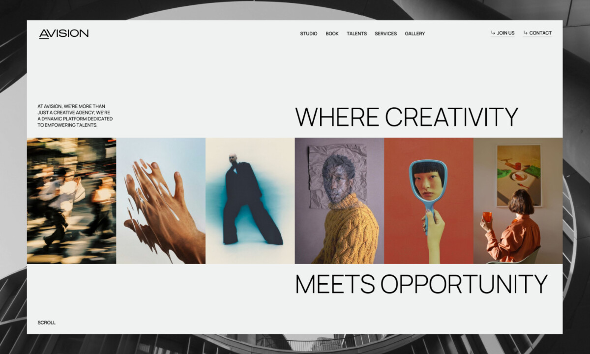
Much like other successful portfolio website designs, Avision combines minimalism, content-first design, and subtle motion to deliver a polished experience that feels both professional and engaging.

- Typography & Color Palette: I appreciate how the modern sans-serif fonts blend seamlessly with the minimalist design to ensure readability. The neutral whites, soft greys, and black palette creates a professional, calming backdrop that lets the portfolios shine.
- Motion & Interactivity: The subtle motion, like images transitioning smoothly, adds engagement without overwhelming the user. The parallax effect on the homepage creates a dynamic, interactive experience while keeping the design clean and sophisticated.
- Content-First Design: The layout focuses on showcasing creative portfolios with ample white space, allowing users to engage without distractions. I like how the structure keeps visuals front and center, while the simple framing avoids clutter.
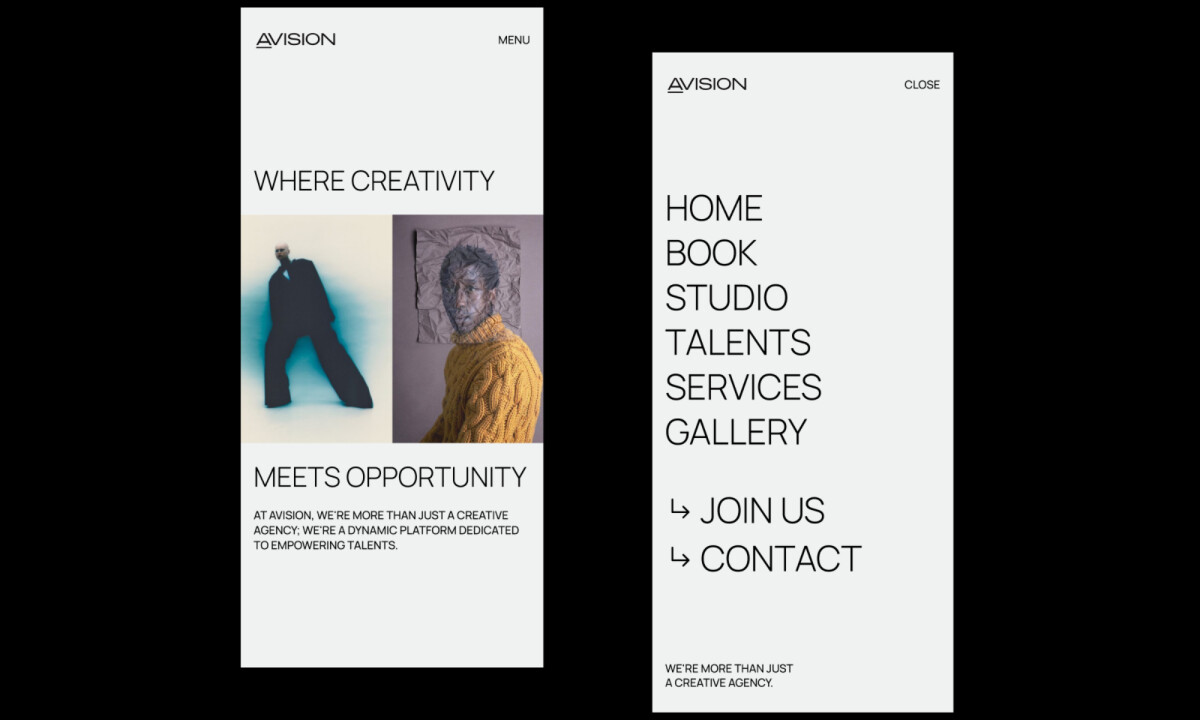
- Mobile Experience: The responsive design ensures that the website is just as effective on mobile as it is on desktop. I find the ease with which users can navigate and interact with portfolios across devices particularly satisfying.
Results
- A clean, modern platform that allows creators to showcase their portfolios professionally and attract new clients.
- Gallery-style grid that encourages talent discovery, making it easier for potential clients to explore and engage.
- Simplified navigation with intuitive browsing across categories ensuring a seamless user experience.
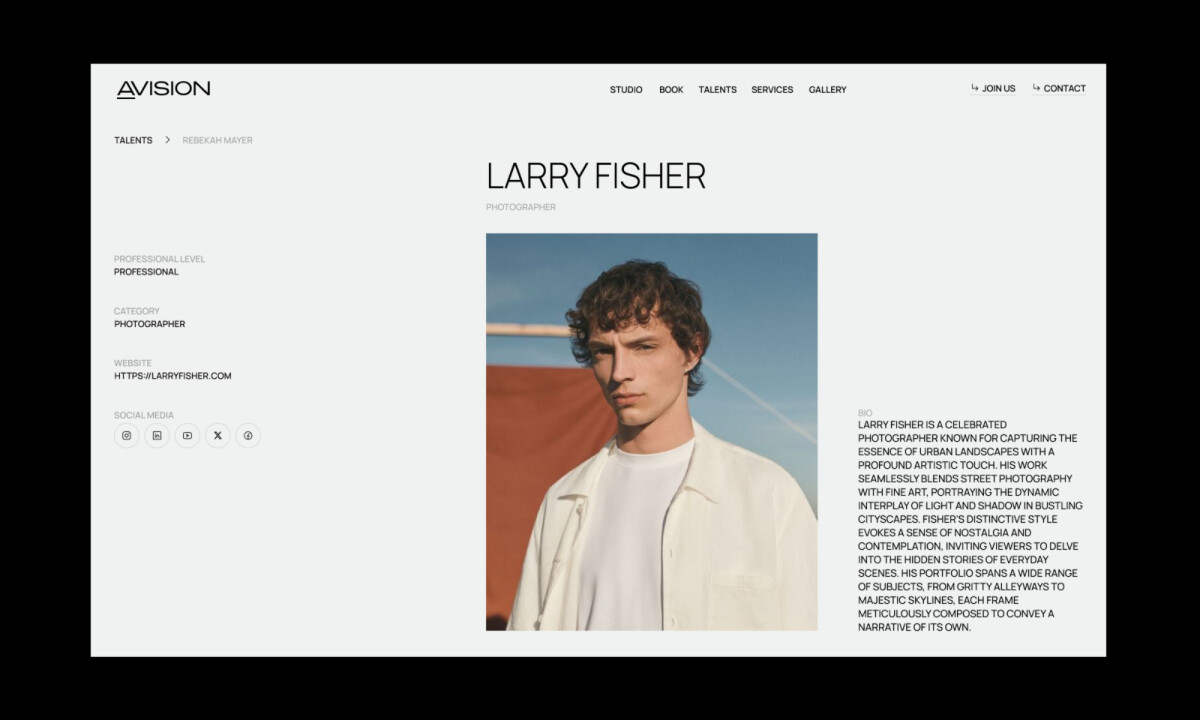
- Personalized creator pages reflecting individual style, strengthening the connection with potential collaborators.
Collaborator Input
The development of Avision's website was rooted in a clear understanding of the challenges faced by creative professionals. The platform was designed to address these needs and provide a streamlined, user-friendly space for creatives to connect, collaborate, and showcase their work.
Word from the Agency
“We started by analyzing the needs of creative professionals, identifying pain points in showcasing portfolios and connecting with clients. My strategy prioritized a clean, user-centric design that combines aesthetics and functionality to elevate the user experience.”
— VALMAX
What Brands & Agencies Can Learn from Avision
Here’s what the Avision website redesign teaches us about creating an intuitive, content-first platform for creative professionals:
1. Prioritize Content Over Clutter
Avision’s minimalist design makes the creative work the star of the show. The clean layout and ample white space allow users to focus solely on the portfolios, ensuring a distraction-free browsing experience. Agencies can adopt this approach for projects where content must take center stage.
2. Use Subtle Motion to Enhance User Engagement
The smooth parallax effect and gentle transitions create a dynamic, engaging experience without overwhelming the user. This strategy can be applied to add interactivity to a site while maintaining a refined, professional feel.
3. Ensure Seamless Mobile Experience
Avision’s mobile-friendly design ensures that the clean and easy-to-navigate layout translates smoothly across devices. Agencies should always ensure that their responsive designs retain their core functionality and aesthetic appeal on all screen sizes, enhancing the user experience.
About DesignRush Featured Designs
At DesignRush, we review hundreds of digital projects each month, spotlighting work that merges creativity with technical precision. The featured designs stand out for concept strength, usability, and execution quality.
Only the most compelling projects advance to become Monthly Design Awards winners, recognized across global creative industries.
See more creative projects across categories:
- Best Website Designs
- Best App Designs
- Best Logo Designs
- Best Print Designs
- Best Packaging Designs
- Best Video Designs
For a full list of design agencies and related services, see our Agency Directory.