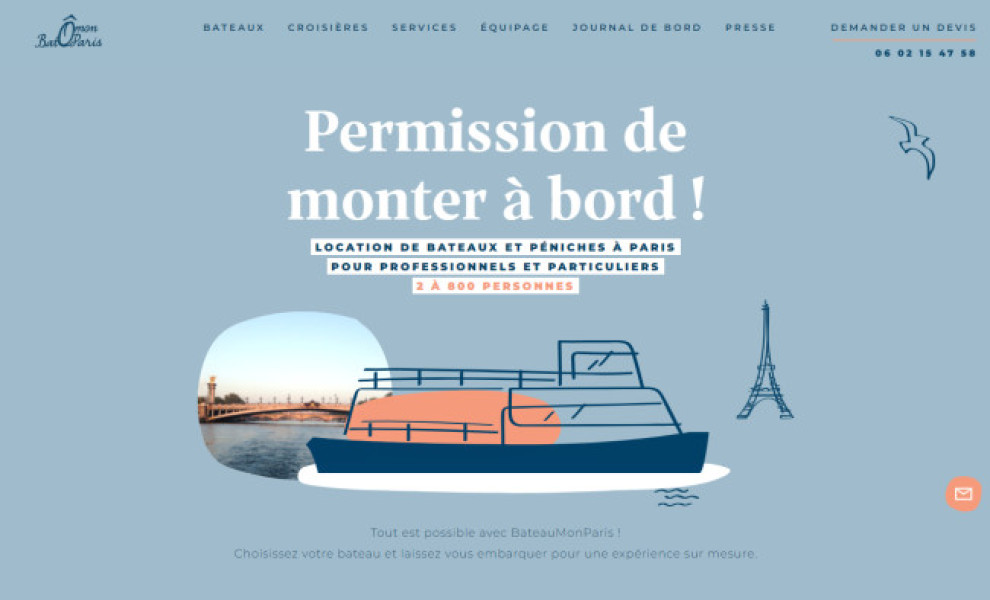
Standout Features:
- A mix of pastel and dark colors
- Complementary color combination
- Hand-drawn illustrations
Looking at BateauMonParis’s website, it’s evident that BuzzNative applied the best practices of color theory in creating a visually striking design that’s easy on the eyes.
How so?
They used a fool-proof color pairing of blue and orange -- two shades that naturally blend well since they are opposite hues in the color wheel. With a complementary palette, how can you go wrong?
By going with slightly muted and pastel shades of those two colors, they captured BateauMonParis’s sophisticated offer of experiencing Paris in a boat. Also, the designers added an extra shade of navy blue to incorporate a nautical aesthetic to cut through the light theme.
Several hand-drawn shapes and illustrations of vital brand symbols such as anchors, waves, wine glasses, and desserts are scattered on the website, bringing out the fun in the design.