
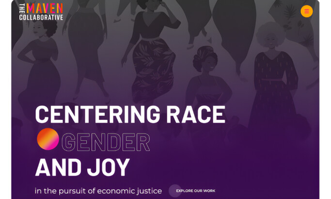
Standout Features
- Unique vertical menu
- Sticky “Donate” CTA
- A mix of curated and casual photos
CARE Climate Change and Resilience website design by Ruby Studio captures the essence of calamity resilience very well. The choice of earthy colors, particularly shades of orange and yellow, instantly gives the audience an idea of what the organization focuses on. This is further complemented by high-resolution images showing people coming out stronger from environmental disasters.
With this type of layout, it makes total sense that the navigation menu is placed on the sidebar. Its vertical look allows visitors to draw more of their attention to the photos and the stories told. Other image blocks contain text and icon overlays, which is quite a departure from the usual non-profit website designs.
Parallel to the sidebar menu is a sticky Donate button. Unlike most websites, it doesn’t redirect you to a separate page for sending a contribution. Instead, it opens up a panel that resembles a payment channel. Hence, users can make donations while scrolling through the website.


-preview.jpg)
-preview.jpg)
-preview.jpg)
-preview.jpg)